When I first look at these credit investment opportunities, the challenge was immediately clear. Our team was evaluating two legacy services chains in Florida, yet almost none of the analytical infrastructure one might expect—standardized operating metrics, historical statements, market share data—was available. Unlike more transparent service sectors, this industry provides no obvious datapoints to anchor intuition or build a conventional model.

But the nice thing about data work is: if you don’t have intuition, you can build a framework.

This post walks through a simple, self-contained demo on how I used alternative data to compare two legacy service chains for a hypothetical private credit investment. All data here are simulated and anonymized; the goal is not to value real companies, but to show how to turn a “no idea where to start” situation into a structured, defensible analysis. My hope is that it provides inspiration for approaching private-credit opportunities in niche service industries where traditional information is limited.

1
chain_attributes.head()

chain name address zip usps_zip_pref_state latitude longitude revenue
0 Eternal Rest Services Seawinds Funeral Home & Crematory - Sebastian 735 S Fleming St, Sebastian 32958 FL 27.7913 -80.4838 NaN
1 Eternal Rest Services Lewis-Ray Mortuary Inc 1595 S Hopkins Ave, Titusville 32780 FL 28.5964 -80.8076 NaN
2 Eternal Rest Services Beth David Memorial Gardens / Levitt Weinstein... 3201 N 72nd Ave, Hollywood 33024 FL 26.0373 -80.2325 NaN
3 Eternal Rest Services Sorensen Funeral Home 3180 30th Ave N, St. Petersburg 33713 FL 27.7988 -82.6770 NaN
4 Eternal Rest Services Brewer & Sons Funeral Homes - Spring Hill Chapel 4450 Commercial Way, Spring Hill 34606 FL 28.4939 -82.5962 NaN

Confronting an opaque sector with minimal initial intuition

My first attempt at framing the problem was straightforward but ultimately insufficient. I began with the assumption that local population size should correlate with demand, and therefore revenue, in a necessity-based service. The logic felt self-evident.

Yet once I tested this idea against the reference dataset where one comparable chain provided actual revenue data—the relationship collapsed almost immediately. Dense ZIP codes did not necessarily produce higher revenue, and several low-population regions performed unexpectedly well. This mismatch signaled that the core driver of performance was not simply “how many people live nearby.” It forced a re-examination of what demand actually means in this context.

Refining the definition of demand

A more nuanced view is that not all population contributes equally to demand. To approximate the actual service need in each market, I began assembling a dataset that did not exist in any ready-made form. I pulled age-bucket distributions from the American Community Survey at the ZIP-code level, then matched each location to its corresponding county in order to merge in CDC crude mortality rates by age group. Only after aligning these disparate geographies—coordinates → ZIP → county—was it possible to compute a more meaningful proxy: the expected number of annual events within each location’s true catchment area.


1
2
3
4
5
6
7
8
import pandas as pd
import numpy as np
import statsmodels.formula.api as smf
import statsmodels.api as sm
import matplotlib.pyplot as plt
import cartopy.crs as ccrs
import cartopy.feature as cfeature
from math import radians, cos, sin, asin, sqrt
1
2
3
4
5
6
7
8
# Load the datasets
chain_attributes = pd.read_csv('chain_attributes.csv',dtype={'zip': str})
zipcode_county_mapping = pd.read_csv('zipcode_county_mapping.csv',dtype={'zipcode': str})
# the American Community Survey (ACS). Downloaded from https://data.census.gov/table/ACSDP5Y2023.DP05?t=Older+Population&g=040XX00US12$8600000
dp03 = pd.read_csv('DP03_by_county.csv')
dp05 = pd.read_csv('DP05_by_county.csv')
#CDC crude mortality rates by age group by county. Downloaded from https://wonder.cdc.gov/controller/datarequest/D76;jsessionid=6FAF78721C8F4B417A0EF2BBEDE8
crude = pd.read_csv('crude_rate.csv',dtype={'county code': str})
1
2
3
4
5
6
7
8
9
10
11
12
13
14
15
16
17
18
19
20
21
22
23
24
25
26
27
28
29
30
# clean up ACS data
dp = pd.merge(dp03, dp05, on=['Geography', 'Geographic Area Name'], how='outer')
dp.columns = ['Geography', 'Geographic Area Name', 'Median household income','Mean household income'] + ['Population '+ str(age) for age in dp.columns[4:]]
dp['county'] = dp.iloc[:, 1].apply(lambda x: x.split(', ')[0].replace(' County', ''))
dp['state'] = dp.iloc[:, 1].apply(lambda x: x.split(', ')[1])
dp['county code'] = dp.iloc[:, 0].apply(lambda x: x.split('US')[1])

# clean up crude rate data
# Pivot the data to reorganize by county and county code, with Ten-Year Age Groups and Crude Rates as columns
pivoted_crude = crude.pivot_table(index=['county code'],
columns='Ten-Year Age Groups',
values='Crude Rate Per 100,000',
aggfunc='first')
pivoted_crude.reset_index(inplace=True)
pivoted_crude.columns = ['county code'] + ['Crude Rate '+ str(age) for age in pivoted_crude.columns[1:]]


# Merge attributes with zip-county map
data = pd.merge(chain_attributes, zipcode_county_mapping, left_on='zip', right_on='zipcode', how='left')
# Merge data with DP03 and DP05 based on the state/county columns
data = pd.merge(data, dp, on=['state','county'], how='left')
# Merge data with crude rate based on the county column
data = pd.merge(data, pivoted_crude, on=['county code'], how='left')

# Check and display the rows that were not merged
unmerged_rows = data[data['Geography'].isna()]
if not unmerged_rows.empty:
print(f"There are {len(unmerged_rows)} rows that did not merge successfully.")
else:
print("All rows have been successfully merged.")
All rows have been successfully merged.
1
2
3
4
5
6
7
8
9
10
11
12
13
# Drop columns that will not be used
df = data.drop(['state_fips','state_abbr', 'zipcode','Geography', 'Geographic Area Name'], axis=1)
df = df.drop(['Population Under 5 years', 'Population 5 to 9 years',
'Population 10 to 14 years', 'Population 15 to 19 years',
'Population 20 to 24 years', 'Population 25 to 34 years',
'Population 35 to 44 years', 'Population 45 to 54 years',
'Population 55 to 59 years', 'Population 60 to 64 years',
'Crude Rate 1-4 years', 'Crude Rate 15-24 years',
'Crude Rate 25-34 years', 'Crude Rate 35-44 years',
'Crude Rate 45-54 years', 'Crude Rate 5-14 years',
'Crude Rate 55-64 years','Crude Rate < 1 year','Crude Rate Not Stated'], axis=1)
# correct data types
df[['Crude Rate 65-74 years','Crude Rate 75-84 years', 'Crude Rate 85+ years','Median household income', 'Mean household income']]= df[['Crude Rate 65-74 years','Crude Rate 75-84 years', 'Crude Rate 85+ years','Median household income', 'Mean household income']].astype('float')

I translated demographic structure into an estimate of actual annual events. Mortality data from the CDC are reported as crude rates per 100,000 people for each age bracket, so the calculation effectively becomes a weighted sum of age-specific risk. For each ZIP, I multiplied the population in each senior age group by the corresponding crude mortality rate, scaled the result back to actual counts, and then aggregated across age brackets. The resulting field—Estimated deaths—provides a first-order approximation of the true service demand in each catchment area.

1
2
3
4
5
# estimated death = population * crude rate
df['Estimated deaths 65 to 74 years'] = ((df['Population 65 to 74 years'] * df['Crude Rate 65-74 years']) / 100000).round(0)
df['Estimated deaths 75 to 84 years'] = ((df['Population 75 to 84 years'] * df['Crude Rate 75-84 years']) / 100000).round(0)
df['Estimated deaths 85 years and over'] = ((df['Population 85 years and over'] * df['Crude Rate 85+ years']) / 100000).round(0)
df['Estimated deaths'] = (df['Estimated deaths 65 to 74 years'] + df['Estimated deaths 75 to 84 years']+ df['Estimated deaths 85 years and over']).round(0)

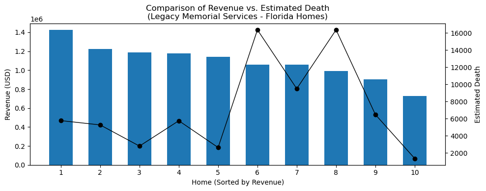
This proxy proved substantially closer to the underlying demand function than raw population counts when comparing with one chain in a different state but with actual revenue data. But while the measure improved explanatory power, it still did not explain why sites with nearly identical expected-event profiles performed so differently. Revenue dispersion within the reference chain remained wide. It became clear that another structural factor—something demographic data alone could not capture—was driving the variation.

1
2
df[['zip',  'Population 65 to 74 years','Crude Rate 65-74 years', 'Population 75 to 84 years','Crude Rate 75-84 years',
'Population 85 years and over', 'Crude Rate 85+ years', 'Estimated deaths', 'revenue']][50:60]

zip Population 65 to 74 years Crude Rate 65-74 years Population 75 to 84 years Crude Rate 75-84 years Population 85 years and over Crude Rate 85+ years Estimated deaths revenue
50 28105 82170 1667.1 35797 4417.0 14314 13249.3 4848.0 1443785.90
51 28715 33804 1673.3 15735 4515.7 7033 14083.6 2267.0 1142504.96
52 28301 25938 2324.2 12208 5129.5 4598 13700.4 1859.0 933859.23
53 27292 18861 2247.5 9673 5438.5 3306 15263.5 1455.0 1104161.22
54 27604 89427 1405.2 39811 4244.9 14816 13564.1 4957.0 902405.14
55 30134 11119 2198.6 4615 5267.5 1732 15275.1 752.0 1046596.19
56 30046 68686 1472.3 28960 4319.0 7830 14309.8 3382.0 783832.30
57 30092 68686 1472.3 28960 4319.0 7830 14309.8 3382.0 1305180.42
58 31404 29473 1966.1 14405 4595.0 4936 13413.5 1903.0 1264724.73
59 30060 64020 1532.7 28231 4505.9 9642 14546.6 3656.0 946321.92
1
2
3
4
5
6
7
8
9
10
11
12
13
14
15
16
17
18
19
20
21
22
23
24
25
26
27
28
### plot comparison of revenue vs. estimated death
df_legacy_fl = df[(df['chain'] == 'Legacy Memorial Services') & (df['state'] == 'Florida')].copy()
# Sort (descending) by revenue, so the highest-revenue location appears first
df_legacy_fl.sort_values(by='revenue', ascending=False, inplace=True)
df_legacy_fl.reset_index(drop=True, inplace=True)

# Create the Plot
x = np.arange(len(df_legacy_fl)) # x-coordinates for each home
fig, ax1 = plt.subplots(figsize=(10, 4))

# Bar Chart for Revenue
bar_width = 0.6
ax1.bar(x, df_legacy_fl['revenue'], width=bar_width, label='Revenue')
ax1.set_ylabel("Revenue (USD)")
ax1.set_xlabel("Home (Sorted by Revenue)")

# For aesthetic labeling, show home indices or names:
ax1.set_xticks(x)
ax1.set_xticklabels(x + 1)

# Line Plot for Estimated Death
ax2 = ax1.twinx() # create a twin axis sharing the same x-axis
ax2.plot(x, df_legacy_fl['Estimated deaths'], color = 'black', marker='o', linewidth=1, label='Estimated Death')
ax2.set_ylabel("Estimated Death")

plt.title("Comparison of Revenue vs. Estimated Death\n(Legacy Memorial Services - Florida Homes)")
plt.tight_layout()
plt.show()

Competition determines revenue more than raw demand

The turning point occurred when I spatially mapped all sites and overlaid nearby competitors. Only then did the inconsistencies resolve.

Two locations with nearly identical demographic and demand characteristics behaved very differently when their competitive environments diverged. A near-monopoly footprint materially outperformed markets with multiple service providers.

1
2
3
4
5
6
7
8
9
10
11
12
13
14
15
16
17
18
19
20
21
22
23
24
25
26
27
28
29
30
31
32
33
34
35
36
37
38
39
40
41
42
43
44
45
46
47
48
49
50
51
52
### plot locations on FL map to see the competitive dynamic
df_fl = df[df['state'] == 'Florida']
colors = {
'Eternal Rest Services': 'red',
'Forever Peace Homes': 'blue',
'Legacy Memorial Services': 'green'
}
if 'chain' in df_fl.columns:
df_fl['color'] = df_fl['chain'].map(colors)
else:
df_fl['color'] = 'purple'

# Create a Matplotlib figure with a Cartopy projection
plt.figure(figsize=(10, 8))
ax = plt.axes(projection=ccrs.PlateCarree())

# Set the geographic extent to cover Florida
ax.set_extent([-88, -80, 24, 32], crs=ccrs.PlateCarree())

# Add map features for context: coastlines, national borders, and state boundaries
ax.add_feature(cfeature.COASTLINE)
ax.add_feature(cfeature.BORDERS, linestyle=':')
ax.add_feature(cfeature.STATES, edgecolor='gray')

# Plot the Florida home locations
if 'chain' in df_fl.columns:
for chain, group in df_fl.groupby('chain'):
ax.scatter(
group['longitude'],
group['latitude'],
label=chain,
color=colors.get(chain, 'purple'),
s=100,
alpha=0.7,
edgecolor='k',
transform=ccrs.PlateCarree()
)
else:
ax.scatter(
df_fl['longitude'],
df_fl['latitude'],
label='Funeral Home',
color='purple',
s=100,
alpha=0.7,
edgecolor='k',
transform=ccrs.PlateCarree()
)

plt.title("Funeral Home Locations in Florida")
plt.legend()
plt.show()
/var/folders/8t/vzks7t793bq9w_c_km9_4f2h0000gn/T/ipykernel_63287/4228247440.py:16: SettingWithCopyWarning: 
A value is trying to be set on a copy of a slice from a DataFrame.
Try using .loc[row_indexer,col_indexer] = value instead

See the caveats in the documentation: https://pandas.pydata.org/pandas-docs/stable/user_guide/indexing.html#returning-a-view-versus-a-copy
  df_fl['color'] = df_fl['chain'].map(colors)

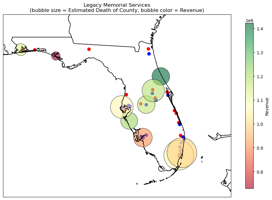
The map below visualizes the reference chain across Florida, and it quickly illustrates why demographic data alone could not explain revenue dispersion. Each bubble represents a county, with bubble size proportional to estimated annual events (derived from senior population × county-level mortality rates) and bubble color reflecting actual 2023 revenue for the nearest location.

What immediately stands out is the lack of a clean relationship between demand potential and realized performance. Several counties with sizeable senior populations and high expected-event estimates (large bubbles) exhibit only mid-range revenues. Conversely, some moderately sized markets but without any competitors nearby outperform expectations despite smaller demand pools.

1
2
3
4
5
6
7
8
9
10
11
12
13
14
15
16
17
18
19
20
21
22
23
24
25
26
27
28
29
30
31
32
33
34
35
36
37
38
39
40
41
42
43
44
### further plot estimated death and revenue for "Legacy Memorial Services"
fig = plt.figure(figsize=(12, 10))
ax = plt.axes(projection=ccrs.PlateCarree())

ax.set_extent([-88, -78, 24, 32], crs=ccrs.PlateCarree())

ax.add_feature(cfeature.COASTLINE)
ax.add_feature(cfeature.BORDERS, linestyle=':')
ax.add_feature(cfeature.STATES, edgecolor='black')

chains = df_fl['chain'].unique()
chain_colors = {
"Eternal Rest Services": "red",
"Forever Peace Homes": "blue"
}

for chain in chains:
if chain != "Legacy Memorial Services":
# For the other chains, plot points in a fixed color.
chain_df = df_fl[df_fl['chain'] == chain]
ax.scatter(chain_df['longitude'], chain_df['latitude'],
color=chain_colors.get(chain, "gray"),
s=50,
label=chain,
transform=ccrs.PlateCarree())

# For "Legacy Memorial Services", use the estimated death as the marker size and revenue for its color.
legacy_df = df_fl[df_fl['chain'] == "Legacy Memorial Services"]

# Set a scale factor for the estimated death to get marker sizes (adjust as needed)
size_factor = 0.3
marker_sizes = legacy_df['Estimated deaths'] * size_factor

# Scatter the Legacy points with a colormap for revenue.
legacy_scatter = ax.scatter(legacy_df['longitude'], legacy_df['latitude'],
c=legacy_df['revenue'], s=marker_sizes,
cmap='RdYlGn', alpha=0.6, edgecolor='k',
label="Legacy Memorial Services",
transform=ccrs.PlateCarree())

cbar = plt.colorbar(legacy_scatter, ax=ax, orientation='vertical', shrink=0.7)
cbar.set_label("Revenue")
plt.title("Legacy Memorial Services\n(bubble size = Estimated Death of County, bubble color = Revenue)")
plt.show()

This led to a critical insight:

Performance is driven less by total demand and more by demand per available provider.

To quantify this, I constructed a measure that ultimately became central to the analysis:
“death share,” defined as expected annual events divided by the number of competitors within a defined radius.

While conceptually simple, it captured competitive intensity more effectively than any other variable and proved to be the strongest empirical predictor of revenue.

First, I reconstructed local market structure directly from geospatial coordinates. The first step was implementing a haversine function, a standard method for calculating great-circle distances between two points on the Earth’s surface. With this, each site could be compared to every other location in the dataset to determine whether it falls within a reasonable competitive radius.

For this analysis, I used a ten-mile radius as a practical proxy for the area in which consumers are likely to consider alternatives. By converting that radius to kilometers and iterating through all pairs of coordinates, I was able to count, for each site, how many competing providers operate within that local catchment. The resulting competitors_within_10_miles field became a foundational feature: it quantifies the local supply environment and captures the structural headwinds—or advantages—that shape a site’s revenue potential.

1
2
3
4
5
6
7
8
9
10
11
12
13
14
15
16
17
18
19
20
21
22
23
24
25
26
27
28
29
30
31
32
33
34
35
36
37
38
39
40
41
42
43
44
45
46
47
48
49
50
51
52
53
54
55
56
57
58
59
60
61
62
# Define the haversine function to calculate distance between two coordinates
def haversine_distance(lat1, lon1, lat2, lon2):
"""
Calculate the great-circle distance between two points on Earth using the haversine formula.

Parameters:
lat1, lon1 : float
Latitude and longitude of the first point in decimal degrees.
lat2, lon2 : float
Latitude and longitude of the second point in decimal degrees.

Returns:
float
Distance between the two points in kilometers.
"""
# Convert decimal degrees to radians
lat1, lon1, lat2, lon2 = map(radians, [lat1, lon1, lat2, lon2])

# Compute differences
dlat = lat2 - lat1
dlon = lon2 - lon1

# Haversine formula
a = sin(dlat / 2)**2 + cos(lat1) * cos(lat2) * sin(dlon / 2)**2
c = 2 * asin(sqrt(a))

# Earth's radius in kilometers
km = 6371 * c
return km

# Specify the search radius
search_radius_miles = 10
# Convert the search radius from miles to kilometers
search_radius_km = search_radius_miles * 1.60934

# Initialize a list to hold the count of competitors for each location
competitor_counts = []

# Loop through each location in the DataFrame
for i, row_i in df.iterrows():
lat_i = row_i['latitude']
lon_i = row_i['longitude']
count_competitors = 0

# Compare location i with every other location j in the DataFrame
for j, row_j in df.iterrows():
if i == j:
continue # Skip comparing the location with itself.
lat_j = row_j['latitude']
lon_j = row_j['longitude']

# Calculate the distance between the two locations
distance_km = haversine_distance(lat_i, lon_i, lat_j, lon_j)

# If the distance is within the search radius, count it as a competitor
if distance_km <= search_radius_km:
count_competitors += 1

competitor_counts.append(count_competitors)

# Add the computed competitor counts to the DataFrame
df['competitors_within_10_miles'] = competitor_counts
1
df[['name','competitors_within_10_miles']].head(10)

name competitors_within_10_miles
0 Seawinds Funeral Home & Crematory - Sebastian 1
1 Lewis-Ray Mortuary Inc 1
2 Beth David Memorial Gardens / Levitt Weinstein... 3
3 Sorensen Funeral Home 0
4 Brewer & Sons Funeral Homes - Spring Hill Chapel 0
5 Fairchild Funeral Home-Crmtry 0
6 Memorial Plan Flagler Memorial Park 3
7 All County Funeral Home & Crematory 1
8 Affordable Cremations by Baldwin Brothers 3
9 Neptune Society 1

Once competition was quantified, the next logical step was to translate local demand into something economically meaningful: how much of that demand a given site could reasonably capture. Estimated annual events alone are insufficient because two locations with identical demand can perform very differently if one operates in a near-monopoly environment while the other is surrounded by multiple providers. To reflect this, I constructed a simple but powerful measure of implied market share.

For each age group—and for total expected events—I divided the estimated annual deaths by the number of competitors within a ten-mile radius (plus one, to include the site itself). This produces an approximate “demand-per-provider” metric, or what I refer to analytically as death share. While coarse by design, this adjustment captures the structural effect of market fragmentation: the more providers sharing the same catchment, the smaller the realistic opportunity set for each individual location.

1
2
3
4
5
# estimate maket share for each location by dividing estimated death by number of competitors in 10 miles
df['Estimated deaths share 65 to 74 years'] = (df['Estimated deaths 65 to 74 years']/(df['competitors_within_10_miles']+1)).round(0)
df['Estimated deaths share 75 to 84 years'] = (df['Estimated deaths 75 to 84 years']/(df['competitors_within_10_miles']+1)).round(0)
df['Estimated deaths share 85 years and over'] = (df['Estimated deaths 85 years and over']/(df['competitors_within_10_miles']+1)).round(0)
df['Estimated deaths share'] = (df['Estimated deaths']/(df['competitors_within_10_miles']+1)).round(0)

Learning the revenue function from a reference chain

Because neither of the two target chains disclosed revenue, the only way to infer the economic structure of the industry was to learn it from the reference operator with known revenue across its Florida locations. The goal was not to build a sophisticated forecasting model, but rather to identify a stable, interpretable mapping between local market characteristics and realized revenue.

I began by isolating the Florida subset of Legacy Memorial and merging in the features I had engineered earlier—competitive density, household income, and various age-adjusted demand metrics. To understand how much revenue each location generated relative to its local opportunity set, I calculated a simple ratio: revenue per unit of estimated demand share. Conceptually, this expresses how much value a site captures from each unit of its adjusted demand pool.

1
2
3
4
5
6
7
8
9
10
# filter 'Legacy Memorial Services' homes in FL
df_lms_fl = df[(df['state'] == 'Florida')&(df['chain'] == 'Legacy Memorial Services')].copy()
df_lms_fl[['chain', 'name','zip','county','revenue','competitors_within_10_miles', 'Mean household income',
'Estimated deaths share 65 to 74 years','Estimated deaths share 75 to 84 years',
'Estimated deaths share 85 years and over', 'Estimated deaths share']]
# calculate rev generated per estimated deaths share (market share)
df_lms_fl['rev per death'] = (df_lms_fl['revenue']/df_lms_fl['Estimated deaths share']).round(0)
df_lms_fl[['chain', 'name','zip','county','revenue','competitors_within_10_miles', 'Mean household income',
'Estimated deaths share 65 to 74 years','Estimated deaths share 75 to 84 years',
'Estimated deaths share 85 years and over', 'Estimated deaths share','rev per death']]

At this point, one location—Baldwin Fairchild Funeral Home in Seminole County—stood out as a clear outlier. Its implied revenue-per-share figure was substantially higher than that of other sites. A closer look revealed that Seminole is the smallest county in Florida, meaning that computing expected events strictly within county boundaries understates the true catchment area. In practice, residents often cross county lines for this category of services, especially when adjacent counties are significantly larger.

To correct for this geographical artifact, I expanded the demand base for Seminole locations by incorporating senior population from neighboring Orange County. This adjustment created a more realistic representation of the actual market size accessible to those sites.

1
2
3
4
5
6
# add the population of the closest neighbor county Orange to locations in Seminole
pop_cols = ['Population 65 to 74 years', 'Population 75 to 84 years','Population 85 years and over',
'Estimated deaths 65 to 74 years', 'Estimated deaths 75 to 84 years','Estimated deaths 85 years and over', 'Estimated deaths']
df.loc[45, pop_cols] += df.loc[39, pop_cols]
df.loc[9, pop_cols] += df.loc[39, pop_cols]
df.loc[df['county'] == 'Seminole', pop_cols]

Population 65 to 74 years Population 75 to 84 years Population 85 years and over Estimated deaths 65 to 74 years Estimated deaths 75 to 84 years Estimated deaths 85 years and over Estimated deaths
9 157525 74102 29533 2545.0 3104.0 3701.0 9350.0
45 157525 74102 29533 2545.0 3104.0 3701.0 9350.0

After correcting the denominator for Seminole, the revenue-per-share metric became remarkably consistent across the reference chain’s locations. This stability provided exactly what I needed: a proportionality constant linking adjusted demand to realized revenue.

In other words, the reference chain supplied a set of empirical weights that could be transplanted onto the two target portfolios. With these weights in hand, I could estimate the economic potential of each site—even in the absence of disclosed financials—and ultimately compare the attractiveness of the two acquisition candidates.

1
2
3
4
5
6
7
8
9
10
# recalculate estimated deaths share based on updated data
df['Estimated deaths share 65 to 74 years'] = (df['Estimated deaths 65 to 74 years']/(df['competitors_within_10_miles']+1)).round(0)
df['Estimated deaths share 75 to 84 years'] = (df['Estimated deaths 75 to 84 years']/(df['competitors_within_10_miles']+1)).round(0)
df['Estimated deaths share 85 years and over'] = (df['Estimated deaths 85 years and over']/(df['competitors_within_10_miles']+1)).round(0)
df['Estimated deaths share'] = (df['Estimated deaths']/(df['competitors_within_10_miles']+1)).round(0)

df_lms_fl = df[(df['state'] == 'Florida')&(df['chain'] == 'Legacy Memorial Services')].copy()
df_lms_fl['rev per death'] = (df_lms_fl['revenue']/df_lms_fl['Estimated deaths share']).round(0)
df_lms_fl[['chain', 'name','zip','county','revenue','competitors_within_10_miles', 'Mean household income', 'Estimated deaths share','rev per death']]
# now rev generated per estimated deaths share is consistant across different locations

chain name zip county revenue competitors_within_10_miles Mean household income Estimated deaths share rev per death
40 Legacy Memorial Services Lohman Funeral Home Ormond 32174 Volusia 1423140.28 0 87233.0 5765.0 247.0
41 Legacy Memorial Services Russell Allen Wright, Sr. Mortuary LLC 32405 Bay 729434.16 0 92641.0 1348.0 541.0
42 Legacy Memorial Services Gendron Funeral & Cremation Services Inc. 33901 Lee 904327.89 3 102290.0 1618.0 559.0
43 Legacy Memorial Services Caballero Rivero Hialeah 33010 Miami-Dade 1060401.51 3 102498.0 4090.0 259.0
44 Legacy Memorial Services Alexander Funeral Home Inc 33881 Polk 1175491.50 1 84031.0 2875.0 409.0
45 Legacy Memorial Services Baldwin Fairchild Funeral Home 32714 Seminole 1189375.91 2 111625.0 3117.0 382.0
46 Legacy Memorial Services Sound Choice Cremation 34232 Sarasota 1221708.98 0 120022.0 5263.0 232.0
47 Legacy Memorial Services Christian Family Funeral 32503 Escambia 1142915.31 1 88025.0 1314.0 870.0
48 Legacy Memorial Services Smith-Youngs Funeral Home, Inc. 33756 Pinellas 1056734.64 3 101629.0 2372.0 446.0
49 Legacy Memorial Services Riverside Gordon Memorial Chapels 33162 Miami-Dade 989213.10 4 102498.0 3272.0 302.0

By combining demographic variables, event-based demand estimates, income proxies, and competition measures, I allowed a simple regression model to reveal which characteristics truly mattered.

The results were:

  1. Death share was the dominant explanatory factor.

  2. Senior population contributed largely through its relationship to death share.

  3. Household income, despite being intuitively appealing as a proxy for pricing power, exerted minimal influence in this dataset.

The muted role of income is less a substantive conclusion about the industry and more a feature of the simplified, simulated structure of this exercise. In this notebook, each location relies on county-level income data without adjusting for actual catchment boundaries. counties are administratively convenient but economically arbitrary; they often fail to reflect the true service footprint, especially in suburban or cross-county markets where consumers may travel several miles beyond their residential ZIP.

In real underwriting work, analysts typically aggregate population and income across multi-ZIP catchments or construct custom polygons based on drive-time radii. That process—while far more laborious—yields a materially more accurate representation of the household base each site can access. Under such a framework, income variability tends to matter more: higher-income catchments support differentiated service tiers, greater upsell elasticity, and more stable spend per event. Here, because the analysis relies on a simplified approximation, income contributes little incremental signal beyond what competition already explains.

The exercise nevertheless confirms a useful takeaway: when pricing dispersion is narrow and supply is unevenly distributed, market structure dominates household characteristics. The regression results remain directionally consistent with qualitative research showing that, in this sector, proximity and provider availability outweigh income-driven preference formation.

1
2
3
4
5
6
7
8
9
10
11
12
13
14
15
16
17
18
19
20
21
22
23
df['income'] = df['Mean household income']
df['death_share'] = df['Estimated deaths share']
df_lms_fl = df[(df['state'] == 'Florida')&(df['chain'] == 'Legacy Memorial Services')].copy()

# Set up predictors (X) and target (y)
features = ['income', 'death_share']
X = df_lms_fl[features]
y = df_lms_fl['revenue']

# Add a constant term to include an intercept in the model
X = sm.add_constant(X)

# Fit the OLS Model
formula = 'revenue ~ death_share + income'
model = smf.ols(formula, data=df_lms_fl).fit()
# Print the model summary
print(model.summary())

# Predict Revenue for Other Chains
X = df[features]
X = sm.add_constant(X)
# Predict revenue using the fitted model
df['predicted_revenue'] = model.predict(X).round()
                            OLS Regression Results                            
==============================================================================
Dep. Variable:                revenue   R-squared:                       0.597
Model:                            OLS   Adj. R-squared:                  0.481
Method:                 Least Squares   F-statistic:                     5.178
Date:                Sat, 12 Apr 2025   Prob (F-statistic):             0.0417
Time:                        00:05:45   Log-Likelihood:                -130.67
No. Observations:                  10   AIC:                             267.3
Df Residuals:                       7   BIC:                             268.2
Df Model:                           2                                         
Covariance Type:            nonrobust                                         
===============================================================================
                  coef    std err          t      P>|t|      [0.025      0.975]
-------------------------------------------------------------------------------
Intercept    1.219e+06   4.01e+05      3.042      0.019    2.71e+05    2.17e+06
death_share    98.2885     30.567      3.215      0.015      26.009     170.568
income         -4.3804      4.182     -1.048      0.330     -14.268       5.508
==============================================================================
Omnibus:                        0.129   Durbin-Watson:                   1.711
Prob(Omnibus):                  0.938   Jarque-Bera (JB):                0.230
Skew:                          -0.196   Prob(JB):                        0.891
Kurtosis:                       2.369   Cond. No.                     9.25e+05
==============================================================================

Notes:
[1] Standard Errors assume that the covariance matrix of the errors is correctly specified.
[2] The condition number is large, 9.25e+05. This might indicate that there are
strong multicollinearity or other numerical problems.


/opt/anaconda3/lib/python3.12/site-packages/scipy/stats/_axis_nan_policy.py:531: UserWarning: kurtosistest only valid for n>=20 ... continuing anyway, n=10
  res = hypotest_fun_out(*samples, **kwds)

Applying the model to the two target chains

1
df_other = df.loc[df['chain'] != 'Legacy Memorial Services',['chain', 'name','zip','county','Mean household income', 'Estimated deaths share', 'predicted_revenue']]

With a stable revenue-per-share relationship established from the reference chain, I applied this calibrated mapping to the two target portfolios. For each location, I used the engineered features developed earlier (estimated senior demand, competitive density, and adjusted death share) to compute its implied revenue contribution.

This step effectively converted a qualitative location footprint into a quantifiable economic profile, allowing the two portfolios to be compared on a like-for-like basis despite the absence of financial disclosures.

1
2
total_revenue_by_chain = df_other.groupby('chain')['predicted_revenue'].sum()
total_revenue_by_chain
chain
Eternal Rest Services    22158799.0
Forever Peace Homes      22932606.0
Name: predicted_revenue, dtype: float64

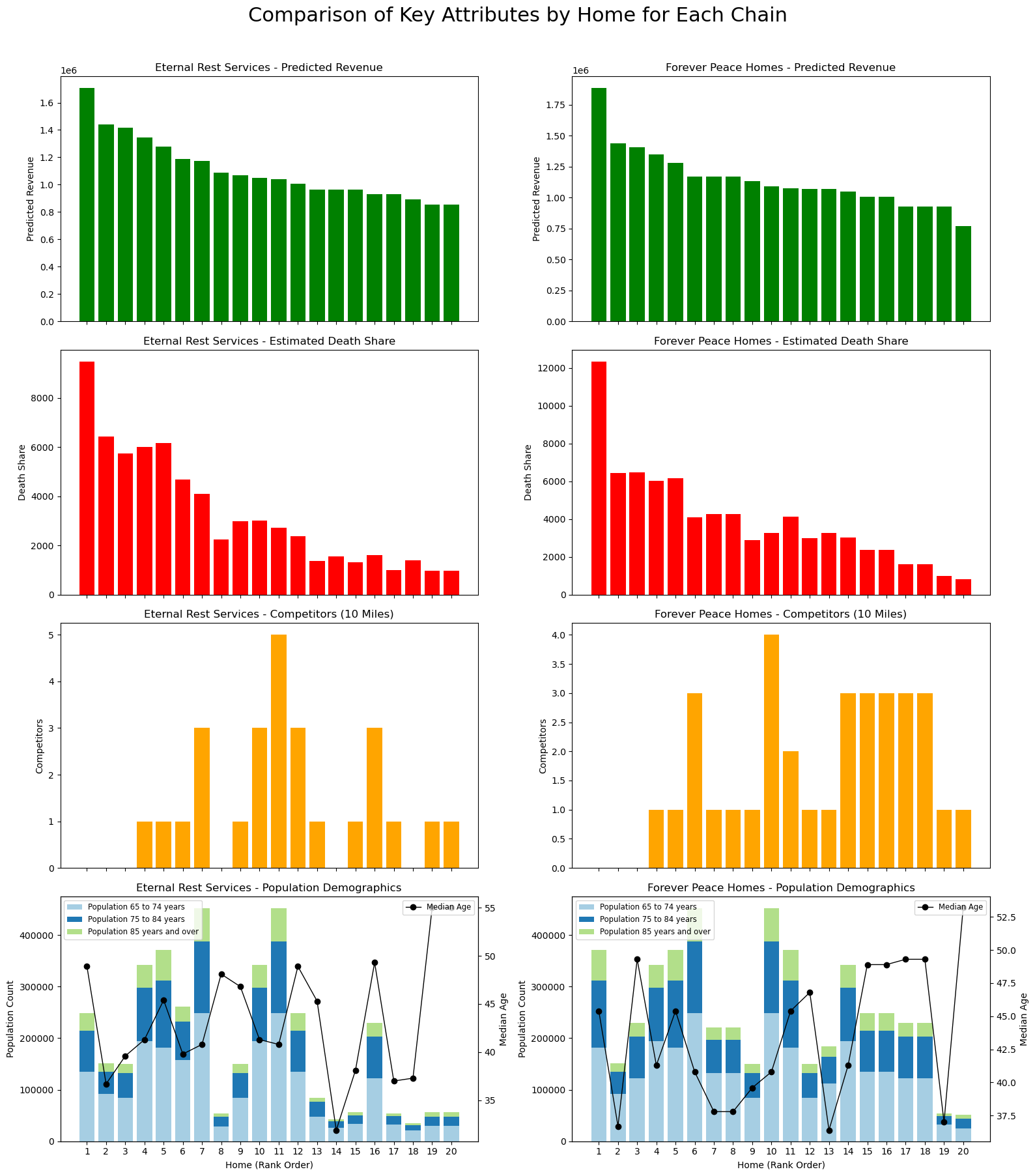
Stepping back from the individual charts, a consistent story emerges across both portfolios. The relative attractiveness of each chain is driven less by headline population numbers and far more by where each location sits within the competitive and demographic landscape. Sites with moderate density and limited competition reliably rise to the top of the revenue distribution; those with constrained catchment areas or fragmented competitive markets tend to fall behind.

Although Eternal Rest Services benefits from several monopoly-like locations, many of these assets are situated in counties with shallow senior populations, limiting their ability to translate exclusivity into sustainable economics. Conversely, Forever Peace Homes competes in denser and occasionally more contested areas, yet still delivers stronger revenue because its best locations sit at the intersection of healthy demand and manageable competition. The Miami cluster illustrates this clearly: even in a tighter competitive environment, the underlying demographics and service need create enough economic weight to outperform less populated regions further north.

1
2
3
4
5
6
7
8
9
10
11
12
13
14
15
16
17
18
19
20
21
22
23
24
25
26
27
28
29
30
31
32
33
34
35
36
37
38
39
40
41
42
43
44
45
46
47
48
49
50
51
52
53
54
55
56
57
58
59
60
61
62
63
64
65
66
67
chains_of_interest = ["Eternal Rest Services", "Forever Peace Homes"]
fig, axs = plt.subplots(nrows=4, ncols=2, figsize=(16, 18), sharex=True)

# Define age groups and colors for the stacked plot
age_groups = ['Population 65 to 74 years', 'Population 75 to 84 years','Population 85 years and over']
age_colors = ['#a6cee3', '#1f78b4', '#b2df8a']

for col_idx, chain in enumerate(chains_of_interest):
# Filter for the current chain and sort by actual revenue descending
df_chain = df[df['chain'] == chain].copy()
df_chain = df_chain.sort_values(by='predicted_revenue', ascending=False).reset_index(drop=True)

# Create an index for homes (rank order)
x = np.arange(len(df_chain))

# -----------------------------
# Row 1: Bar Chart for Predicted Revenue
# -----------------------------
axs[0, col_idx].bar(x, df_chain['predicted_revenue'], color='green')
axs[0, col_idx].set_title(f"{chain} - Predicted Revenue")
axs[0, col_idx].set_ylabel("Predicted Revenue")
axs[0, col_idx].set_xticks(x)
axs[0, col_idx].set_xticklabels(x + 1)

# -----------------------------
# Row 2: Bar Chart for Estimated Death Share
# -----------------------------
axs[1, col_idx].bar(x, df_chain['Estimated deaths share'], color='red')
axs[1, col_idx].set_title(f"{chain} - Estimated Death Share")
axs[1, col_idx].set_ylabel("Death Share")
axs[1, col_idx].set_xticks(x)
axs[1, col_idx].set_xticklabels(x + 1)

# -----------------------------
# Row 3: Bar Chart for Competitors Within 10 Miles
# -----------------------------
axs[2, col_idx].bar(x, df_chain['competitors_within_10_miles'], color='orange')
axs[2, col_idx].set_title(f"{chain} - Competitors (10 Miles)")
axs[2, col_idx].set_ylabel("Competitors")
axs[2, col_idx].set_xticks(x)
axs[2, col_idx].set_xticklabels(x + 1)

# -----------------------------
# Row 4: Stacked Bar Chart for Population Demographics with Median Age Line
# -----------------------------
bottom = np.zeros(len(df_chain))
for age_group, color in zip(age_groups, age_colors):
values = df_chain[age_group].values
axs[3, col_idx].bar(x, values, bottom=bottom, color=color, label=age_group)
bottom += values
axs[3, col_idx].set_title(f"{chain} - Population Demographics")
axs[3, col_idx].set_ylabel("Population Count")
axs[3, col_idx].set_xticks(x)
axs[3, col_idx].set_xticklabels(x + 1)
axs[3, col_idx].legend(loc='upper left', fontsize='small')

ax2 = axs[3, col_idx].twinx()
ax2.plot(x, df_chain['Population Median age (years)'], marker='o', color='black', linewidth=1, label='Median Age')
ax2.set_ylabel("Median Age", color='black')
ax2.tick_params(axis='y', labelcolor='black')
ax2.legend(loc='upper right', fontsize='small')
for ax in axs[3, :]:
ax.set_xlabel("Home (Rank Order)")

plt.tight_layout(rect=[0, 0, 1, 0.96])
plt.suptitle("Comparison of Key Attributes by Home for Each Chain", fontsize=22, y=1)
plt.show()

Building structure out of ambiguity

This simplified, simulated exercise obviously abstracts away many real-world complexities—pricing tiers, referral patterns, operational differences, and localized brand effects. But the analytical path is instructive: by breaking the problem into demand, competition, and share of market opportunity, a coherent investment framework emerges even in a niche sector with sparse standardized data. In practice, the analysis would be enriched by catchment-level population aggregation, drive-time modeling, and income-segmented demand estimation, all of which tend to sharpen revenue mapping further.

Yet even in this lightweight demonstration, the conclusion is clear:
the economics of legacy services are fundamentally spatial, and the winning portfolio is the one that consistently occupies strong demographic basins with structurally advantaged competitive positions.

This project began as a blank slate—no intuition, no industry metrics, no obvious path forward—but ended with a defensible, data-driven view of portfolio quality. That is ultimately the value of alternative data in private-credit underwriting: when traditional signals are absent, rigorous structure can still be built from the ground up.

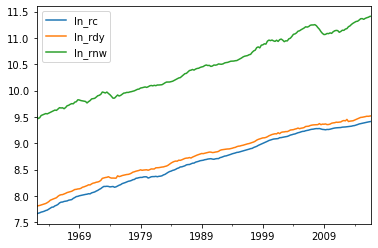
In the last blog, we went through the economic intuitions behind this consumption model, conducted some preliminary analysis in search for structural breaks and checked the stationarity of the endogenous variables using ADF and KPSS tests. Since we have found that none of the variables can be considered stationary, we can therefore ask whether the variables form a cointegrated system with a given number of “common trends”. Intuitively, I would argue that there exists one cointegration equation among the three variables as in the long run, one’s consumption and net wealth should add up to the one’s income.

So let’s keep going down to the path, and see how we can test for cointegration and include it in a VECM.

Cointegration Test

Given that all variables are consistent with the unit root hypothesis and possibly cointegrated, we can use Johansen’s trace statistic to test for the existence of a common trend i.e., a long-run cointegration relationship among the three endogenous variables.

First, we should estimate the VAR in levels so as to find out the optimal lags to use for the cointegration test. You might want to do this in first differences depending on your preferences, but basically the objective here is to run a preliminary VAR without worrying about whether the variables are cointegrated, which is obviously an issue given that they all have unit roots.

VAR in Levels

I’m going to allow for 10 lags in the first instance just to get the process going, and these are the variables in the VAR as I include the dummy variables sb_1975_4, sb_2008_3 to allow for the possibility of a structural breaks.

The BIC and HQ statistics suggest two lags for the optimal number of lags, whereas the AIC and FPE statistics suggest three. We choose the VAR model with three lags to allow for the possibility.

1
train = train.iloc[1:]
1
2
3
model = VAR(endog=train[['ln_rc','ln_rdy','ln_rnw']], exog =train[['sb_1975_4','sb_2008_3','const']])
res = model.select_order(10)
res.summary()
VAR Order Selection (* highlights the minimums)
AIC BIC FPE HQIC
0 -17.58 -17.39 2.310e-08 -17.51
1 -27.99 -27.66 6.975e-13 -27.86
2 -28.19 -27.71* 5.696e-13 -28.00*
3 -28.20* -27.58 5.664e-13* -27.95
4 -28.17 -27.40 5.829e-13 -27.86
5 -28.13 -27.22 6.067e-13 -27.76
6 -28.12 -27.07 6.144e-13 -27.69
7 -28.07 -26.87 6.488e-13 -27.58
8 -28.02 -26.68 6.810e-13 -27.48
9 -28.02 -26.53 6.807e-13 -27.42
10 -27.97 -26.33 7.217e-13 -27.31

Johansen Cointegration Test

Then, we conduct the Johansen’s test with two lags. One has to ensure that the lag interval for the
differenced endogenous variables is 1 smaller than the number of lags used in VAR in levels by moving to the corresponding VECM form.

1
2
3
vec_rank = vecm.select_coint_rank(endog=train[['ln_rc','ln_rdy','ln_rnw']], det_order = 0, k_ar_diff = 2, method = 'trace', signif=0.05)
print(vec_rank.summary())
print('The rank to choose according to the Johansen test: '+ str(vec_rank.rank))
Johansen cointegration test using trace test statistic with 5% significance level
=====================================
r_0 r_1 test statistic critical value
-------------------------------------
  0   3          33.75          29.80
  1   3          11.44          15.49
-------------------------------------
The rank to choose according to the Johansen test: 1

The results suggest that we can reject the null hypothesis of no cointegration (or zero cointegrating vectors) using a 5% significance level. Moreover, we cannot reject the null hypotheses of at most 1 cointegrating vectors versus the alternative of 2. Therefore, we assume that there exists one (and only one) cointegrating vector.

VECM Estimation

Since there is a cointegration relationship existing, we should construct an ECM equation (e.g., an error correction model) that can explain the actual behavior of consumption during the sample period based on the long-run specification.

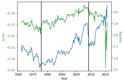
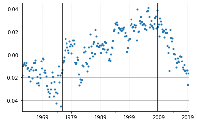
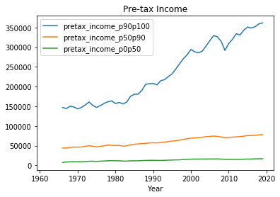
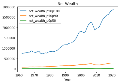
In developing the ECM model, we can include additional exogenous variables in the VECM to explain short-run dynamics of consumption. Besides the structural break around 1976 and the inequality gap, here are a bunch of other variables that we should consider. Remember the the determinants we discussed at the beginning?

  • Disposable Income (in the current period) (+)
  • Expectations (consumer confidence indexes, employment growth) (+)
  • Wealth (stock market performance, housing prices) (+)
  • Uncertainty (precautionary saving) (-)
  • Availability of Credit (+)
  • Real Interest Rate (?)
    • Substitution effect (-)
    • Income effect (+)

Explore Exogenous Variables

In developing the ECM model, we should include additional exogenous variables in the VECM to explain short-run dynamics of consumption.

Expectations

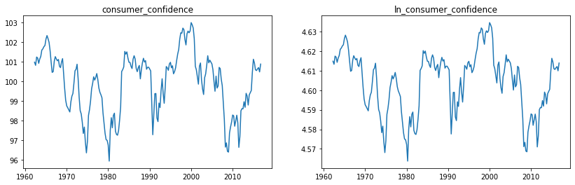
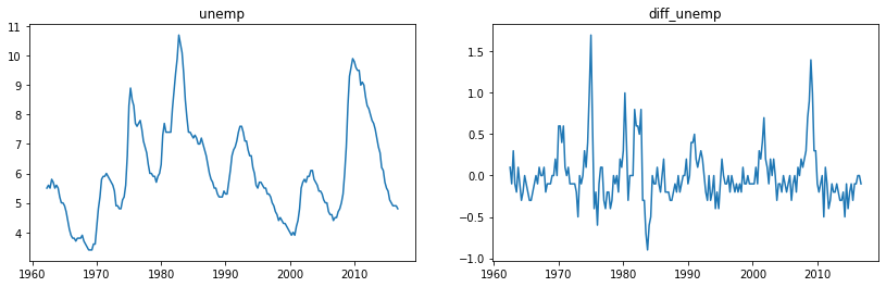
Here we use the unemployment rate and the consumer confidence index as exogenous variables. These variables are proxies for changes in the level of income uncertainty facing the household sector.

1
2
3
4
5
f, (ax1, ax2) = plt.subplots(1, 2,figsize=(14,4))
ax1.plot(train['unemp'])
ax2.plot(train['unemp'].diff().dropna())
ax1.set_title('unemp')
ax2.set_title('diff_unemp')
1
2
3
4
5
f, (ax1, ax2) = plt.subplots(1, 2,figsize=(14,4))
ax1.plot(train['consumer_confidence'])
ax2.plot(np.log(train['consumer_confidence']))
ax1.set_title('consumer_confidence')
ax2.set_title('ln_consumer_confidence')

Let’s then conduct the stationary tests for the change in the unemployment rate and the logarithm of the consumer confidence index, to check whether they are separately consistent with the stationarity assumption.

1
2
augmented_dickey_fuller_test(train['unemp'].diff().dropna())
kpss_test(train['unemp'].diff().dropna())
ADF Statistic: -5.032319
ADF p-value: 0.000019
stationary - null hypothesis of a unit root can be rejected at a 5% significant level
KPSS Statistic: 0.048204
KPSS p-value: 0.100000
stationary - null hypothesis of stationary cannot be rejected at a 5% significant level
1
2
augmented_dickey_fuller_test(np.log(train['consumer_confidence']))
kpss_test(np.log(train['consumer_confidence']))
ADF Statistic: -3.450606
ADF p-value: 0.009350
stationary - null hypothesis of a unit root can be rejected at a 5% significant level
KPSS Statistic: 0.134007
KPSS p-value: 0.100000
stationary - null hypothesis of stationary cannot be rejected at a 5% significant level

Availability of Credit

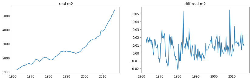
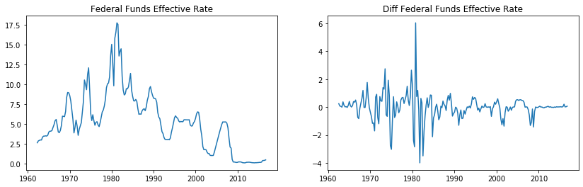
Evidently, the availability and cost of credit will also affect decisions of households to consume. So the behavior of monetary aggregates in terms of the availability of credit and the interest rates in terms of the cost of credit will matter for our projections for private consumption.

(Honestly, it would be ridiculous to ignore the crazy amount of money that the fed has been pumping into the economy since 2008 and its consequential impact. The hopeless belief in the Keynesian’s monetary policy.)

1
2
3
4
5
f, (ax1, ax2) = plt.subplots(1, 2,figsize=(14,4))
ax1.plot(train['m2'])
ax2.plot(np.log(train['m2']).diff())
ax1.set_title('real m2')
ax2.set_title('diff real m2')
1
2
3
4
5
f, (ax1, ax2) = plt.subplots(1, 2,figsize=(14,4))
ax1.plot(train['dff'])
ax2.plot(train['dff'].diff())
ax1.set_title('Federal Funds Effective Rate')
ax2.set_title('Diff Federal Funds Effective Rate')
1
2
augmented_dickey_fuller_test(np.log(train['m2']).diff().dropna())
kpss_test(np.log(train['m2']).diff().dropna())
ADF Statistic: -5.040178
ADF p-value: 0.000018
stationary - null hypothesis of a unit root can be rejected at a 5% significant level
KPSS Statistic: 0.172896
KPSS p-value: 0.100000
stationary - null hypothesis of stationary cannot be rejected at a 5% significant level

Let’s adding these new variables to the dataframe.

1
2
3
4
5
6
7
df['d_unemp'] = df['unemp'].diff()
df['ln_consumer_confidence'] = np.log(df['consumer_confidence'])
df['d_ln_m2'] = np.log(df['m2']).diff()
df['d_dff'] = df['dff'].diff()
df['spread_10y3m'] = df['yield_10y']-df['yield_3m']

train,test = df[1:cut], df[cut:]

Model Estimation

Based on all previous analysis, we can eventually run a VECM. Based on the long-run equation, we specify the form of the model with three endogenous variables log(rc), log(rdy) and log(rnw), and allow for five additional exogenous variables.

The lag intervals for the differenced endogenous variables are 2 given that we estimated the VAR with 3 lags in levels.

1
2
endog = ['ln_rc','ln_rdy','ln_rnw']
exog = ['sb_1975_4','sb_2008_3','d_unemp','ln_consumer_confidence', 'd_ln_m2', 'd_dff']
1
2
3
4
vec = vecm.VECM(endog = train[endog],
exog =train[exog],
k_ar_diff = 2, coint_rank = 1, deterministic = "co", missing= 'drop')
vecm_fit = vec.fit()

The coefficients in the long-run equation are both statistically significantly different from zero (see the first three tables below), and most importantly, consistent with our economic priors i.e., income and wealth have positive coefficients on consumption (see parameters for ln_rdy and ln_rnw in the first table).

For the exogenous variables, the negative coefficient on the structural breaks indicates that the increasing inequality may compress the consumption of households. Positive and significant coefficient on real m2 complies with our assumption that expanding monetary policy through quantitative ease may stimulate consumption in the short term.

Also, the coefficient on the ECM term is negative and significant with respect to real consumption, and significant and positive with respect to disposable income, both using a 5% level of significance, which are reasonable since both consumption and income are endogenous variables and dependent on each other, a rational household would react to disequilibrium in consumption relative to its long-run path though simultaneous adjustments - lower their spending (negative coefficient) and increase their income (positive coefficient).

From the “cointegration relations” table, we can verify our idea that in the long run, amount that one’s consumption and wealth accumulated would be equal to the income one earns.

1
vecm_fit.summary().as_latex
<bound method Summary.as_latex of <class 'statsmodels.iolib.summary.Summary'>
"""
Det. terms outside the coint. relation & lagged endog. parameters for equation ln_rc
==============================================================================
                 coef    std err          z      P>|z|      [0.025      0.975]
------------------------------------------------------------------------------
const         -0.6625      0.154     -4.310      0.000      -0.964      -0.361
exog1         -0.0027      0.001     -3.309      0.001      -0.004      -0.001
exog2         -0.0052      0.001     -4.940      0.000      -0.007      -0.003
exog3         -0.0069      0.001     -4.782      0.000      -0.010      -0.004
exog4          0.1386      0.032      4.279      0.000       0.075       0.202
exog5          0.1697      0.033      5.189      0.000       0.106       0.234
exog6          0.0006      0.000      1.463      0.144      -0.000       0.001
L1.ln_rc      -0.2099      0.068     -3.108      0.002      -0.342      -0.078
L1.ln_rdy      0.0742      0.043      1.739      0.082      -0.009       0.158
L1.ln_rnw      0.0485      0.022      2.248      0.025       0.006       0.091
L2.ln_rc      -0.0623      0.063     -0.986      0.324      -0.186       0.062
L2.ln_rdy      0.0077      0.042      0.184      0.854      -0.074       0.090
L2.ln_rnw      0.0039      0.022      0.176      0.860      -0.039       0.047
Det. terms outside the coint. relation & lagged endog. parameters for equation ln_rdy
==============================================================================
                 coef    std err          z      P>|z|      [0.025      0.975]
------------------------------------------------------------------------------
const         -0.2331      0.251     -0.928      0.353      -0.725       0.259
exog1         -0.0025      0.001     -1.879      0.060      -0.005       0.000
exog2         -0.0031      0.002     -1.777      0.076      -0.006       0.000
exog3         -0.0069      0.002     -2.937      0.003      -0.011      -0.002
exog4          0.0640      0.053      1.210      0.226      -0.040       0.168
exog5          0.1607      0.053      3.007      0.003       0.056       0.265
exog6         -0.0003      0.001     -0.445      0.656      -0.002       0.001
L1.ln_rc       0.1241      0.110      1.124      0.261      -0.092       0.340
L1.ln_rdy     -0.1826      0.070     -2.620      0.009      -0.319      -0.046
L1.ln_rnw      0.0519      0.035      1.469      0.142      -0.017       0.121
L2.ln_rc      -0.1472      0.103     -1.426      0.154      -0.350       0.055
L2.ln_rdy      0.0505      0.068      0.738      0.460      -0.084       0.184
L2.ln_rnw     -0.0868      0.036     -2.421      0.015      -0.157      -0.017
Det. terms outside the coint. relation & lagged endog. parameters for equation ln_rnw
==============================================================================
                 coef    std err          z      P>|z|      [0.025      0.975]
------------------------------------------------------------------------------
const         -1.4968      0.494     -3.028      0.002      -2.466      -0.528
exog1          0.0003      0.003      0.097      0.923      -0.005       0.005
exog2         -0.0009      0.003     -0.260      0.795      -0.007       0.006
exog3         -0.0024      0.005     -0.514      0.607      -0.011       0.007
exog4          0.3093      0.104      2.968      0.003       0.105       0.513
exog5          0.1839      0.105      1.748      0.080      -0.022       0.390
exog6         -0.0021      0.001     -1.576      0.115      -0.005       0.001
L1.ln_rc       0.1244      0.217      0.573      0.567      -0.301       0.550
L1.ln_rdy     -0.2364      0.137     -1.723      0.085      -0.505       0.033
L1.ln_rnw      0.0856      0.069      1.232      0.218      -0.051       0.222
L2.ln_rc       0.2163      0.203      1.065      0.287      -0.182       0.615
L2.ln_rdy     -0.2192      0.135     -1.629      0.103      -0.483       0.044
L2.ln_rnw      0.0711      0.071      1.008      0.314      -0.067       0.209
               Loading coefficients (alpha) for equation ln_rc                
==============================================================================
                 coef    std err          z      P>|z|      [0.025      0.975]
------------------------------------------------------------------------------
ec1           -0.0605      0.020     -2.993      0.003      -0.100      -0.021
               Loading coefficients (alpha) for equation ln_rdy              
==============================================================================
                 coef    std err          z      P>|z|      [0.025      0.975]
------------------------------------------------------------------------------
ec1            0.0887      0.033      2.684      0.007       0.024       0.153
               Loading coefficients (alpha) for equation ln_rnw              
==============================================================================
                 coef    std err          z      P>|z|      [0.025      0.975]
------------------------------------------------------------------------------
ec1           -0.1382      0.065     -2.126      0.033      -0.266      -0.011
          Cointegration relations for loading-coefficients-column 1          
==============================================================================
                 coef    std err          z      P>|z|      [0.025      0.975]
------------------------------------------------------------------------------
beta.1         1.0000          0          0      0.000       1.000       1.000
beta.2        -1.1175      0.073    -15.311      0.000      -1.261      -0.974
beta.3         0.0555      0.058      0.963      0.336      -0.057       0.168
==============================================================================
""">

VECM Forecast

Out-of-sample Forecast

As we are comfortable with the model estimated, let’s do some forecasting with the out-of-sample data and evaluate how the model works.

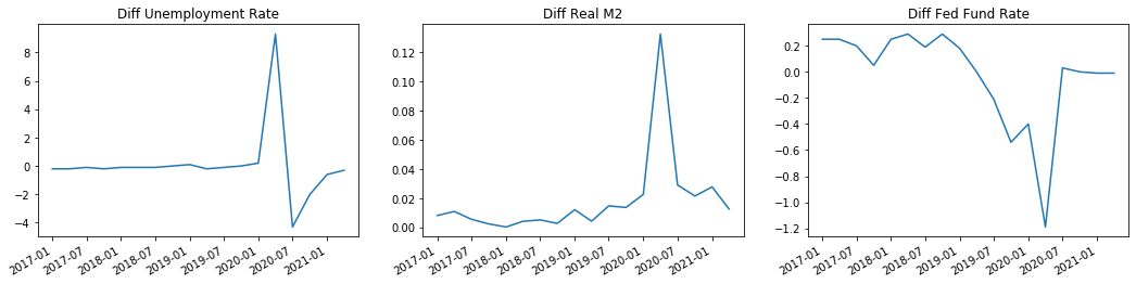
To forecast for time beyond the sample period pre-2017, we need to provide futures shocks post-2017 i.e., the exogenous variables, which includes the dramatic economic downturn during the Covid recession. Let’s plot them out and get a feel.

1
2
3
4
5
6
7
8
f, (ax1, ax2, ax3) = plt.subplots(1,3,figsize=(18,4))
ax1.plot(test['d_unemp'])
ax2.plot(test['d_ln_m2'])
ax3.plot(test['d_dff'])
ax1.set_title('Diff Unemployment Rate')
ax2.set_title('Diff Real M2')
ax3.set_title('Diff Fed Fund Rate')
f.autofmt_xdate()

When forecasting, I include the confidence intervals for the predictions as well. Remember, point predictions won’t help you much with gauging the uncertainty of forecasts.

1
2
3
4
5
6
7
8
9
mid, lower_1se, upper_1se = vecm_fit.predict(steps=len(test),alpha = 0.32, exog_fc =test[exog])
_, lower_2se, upper_2se = vecm_fit.predict(steps=len(test),alpha = 0.05, exog_fc =test[exog])

pred_mid = pd.DataFrame(np.exp(mid), columns=['pred_rc','pred_rdy','pred_rnw'], index = test.index)
pred_lower_1se = pd.DataFrame(np.exp(lower_1se), columns=['lower_1se_rc','lower_1se_rdy','lower_1se_rnw'], index = test.index)
pred_upper_1se = pd.DataFrame(np.exp(upper_1se), columns=['upper_1se_rc','upper_1se_rdy','upper_1se_rnw'], index = test.index)
pred_lower_2se = pd.DataFrame(np.exp(lower_2se), columns=['lower_2se_rc','lower_2se_rdy','lower_2se_rnw'], index = test.index)
pred_upper_2se = pd.DataFrame(np.exp(upper_2se), columns=['upper_2se_rc','upper_2se_rdy','upper_2se_rnw'], index = test.index)
ptest = pd.concat([test, pred_mid, pred_lower_1se, pred_upper_1se, pred_lower_2se, pred_upper_2se],axis = 1)

The saving rate (percentage points) can be derived from total nominal consumption and
nominal household disposable income using the following formula:

$saving\ rate=100*(rdy - (rc + (government\ transfers + interest\ payments/gdp\ deflator))) /rdy$

1
ptest['pred_saving_rate']=100*(ptest.pred_rdy-(ptest.pred_rc+(ptest.gov_transfers+ptest.interest_payments/ptest.c_deflator)))/ptest.pred_rdy

Now let’s see how the model predicts,

1
2
3
4
5
6
7
8
9
10
11
12
13
def plot_point_prediction(test):
fig, axes = plt.subplots(2, 2, figsize=(12,8))
count=0
for endog in ['rc','rdy','rnw','saving_rate']:
col=count %2
row=count //2
ax=axes[row][col]
ax.set_title(endog)
ax.plot(test[endog], color='Black',linewidth=1, label="Observed")
ax.plot(test['pred_'+endog],color='grey',linestyle='--',linewidth=1, label="Forecast")
ax.legend()
count+=1
fig.autofmt_xdate()
1
plot_point_prediction(ptest)

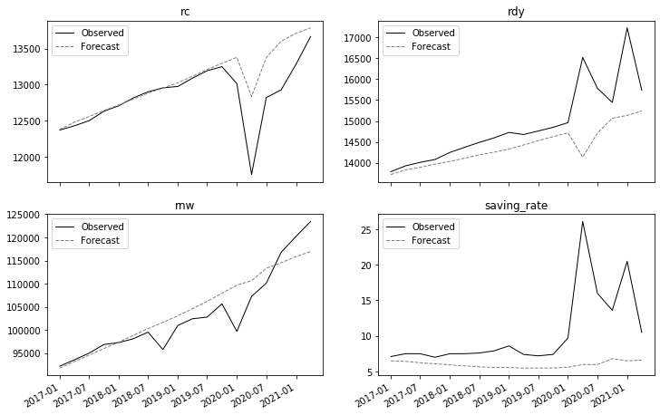
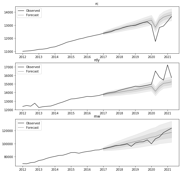
The results are not so bad. Actually pretty dope pre-pandemic. For a model that is trying to predict for consumption three years out, its predictive accuracy is out-of-expectation.

Though not surprisingly, the forecasts are over predicting actual real disposable income, real net wealth and therefore real consumption expenditures. This reflects the I(1) nature of the variables involved, the limited serial correlation in their innovation sequences, and the fact that all variables were trending upwards before the pandemic. Because of their I(1) nature, a dynamic forecast will effectively use the last known value (four years ago) of these variables to generate out-of-sample forecasts. Consequently, the forecasting model does not do good job of predicting the impact of covid19 on real consumption, and its predictions for the saving ratio appear to be systematically below the actual saving outcome.

1
2
3
4
5
6
7
8
9
10
11
12
13
def plot_forecast_with_confidence_intervals(df,test):
fig, axes = plt.subplots(3, 1, figsize=(10,10))
count=0
for endog in ['rc','rdy','rnw']:
col=count
ax=axes[col]
ax.set_title(endog)
ax.plot(df[endog], color='Black',linewidth=1.2,label="Observed")
ax.plot(test['pred_'+endog],'k--',linewidth=0.7,label="Forecast")
ax.fill_between(test['pred_'+endog].index,test['lower_1se_'+endog],test['upper_1se_'+endog],alpha=0.07,color="k")
ax.fill_between(test['pred_'+endog].index,test['lower_2se_'+endog],test['upper_2se_'+endog],alpha=0.07,color="k")
ax.legend(loc ='upper left')
count+=1

With that being said, the previous assessment considers only a single point prediction using the baseline model. A fairer assessment of the model can be made considering the confidential intervals for prediction, which suggest that the underlying model is useful for predicting the outcome of the consumption and net wealth.

1
plot_forecast_with_confidence_intervals(df.iloc[200:],ptest)

While there is obvious (downward) bias in the model’s predictions, it should be noted that this partly a reflection of the initial starting point of the forecast. If one begins the forecast after the pandemic, the resulting confidential intervals would be much closer to what observed. In this way, a static forecast which is one-period ahead forecasting would do a much better job. This is also how the model should be used in practice. As always, predicting future is difficult, trying to predict mutiple years out is meaningless.

Long-run Forecasts Based on Potential Paths of Monetary Policy

Now it has come to a very interesting point. Let’s fit a VECM with the complete data from 1962 to 2021Q2, and use it to forecast for 2021Q3 onwards using two simulated forward paths of the Fed’s monetary policy. Correct assumptions would help us to get more accurate estimates for the long-run consumption, disposal income and net wealth of the American households after the pandemic.

1
2
3
4
5
6
endog = ['ln_rc','ln_rdy','ln_rnw']
exog = ['sb_1975_4','sb_2008_3','d_unemp','ln_consumer_confidence', 'd_ln_m2','d_dff']
vec = vecm.VECM(endog = df[endog],
exog =df[exog],
k_ar_diff = 2, coint_rank = 1, deterministic = "co", missing= 'drop')
vecm_fit = vec.fit()

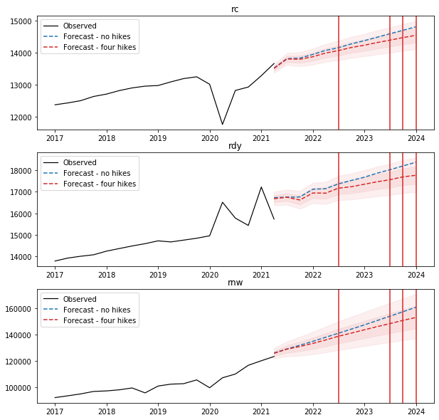
Let’s generate two paths for the forward monetary shocks. One path assumes that fed keeps its current pacing of assets purchasing i.e., no tapering, the other path assumes four interest rate hikes in 2022, 2023 and 2024 assuming the same pace as the period after the financial crisis from 2014Q4 to 2017Q3, with all the other exogenous variables being the same, specifically, current value for unemployment rate and the historical average for consumer confidence.

1
2
3
4
5
6
7
8
9
10
11
12
13
14
forecast_range = pd.date_range(start='04/01/2021', end ='01/01/2024',freq='QS' )
shocks = {}
shocks = pd.DataFrame(shocks, index = forecast_range, columns = exog)
shocks['sb_1975_4'] = 1
shocks['sb_2008_3'] = 1
shocks['d_unemp'] = 0
shocks['ln_consumer_confidence'] = df['ln_consumer_confidence'].mean()

no_hikes_shocks = shocks.copy()
no_hikes_shocks['d_ln_m2'] = df.iloc[-4:]['d_ln_m2'].mean()
no_hikes_shocks['d_dff'] = 0.0

four_hikes_shocks =shocks.copy()
four_hikes_shocks[['d_ln_m2','d_dff']] = df.loc['2014-10-01':'2017-07-01',['d_ln_m2','d_dff']].values

Here’s how the money aggregates is going to be like if assuming no tapering until 2024, which would be of course totally insane…

1
2
# change of log(real m2) and change of fed fund rate
no_hikes_shocks[['d_ln_m2','d_dff']]

d_ln_m2 d_dff
2021-04-01 0.02268 0.0
2021-07-01 0.02268 0.0
2021-10-01 0.02268 0.0
2022-01-01 0.02268 0.0
2022-04-01 0.02268 0.0
2022-07-01 0.02268 0.0
2022-10-01 0.02268 0.0
2023-01-01 0.02268 0.0
2023-04-01 0.02268 0.0
2023-07-01 0.02268 0.0
2023-10-01 0.02268 0.0
2024-01-01 0.02268 0.0

Here’s a more likely path assumes that the fed would stop expanding its balance sheet from the forth quarter of 2021 and hike once in 2022 and three times at the end 2023 and beginning of 2024. This path is quite aggressive.

(By the way, when central banks expend their balance sheets i.e., increase their net asset position, they literally buy assets or reduce their liability through money creation, which means writing checks to themselves.)

1
2
3
# hike schedule - historical simulation using 2014-2017 data
## change of log(real m2) and change of fed fund rate
four_hikes_shocks[['d_ln_m2','d_dff']]

d_ln_m2 d_dff
2021-04-01 0.015029 0.01
2021-07-01 0.025704 0.01
2021-10-01 0.003989 0.02
2022-01-01 0.007853 0.00
2022-04-01 0.013799 0.03
2022-07-01 0.022938 0.20
2022-10-01 0.009184 0.01
2023-01-01 0.011144 0.02
2023-04-01 0.009073 0.06
2023-07-01 0.008134 0.25
2023-10-01 0.010906 0.25
2024-01-01 0.005544 0.20
1
2
3
4
5
6
7
8
9
10
11
12
mid_no_hikes = vecm_fit.predict(steps=12,exog_fc =no_hikes_shocks[exog])
pred_mid_no_hikes = pd.DataFrame(np.exp(mid_no_hikes), columns=['pred_rc','pred_rdy','pred_rnw'], index = forecast_range)

mid, lower_1se, upper_1se = vecm_fit.predict(steps=12,alpha = 0.32, exog_fc =four_hikes_shocks[exog])
_, lower_2se, upper_2se = vecm_fit.predict(steps=12,alpha = 0.05, exog_fc =four_hikes_shocks[exog])

pred_mid = pd.DataFrame(np.exp(mid), columns=['pred_rc','pred_rdy','pred_rnw'], index = forecast_range)
pred_lower_1se = pd.DataFrame(np.exp(lower_1se), columns=['lower_1se_rc','lower_1se_rdy','lower_1se_rnw'], index = forecast_range)
pred_upper_1se = pd.DataFrame(np.exp(upper_1se), columns=['upper_1se_rc','upper_1se_rdy','upper_1se_rnw'], index = forecast_range)
pred_lower_2se = pd.DataFrame(np.exp(lower_2se), columns=['lower_2se_rc','lower_2se_rdy','lower_2se_rnw'], index = forecast_range)
pred_upper_2se = pd.DataFrame(np.exp(upper_2se), columns=['upper_2se_rc','upper_2se_rdy','upper_2se_rnw'], index = forecast_range)
pred = pd.concat([pred_mid, pred_lower_1se, pred_upper_1se, pred_lower_2se, pred_upper_2se],axis = 1)
1
2
3
4
5
6
7
8
9
10
11
12
13
14
15
16
17
18
def plot_forecasts_given_different_paths(df,pred1,pred2):
fig, axes = plt.subplots(3, 1, figsize=(10,10))
count=0
for endog in ['rc','rdy','rnw']:
col=count
ax=axes[col]
ax.set_title(endog)
ax.plot(df[endog], color='Black',linewidth=1.2,label="Observed")
ax.plot(pred1['pred_'+endog],'--',color='tab:blue', linewidth=1.5,label="Forecast - no hikes")
ax.plot(pred2['pred_'+endog],'--',color='tab:red', linewidth=1.5,label="Forecast - four hikes")
ax.fill_between(pred2['pred_'+endog].index,pred2['lower_1se_'+endog],pred2['upper_1se_'+endog],alpha=0.07,color="tab:red")
ax.fill_between(pred2['pred_'+endog].index,pred2['lower_2se_'+endog],pred2['upper_2se_'+endog],alpha=0.07,color="tab:red")
ax.legend(loc ='upper left')
ax.axvline(x=datetime(2022, 7, 1), color='tab:red')
ax.axvline(x=datetime(2023, 7, 1), color='tab:red')
ax.axvline(x=datetime(2023, 10, 1), color='tab:red')
ax.axvline(x=datetime(2024, 1, 1), color='tab:red')
count+=1

In March 2020, in response to the economic impact of the pandemic, the Fed acted quickly having learned its lesson from the financial crisis and cut short-term interest rates to zero. It also restarted its large-scale asset purchases and since June 2020, the Fed has been buying 80 billion of Treasury securities and 40 billion of mortgage-backed securities each month, with its balance sheet swelling from 4.4 trillion to 8.6 trillion. The extreme monetary support combined with a huge fiscal stimulus package holds the U.S economy and shields American household incomes. Though plots won’t be shown here, the model forecasts a much lower rdy and rnw if not taking into account the rapid increase of money base. Therefore, in the last 20 months, we all see the quick recovery of consumption and a rapid growth of asset prices, which is also reflected in the steeper slope of the third graph. However, as the economy rebounded, it may no longer need such extreme measures of support and keeping them in place could do more harm than good. For example, low mortgage rates have fueled a boom in house prices, but the problems that now afflict the economy are mostly supply issues while demand, which the bond buys most directly affects. Therefore, the policy makers may start to hit the brakes. That’s also why we are seeing Fed officials talking about tapering the pace of its bond purchases and lately laying the groundwork for higher rates.

1. Growth rates return to normal

First it’s not surprising that real consumption, disposable income and household net wealth are projected to grow at milder rates comparing to those when the economy was bottoming out from the slump. As the stimulus aids wear off over time, one would expect the growth rates to normalize to pre-pandemic levels.

2. Growth differences taking expansionary and tight monetary policy

Secondly, assuming a tighter monetary policy to come, we project that the growth rate of real consumption throughout 2023 would slow down to 2.2% from 3.0%. The real income and net wealth of households would decrease from 3.9% and 9.1% to 2.4% and 6.5% respectively. At the end of 2023, all three measures would be lower than those come from the first path - that the Fed sticks to its current rate target and asset buying pace. In fact the amounts would be lowered by 1.8%, 3.3% and 4.8% respectively.

3. Foreseeable shallow decline in mid 2022

Thirdly, we also notice that in the middle of 2022, the private consumption and household income would show a temporary and shallow decline and then grow at an annual rate again coming close to the path observed just before the pandemic. Likely this is caused by the tightening of policy in 2022. So far, Powell has announced that the fed will begin tapering this month, the first step toward pulling back on the massive amount of help it had been providing markets and the economy. One the fiscal side, though public programs to support households and businesses have been the most powerful engine of recovery from the hit, governments of the major economies now are hitting the brakes. The money they’ ll pull out of their economies in 2022 amounts to 2.5 percentage points of the world’s GDP, five times bigger than anything that happened during the turn to austerity after the 2008 crisis, according to UBS estimates. The fiscal tightening - the withdrawal of pandemic spending will likely have more impact on the global economy next year.

1
plot_forecasts_given_different_paths(df.iloc[220:],pred_mid_no_hikes,pred)

It’s official on Nov.3rd that the Federal Reserve is winding down its aggressive pandemic-era asset purchasing, or as what we call “tapering”. The announcement actually didn’t come out as a surprise since Fed officials had been laying the groundwork for policy tightening as the economy gradually recovered from the Covid19 slump. Furthermore, due to the lately surging inflation readings, we are seeing traders start to bet on faster Fed hikes. So it seems interesting to get some ideas of how the post-pandemic consumption behaviors of the American households would be, and quantify the potential impact of policy shifting on these behaviors using two classic time series models - the Vector Autoregression (VAR) and the Vector Error Correction Model (VECM). Tribute to Christopher Sims who first promoted the use of VAR in empirical macroeconomics.

We will build the models following the steps below,

And before we get onto that, I will introduce some of the economic theories behind predicting real consumption.

Economic Intuitions Behind

Let’s first recap some of the main determinants of private consumption,

  • Disposable Income (in the current period) (+)
  • Expectations (consumer confidence indexes, employment growth) (+)
  • Wealth (stock market performance, housing prices) (+)
  • Uncertainty (precautionary saving) (-)
  • Availability of Credit (+)
  • Real Interest Rate (?)
        - Substitution effect (-)
        - Income effect (+)

You might remember that perhaps the simplest theories of consumption, Keynesian theories of consumption, would link private consumption to disposable income in the current period, and of course positively. So as disposable income goes up, private consumption is expected to go up as well. More sophisticated, forward looking models would give more prominence or link consumption not to disposable income today but to expectations about the evolution of disposable income in the future. A number of indicators that can be used to gauge these expectations, for example, consumer confidence index, employment growth or my personally preferred - yield spreads. These can be used as a proxy for expectations for future income.

Another variable thought to be important by economists in terms of explaining the behavior of private consumption is wealth. In that sense, for this wealth channel, the performance of the stock market or even the behavior of housing prices, would have an impact on private consumption.

Another important factor is uncertainty, which would actually have a negative association with private consumption because it would create incentives for what the economists called precautionary saving. So agents will try to create a buffer to be able to fall back on in case a bad shock hits.

The availability of credit is also thought to be an important determinant with, obviously, a positive relationship.

And finally, the real interest rate is also thought to be one of the important determinants of private consumption.
The effect of real interest on consumption can be a little bit ambiguous. Perhaps the most straightforward or direct effect
would be what economists call a substitution effect where, as interest rates go up, the incentives to consume are reduced. So agents will have, on the contrary, incentives to save more. And therefore, an increase in rates will be linked to a decrease in private consumption. But on the other hand, it is also possible that if consumers are net savers the increase in interest rates
might generate some additional income– what economists call an income effect–and this might actually lead to an increase in private consumption.

Getting Data

Based on the economic intuitions, I grabbed the following well-defined and organized economic data from the Federal Reserve Economic Data of the St. Louis Fed. The FRED allows modelers to write programs and build applications that retrieve data through an API provided. There is a list of packages/libraries that one can turn to, depending on one’s programming language. Since I have to model everything in Python as it’s compatible with the github blog, I use the library fredapi to request the data. However, in practice, I would probably go for EViews as most economists prefer and do.

1
2
3
4
5
6
7
8
9
10
11
12
13
14
15
16
import pandas as pd
import numpy as np
from fredapi import Fred
import matplotlib.pyplot as plt
from datetime import datetime
%matplotlib inline

import statsmodels.api as sm
from statsmodels.tsa.stattools import adfuller
from statsmodels.tsa.stattools import kpss
from statsmodels.tsa.api import VAR
from statsmodels.tsa.vector_ar import vecm
from statsmodels.tsa import filters

pd.options.display.max_colwidth = 50
pd.options.display.max_rows = 400
1
fred = Fred(api_key=your_key_string)

The period I study is from 1962Q1 to 2021Q2, which ensures that the economic data that I am interested in all has a value.

1
2
startDate = '1962-01-01'
endDate = '2021-04-01'
1
2
3
4
def get_series_and_print_info(fred, series_id, startDate, endDate, name):
    series = fred.get_series(series_id, observation_start=startDate, observation_end=endDate, frequency='q')
    print(name+': '+fred.get_series_info(series_id).title)
    return series
1
2
3
4
5
6
7
8
9
10
11
12
13
14
15
16
17
18
19
20
21
22
23
24
25
26
27
28
29
30
data = {}
data['saving_rate'] = get_series_and_print_info(fred, 'a072rc1q156sbea',startDate, endDate, 'saving_rate')
data['ns'] = get_series_and_print_info(fred, 'w986rc1q027sbea',startDate, endDate, 'ns')
data['nnw'] = get_series_and_print_info(fred, 'TNWBSHNO',startDate, endDate, 'nnw')
data['nl'] = get_series_and_print_info(fred, 'TCMILBSHNO',startDate, endDate, 'nl')
data['na'] = get_series_and_print_info(fred, 'TABSHNO',startDate, endDate, 'na')
data['nfa'] = get_series_and_print_info(fred, 'TFAABSHNO',startDate, endDate, 'nfa')
data['interest_payments'] = get_series_and_print_info(fred, 'b069rc1q027sbea',startDate, endDate, 'interest_payments')
data['cpi'] = get_series_and_print_info(fred, 'cpiaucsl',startDate, endDate, 'cpi')
data['c_deflator'] = get_series_and_print_info(fred, 'dpcerd3q086sbea',startDate, endDate, 'c_deflator')/100
data['dff'] = get_series_and_print_info(fred, 'DFF',startDate, endDate, 'dff')
data['yield_3m'] = get_series_and_print_info(fred, 'dgs3',startDate, endDate, 'yield_3m')
data['yield_10y'] = get_series_and_print_info(fred, 'irltlt01usq156n',startDate, endDate, 'yield_10y')
data['prime_rate'] = get_series_and_print_info(fred, 'dprime',startDate, endDate, 'prime_rate')
data['m2'] = get_series_and_print_info(fred, 'M2REAL',startDate, endDate, 'm2')
data['ndy'] = get_series_and_print_info(fred, 'dpi',startDate, endDate, 'ndy')
data['rdy'] = get_series_and_print_info(fred, 'dpic96',startDate, endDate, 'rdy')
data['npiy'] = get_series_and_print_info(fred, 'b703rc1q027sbea',startDate, endDate, 'npiy')
data['ny'] = get_series_and_print_info(fred, 'pincome',startDate, endDate, 'ny')
data['ry'] = get_series_and_print_info(fred, 'rpi',startDate, endDate, 'ry')
data['nc'] = get_series_and_print_info(fred, 'pcec',startDate, endDate, 'nc')
data['rc'] = get_series_and_print_info(fred, 'pcecc96',startDate, endDate, 'rc')
data['nc_services'] = get_series_and_print_info(fred, 'pcesv',startDate, endDate, 'nc_services')
data['nc_durable_goods'] = get_series_and_print_info(fred, 'pcdg',startDate, endDate, 'nc_durable_goods')
data['unemp'] = get_series_and_print_info(fred, 'unrate',startDate, endDate, 'unemp')
data['house_prices'] = get_series_and_print_info(fred, 'ussthpi',startDate, endDate, 'house_prices')
data['mortgage_30y'] = get_series_and_print_info(fred, 'MORTGAGE30US',startDate, endDate, 'mortgage_30y')
data['consumer_confidence'] = get_series_and_print_info(fred, 'CSCICP03USM665S',startDate, endDate, 'consumer_confidence')
data['gov_debt'] = get_series_and_print_info(fred, 'fygfdpun',startDate, endDate, 'gov_debt')
data['gov_transfers'] = get_series_and_print_info(fred, 'w211rc1q027sbea',startDate, endDate, 'gov_transfers')

    saving_rate: Personal saving as a percentage of disposable personal income
    ns: Net private saving: Households and institutions
    nnw: Households and Nonprofit Organizations; Net Worth, Level
    nl: Households and Nonprofit Organizations; Debt Securities and Loans; Liability, Level
    na: Households and Nonprofit Organizations; Total Assets, Level
    nfa: Households and Nonprofit Organizations; Total Financial Assets, Level
    interest_payments: Personal interest payments
    cpi: Consumer Price Index for All Urban Consumers: All Items in U.S. City Average
    c_deflator: Personal consumption expenditures (implicit price deflator)
    dff: Federal Funds Effective Rate
    yield_3m: Market Yield on U.S. Treasury Securities at 3-Year Constant Maturity
    yield_10y: Long-Term Government Bond Yields: 10-year: Main (Including Benchmark) for the United States
    prime_rate: Bank Prime Loan Rate
    m2: Real M2 Money Stock
    ndy: Disposable Personal Income
    rdy: Real Disposable Personal Income
    npiy: Personal income receipts on assets: Personal dividend income
    ny: Personal Income
    ry: Real Personal Income
    nc: Personal Consumption Expenditures
    rc: Real Personal Consumption Expenditures
    nc_services: Personal Consumption Expenditures: Services
    nc_durable_goods: Personal Consumption Expenditures: Durable Goods
    unemp: Unemployment Rate
    house_prices: All-Transactions House Price Index for the United States
    mortgage_30y: 30-Year Fixed Rate Mortgage Average in the United States
    consumer_confidence: Consumer Opinion Surveys: Confidence Indicators: Composite Indicators: OECD Indicator for the United States
    gov_debt: Federal Debt Held by the Public
    gov_transfers: Personal current transfer payments

1
df = pd.DataFrame(data)

Since we are interested in predicting the real consumption, which means eliminating the effect of prices, nominal variables including consumption, disposable income and net wealth need to be converted into real terms. Here they are deflated by the price deflator for consumption (c_deflator).

1
2
3
4
df['rnw'] = df['nnw']/df['c_deflator']
df['rl'] = df['nl']/df['c_deflator']
df['ra'] = df['na']/df['c_deflator']
df['rfa'] = df['nfa']/df['c_deflator']

Data Visualization and Preliminary Analysis (Some Fun Ideas)

Structural Breaks

To get a feel for the data, let’s plot log(rc/rdy) against log(rnw/rdy). Also regress log(rc/rdy) on a constant and log(rnw/rdy) and then examine the fitted residuals, looking for evidence of any structural changes in the relationship between consumption, disposable income and net wealth.

1
2
3
4
5
6
7
8
9
10
11
12
13
14
15
fig, ax1 = plt.subplots()
ax1.set_xlabel('Year')
ax1.set_ylabel('rdy rl')
ax1.plot(df['rc'], color='tab:grey',label='real consumption')
ax1.plot(df['rdy'], color='tab:blue',label='real disposable income')
ax1.plot(df['rl'], color='tab:green',label='real liability')
ax1.legend(loc='upper left')
ax2 = ax1.twinx()  
ax2.set_ylabel('rnw ra rfa')
ax2.plot(df['rnw'], color='tab:red',label='real net worth')
ax2.plot(df['ra'], color='tab:orange',label='real asset')
ax2.plot(df['rfa'], color='tab:purple',label='real fincl asset')
ax2.legend(loc='lower right')
fig.tight_layout()
plt.show()
1
2
3
4
5
6
7
8
9
10
11
12
13
14
15
16
17
18
data1 = df['rc']/df['rdy']
data2 = df['rc']/df['rnw']
data3 = df['rc']/df['rl']
data4 = df['rc']/df['ra']
data5 = df['rc']/df['rfa']
fig, ax1 = plt.subplots()
ax1.set_xlabel('Year')
ax1.set_ylabel('rdy')
ax1.plot(data1, color='tab:blue',label='rc/rdy')
ax1.legend(loc='upper left')
ax2 = ax1.twinx()  
ax2.set_ylabel('rnw ra rfa')
ax2.plot(data2, color='tab:red',label='rc/rnw')
ax2.plot(data4, color='tab:orange',label='rc/ra')
ax2.plot(data5, color='tab:purple',label='rc/rfa')
ax2.legend(loc='upper right')
fig.tight_layout()
plt.show()
1
2
3
4
5
6
7
8
9
10
11
12
13
14
15
16
17
data1 = np.log(df['rc']/df['rdy'])
data2 = np.log(df['rnw']/df['rdy'])
fig, ax1 = plt.subplots()
color = 'tab:green'
ax1.set_xlabel('Year')
ax1.set_ylabel('rc/rdy', color=color)
ax1.plot(data1, color=color)
ax1.tick_params(axis='y', labelcolor=color)
ax2 = ax1.twinx()  
color = 'tab:blue'
ax2.set_ylabel('rnw/rdy', color=color)
ax2.plot(data2, color=color)
ax2.tick_params(axis='y', labelcolor=color)
fig.tight_layout()
ax1.axvline(x=datetime(1975, 10, 1), color='k')
ax1.axvline(x=datetime(2008, 7, 1), color='k')
plt.show()

Are there any structural breaks in the relationship before 1975Q4 and after 2008Q3? If so, we have to create dummies to allow for them. Let’s run a regression to further confirm it.

1
2
3
4
5
Y = np.log(df['rc']/df['rdy'])
X = np.log(df['rnw']/df['rdy'])
X = sm.add_constant(X)
model = sm.OLS(Y,X)
res = model.fit()
1
2
3
4
ax = res.resid[:-8].plot(style='.',grid=True)
ax.xaxis.grid(True, linestyle='--', linewidth=0.25)
ax.axvline(x=datetime(1975, 10, 1), color='k')
ax.axvline(x=datetime(2008, 7, 1), color='k')

Both the time plot and the regression of log(rc/rdy) on a constant and log(rnw/rdy) suggests that there were structural breaks around 1975Q4 and 2008Q3. Notice the consistently negative residuals till 1975Q4 and the wider gap between log(rc/rdy) and log(rnw/rdy) before 1976 compared to the gap after 1976. Another one is that household net worth and assets have increased at an accelerating rate after the 2008 global financial crisis (increasing rnw/rdy ratio). While at the same time, we don’t see a rising trend of consumption compared to income even though households have accumulated higher real net wealth benefited from the booming asset prices post-crisis, which is a quite different behavior compared to pre-crisis.

These are strong suggestive evidence that structural breaks occurred around 1975Q4 and 2008Q3. But why? What are the drivers?

Inequality and the Kondratiev theory

Let’s now take a look at the inequality data, which will give us better clues to our questions.

Data is downloaded from the World Inequality Database WID. Buckets I selected are top 10%, middle 40% and the bottom 50% of the US population.

1
2
3
4
income_inequality = pd.read_csv('income_inequality.csv',index_col=0)
wealth_inequality = pd.read_csv('wealth_inequality.csv',index_col=0)
pretax_income = pd.read_csv('pretax_income.csv',index_col=0)
net_wealth = pd.read_csv('net_wealth.csv',index_col=0)

As we can tell from the following graphs, income inequality in the US has risen dramatically since the mid 1970s, see how the income of the top 10% grows whereas that of the middle and bottom classes remains nearly flat. This issue has drawn heightened attention in recent years (including me :D).

In the past decade, economic observers have also become increasingly worried about “secular stagnation” - or a chronic shortfall of aggregate demand, fearing that this shortfall will constrain American economic growth in coming years. These two phenomena—rising inequality and chronic weakness of demand - are related. Specifically, since the marginal propensity to consume (MPC) is much lower at the higher wealth quintiles (for low-wealth households, the MPC is 10 times larger than it is for wealthy households, see this paper elaborating it), rising inequality transfers income from high MPC households in the bottom and middle of the income distribution to lower MPC households at the top. All else equal, this redistribution away from low- to high-saving households reduces consumption spending, which drags on demand growth.

1
pretax_income.iloc[:,1:].plot(title='Pre-tax Income')
1
net_wealth.iloc[:,1:].plot(title='Net Wealth')

    <matplotlib.axes._subplots.AxesSubplot at 0x23c76c39e48>

Due to the differences in income growth, we see a larger and larger wealth gap between groups.

1
2
3
4
5
6
7
8
9
10
11
12
13
14
15
16
17
18
19
20
21
22
23
data1 = wealth_inequality['sw_p99p100']
data2 = wealth_inequality['sw_p90p100']
data3 = wealth_inequality['sw_p50p90']
data4 = wealth_inequality['sw_p0p50']

fig, ax1 = plt.subplots()
color = 'tab:blue'
ax1.set_xlabel('Year')
ax1.set_ylabel('Rich', color=color)
ax1.plot(data1, color='royalblue',label='Share of p99p100')
ax1.plot(data2, color='dodgerblue',label='Share of p90p100')
ax1.tick_params(axis='y', labelcolor=color)
ax1.legend(loc ='center left')
ax1.set_title('Wealth Inequality')
ax2 = ax1.twinx()  
color = 'tab:green'
ax2.set_ylabel('Poor', color=color)
ax2.plot(data3, color='limegreen',label='Share of p50p90')
ax2.plot(data4, color='lightgreen',label='Share of p0p50')
ax2.tick_params(axis='y', labelcolor=color)
fig.tight_layout()
ax2.legend(loc ='center right')
plt.show()

Based on the theory, we can assume that there is a negative correlation between income inequality and consumption. Here I created an inequality indicator using the difference in shares of wealth of the top 10% and the bottom 50%, so that we can further look into the change of inequality over the last half century. The long-term trend is estimated using the Hodrick–Prescott filter, which can smooth the data by getting rid of the short-term fluctuations (shorter cycles).

1
2
3
4
5
wealth_inequality.index = pd.to_datetime(wealth_inequality.index, format='%Y')
# create a variable nw_inequlity for the wealth gap between top 10% and bottom 50%
wealth_inequality['nw_inequality'] = wealth_inequality['sw_p90p100']-wealth_inequality['sw_p50p90']
# apply the Hodrick-Prescott filter to smooth the inequality data and estimate the long-term trend
wealth_inequality['f_nw_inequality'] = pd.DataFrame(filters.hp_filter.hpfilter(wealth_inequality['nw_inequality'],lamb=6.25)[1])
1
2
3
4
5
f, (ax1, ax2) = plt.subplots(1,2,figsize=(15,4))
ax1.plot(wealth_inequality['nw_inequality'])
ax2.plot(wealth_inequality['f_nw_inequality'])
ax1.set_title('nw inequality')
ax2.set_title('filtered nw inequality (trend)')

Seeing the long-term inequity trend, it’s no wonder why we have identified two structural breaks.

Actually up to now, if you are familiar with the theory of Kondratieff cycles, this probably starts to look quite interesting to you. Kondratiev waves (also called super-cycles, great surges, long waves, K-waves or the long economic cycle) are hypothesized cycle-like phenomena in the modern world economy. The phenomenon is closely connected with the technology life cycle. It is stated that the period of a wave ranges from forty to sixty years, the cycles consist of alternating intervals of high sectoral growth and intervals of relatively slow growth.

Though there is a lack of agreement about both the cause of the waves and the start and end years of particular waves, inequity appears to be the most obvious driver, and yet some researchers have presented a technological and credit cycle explanation as well. However, among several modern timing versions of the cycles based on any of the causes, the consensus is that the start of our current cycle - Wave of the Information and Telecommunications Revolution falls into the range of early 1970s to mid 1980s, which happens to be the first break point we identified.

Every wave of innovations lasts approximately until the profits from the new innovation or sector fall to the level of other, older, more traditional sectors. It is a situation when the new technology, which originally increased a capacity to utilize new sources from nature, reached its limits and it is not possible to overcome this limit without an application of another new technology. For the end of an application phase of any wave there is typically an economic crisis and economic stagnation. The financial crisis of 2007–2008 is viewed by some as a result of the coming end of the Wave of the Information and Telecommunications Revolution, our second break point.

So after all, I create two dummy variables below to represent the turning points of the cycle.

1
2
df['sb_1975_4'] = np.where(df.index < '1976-10-1',0,1)
df['sb_2008_3'] = np.where(df.index < '2008-07-1',0,1)

Long-run Model Specification

Now let’s put aside the fun ideas and start model development with specifying the long-run predictive equation for real consumption.

Consider the following long-run model for U.S. real consumption:

\begin{align}
\log rc_t &= \beta_0 + \beta_1 \log rdy_t + \beta_1 \log rnw_t + \epsilon_t
\end{align}

It’s helpful to express our model in logarithmic form, so that the parameter estimates are elasticities.

1
2
3
4
df['ln_rc'] = np.log(df['rc'])
df['ln_rdy'] = np.log(df['rdy'])
df['ln_rnw'] = np.log(df['rnw'])
df['const'] = 1

Sample and Forecast Period

The sample period for model specification i.e., specifying the preferred model for forecasting purposes can be 1962:1 to 2016:4 (and no later than 2007:4). Remember we have to stick with the train data from now on for the model development. The test set will be preserved for testing the predictive power of the model.

1
2
3
cut = 220
train,test = df[:cut], df[cut:]
train.shape,test.shape

    ((220, 39), (18, 39))

1
train.tail()

                                                                                                                                                                                                                                                                                                                                                                                                                                                                                                                                                                                                                                                                                                                                                                                                                                                                               
saving_ratensnnwnlnanfainterest_paymentscpic_deflatordff...rnwrlrarfasb_1975_4sb_2008_3ln_rcln_rdyln_rnwconst
2015-10-017.41026.97289638.83214191.141104202.90072619.083271.856237.8371.032860.16...86787.01082413739.655907100887.72921870308.737873119.3929249.50597811.3712121
2016-01-017.51046.17290792.56214181.444105350.15773464.821266.871237.6891.033400.36...87858.10141313723.092704101945.18773071090.401587119.4002319.51352511.3834781
2016-04-016.9969.63592170.18414313.771106862.97874353.858271.273239.5901.039890.37...88634.55173113764.697228102763.73270271501.656906119.4053019.51188511.3922771
2016-07-016.8961.21893991.42514497.803108869.33175700.352274.959240.6071.043790.39...90048.21372113889.578363104301.94866872524.503971119.4111429.51670511.4081011
2016-10-016.8974.32094743.72614601.767109726.27276056.719277.958242.1351.048720.45...90342.25150713923.418072104628.75886872523.379930119.4159789.52200211.4113611

5 rows × 39 columns

Check for Stationary

I’m going to pre-test the data to determine whether if it has a unit root, that is, whether it’s stationary or non-stationary.

1. What is stationarity?

A stationary process is a stochastic process whose probability distribution does not change over time. For our work in time series analysis, we mostly care about stationarity in its weak form - covariance stationary.

Covariance stationary:

  • Constant mean:
    \begin{align}
    &E(y_t) = E(y_{t+1}) = \mu
    \end{align}
  • Constant variance:
    \begin{align}
    &Var(y_t) = Var(y_{t+1}) = \sigma^2
    \end{align}
  • Covariance depends on time that has elapsed between observations, not on reference period:
    \begin{align}
    &Cov(y_t,y_{t+j}) = Cov(y_s,y_{s+j}) = \gamma_j
    \end{align}

To get an intuition of stationarity, one can imagine a frictionless pendulum. It swings back and forth in an oscillatory motion, yet the amplitude and frequency remain constant. Although the pendulum is moving, the process is stationary as its “statistics” are constant (frequency and amplitude). However, if a force were to be applied to the pendulum, either the frequency or amplitude would change, thus making the process non-stationary.

2. Why is stationarity important?

Stationarity is one important assumption underlying in time series analysis as if the series is non-stationary, the shocks do not die out, the impact of disturbances become more influential over time and so gives a poor forecast accuracy.

Consequences of non-stationarity

  • The effect of a shock will diminish as time elapses
  • Statistical consequences
         - Non-normal distribution of test statistics
         - Bias in autoregressive coefficients; we might mistakenly estimate an AR(1), deficient forecast
         - Usual confidence intervals for coefficients not valid, poor forecast ability

3. How do we determine whether a time series is nonstationary?

As always, visual inspection is one of the most useful ways to identify non stationary series. It looks that all of the curves obviously have a trend, which is definitely against the definition of stationarity.

1
train[['ln_rc','ln_rdy','ln_rnw']].plot()

    <matplotlib.axes._subplots.AxesSubplot at 0x23c0007c248>

Then we can turn to statistical tests. The first would be Augmented Dickey-Fuller (ADF) Test, which tests for non-stationarity.

Recall AR(1) model:
\begin{align}
y_t =  by{t_1} + \epsilon_t
\end{align}

A special case is the random walk when $b = 1$. However, for stationarity, it requires $b<1$.

If generalizing to AR(p), it means that roots of the polynomial below must all be >1 in abs value,
\begin{align}
1 - b_1z -b_2z^2-b_3z^3-…-b_pz^p
\end{align}

If one of the roots = 1, then it is said to have a unit root i.e., non-stationary.

The ADF Test can test for the coefficient on $y_{t-1}$. Basically, it regresses y on its lag testing for significance of coefficient. I won’t go into great mathematical details, if anyone’s interested, check out this wiki page.

However, ADF has been found to have low power in certain circumstances:

  • stationary processes with near-unit roots. For example, it has difficulty distinguishing between b = 1 and b = 0.95, especially with small samples.
  • Trend stationary processes.

So alternative tests have been designed, which are Phillips–Perron (PP) Test and Kwiatkowski–Phillips–Schmidt–Shin (KPSS)Test. I usually prefer to use all three of them together, but here I would focus on ADF and KPSS as they have been implemented in statsmodels.

A few notes:
 - ADF and PP are called unit root tests; the null hypothesis is that $y_t$ has a unit root; is I(1) or higher.
 - KPSS, on the other hand, is a stationarity test; the null hypothesis is that $y_t$ is I(0).
 - Correct specification is key. Intercept and trend should be included when appropriate as critical values for the t-statistics will vary depending on whether they are included.
 - Structural breaks can complicate matters further. That’s why we start this blog with detecting structural breaks.

1
2
3
4
5
6
7
8
9
10
11
12
13
14
15
16
17
def augmented_dickey_fuller_test(time_series):
    result = adfuller(time_series.values)
    print('ADF Statistic: %f' % result[0])
    print('ADF p-value: %f' % result[1])
    if result[1]<0.05:
        print('stationary - null hypothesis of a unit root can be rejected at a 5% significance level')
    else:
        print('non-stationary - null hypothesis of a unit root cannot be rejected at a 5% significance level')

def kpss_test(timeseries):
    result = kpss(timeseries, regression="c")
    print('KPSS Statistic: %f' % result[0])
    print('KPSS p-value: %f' % result[1])
    if result[1]>=0.05:
        print('stationary - null hypothesis of stationary cannot be rejected at a 5% significance level')
    else:
        print('non-stationary - null hypothesis of stationary can be rejected at a 5% significance level')
1
2
augmented_dickey_fuller_test(train['ln_rc'])
kpss_test(train['ln_rc'])

    ADF Statistic: -1.949803
    ADF p-value: 0.309007
    non-stationary - null hypothesis of a unit root cannot be rejected at a 5% significance level
    KPSS Statistic: 2.297233
    KPSS p-value: 0.010000
    non-stationary - null hypothesis of stationary can be rejected at a 5% significance level

1
2
augmented_dickey_fuller_test(train['ln_rdy'])
kpss_test(train['ln_rdy'])

    ADF Statistic: -2.970069
    ADF p-value: 0.037786
    stationary - null hypothesis of a unit root can be rejected at a 5% significance level
    KPSS Statistic: 2.292161
    KPSS p-value: 0.010000
    non-stationary - null hypothesis of stationary can be rejected at a 5% significance level

1
2
augmented_dickey_fuller_test(train['ln_rnw'])
kpss_test(train['ln_rnw'])

    ADF Statistic: -0.266563
    ADF p-value: 0.930108
    non-stationary - null hypothesis of a unit root cannot be rejected at a 5% significance level
    KPSS Statistic: 2.300497
    KPSS p-value: 0.010000
    non-stationary - null hypothesis of stationary can be rejected at a 5% significance level

None of the variables can be considered stationary with the two tests. We can therefore ask whether the variables form a cointegrated system with a given number of “common trends”. Intuitively, I would argue that there exists one cointegration equation among the three variables as in the long run, one’s amount consumed and wealth accumulated should be equal to the income that one earns.

We will discuss how to test for cointegration relationships and how to estimate them using a vector error correction model in the next blog.

In the last two blogs, we went through linear regression and generalized linear regression in search of the best solution to the covid data by relaxing the assumptions of linear regression and OLS. Based on what have done so far, our conclusion is negative binomial regression fit the data best. However, still, we have this problem that for some states with high vaccination rates, the increasing cases are over-estimated, and a few state such as FL and KY, are more like outliers to the model. Today, we are going to fixed these issues with the mixed-effects model, specifically, the generalized linear mixed-effects model(GLMM), which is very popular in biostatistics and econometrics, especially useful for economists when modeling cross-country macro data.

A mixed-effects model contains both fixed effects and random effects. They are particularly useful in settings where measurements are made on clusters of related statistical units. There are several ways people usually choose to deal with this type of inherently “lumpy” data.

1. Pooled Data Regression

One can run a regular regression on $y$ versus $x$ ignoring the group information, like what we have done in the last two blogs.

It works but:

  • It throws away useful information.
  • Linear Regression assumes observations are independent here they are not.
  • The $\alpha$ and $\beta$ coefficients are unbiased estimates (not bad).
  • The confidence intervals will be too optimistic.

2. Unpooled Data Regression

Instead one can run a regression for each of the groups.

  • One needs to estimate too many coefficients (51 $\alpha$s and 51 $\beta$s in our case).
  • This results in unbiased, but very noisy estimates if some groups have few observations.

3. Pooled Slope, Unpooled Intercept

We can instead fit a regression with a dummy variable for each group.
$$
y_i = \alpha + \beta x + \rho^T Z_i
$$
where $\rho$ is now a vector with as many coefficients as groups, and $Z$ is a vector of dummies, one column per group (we must leave one group out to avoid co-linearity of Z).

This method:

  • Pools information for the slope $\beta$.
  • Treats each group intercept independently. If some group $g$ has few examples $\rho_g$ will be noisy.

4. Penalized Linear Regression

To pool over the different groups, we can introduce a regression penalty to penalize model coefficients to reduce the model degrees of freedom.

  • Theoretically, the correct penalty is proportional to the ration of variances for the observations $\sigma_Y^2$ and the random effects $\sigma_\rho^2$.
  • Because there is no penalty for $\alpha$, the mean over all the population will be matched exactly.

5. Linear Mixed-effect Model

For people who are familiar with penalized regressions and regularizations like lasso and rigid, the estimation of mixed models would be very straightforward as essentially, they are the same. Same result can be obtained with less work by fitting to a Linear Mixed Effect Model with statsmodels.mixed_linear module.

6. Generalized Linear Mixed-effects Model (GLMM)

Today, as we already know that negative binomial distribution fits the covid data better, we will skip the linear mixed model and start with the non-linear GLMM. Since the model is relatively complex, we will be using a much cooler statistical inference method – Bayesian.

Preliminaries

1
2
3
4
5
6
7
8
9
10
import numpy as np
import pandas as pd
import matplotlib
import matplotlib.pyplot as plt
import matplotlib.cm as cm
import seaborn as sns
import pymc3 as pm
import arviz as az
import sys
import covid_analysis as covid

As usual, let’s prepare the data. Hospital admissions and vaccinations are from the CDC website, and the most up-to-date populations by state are from the US Census Bureau.

1
data_dir="../data"
1
2
3
4
5
6
7
8
9
10
11
hospitalizations=pd.read_csv(f"{data_dir}/covid_hospitalizations.csv",parse_dates=["date"])
vaccinations=pd.read_csv(f"{data_dir}/covid_vaccinations.csv",parse_dates=["date"])
population=pd.read_csv(f"{data_dir}/population.csv")

event="admissions"
data=hospitalizations

data=data.merge(vaccinations,on=["date","state"])
data=data.merge(population,on="state")
data["vaccinated"]=data["vaccinated"]/data["population"]
data.head()

date state used_beds admissions vaccinated population
0 2021-06-10 MT 66.0 16.0 0.397597 1080577
1 2021-06-21 MT 57.0 13.0 0.411614 1080577
2 2021-08-05 MT 149.0 23.0 0.440153 1080577
3 2021-07-15 MT 62.0 9.0 0.431722 1080577
4 2021-08-21 MT 224.0 59.0 0.449196 1080577

Split the train and test data,

1
2
3
4
5
6
7
8
9
# train dates
start_train="2021-07-15"
end_train="2021-08-15"
train_data=data[(data['date'] >= start_train) & (data['date'] <= end_train)].copy()
date0=train_data["date"].min()
# test dates
test_period=7 # days
test_end=pd.Timestamp(end_train)+pd.DateOffset(days=test_period)
test_data=data[(data["date"]>end_train) & (data["date"]<=test_end)].copy()

Here we write a function to generate our desired matrix. This time, we will need an extra step to label data by state.

1
2
3
4
5
6
7
8
9
10
def define_variables(data,date0):
N=len(data)
T=(data["date"]-date0).dt.days/30
X=pd.DataFrame({"const":np.ones(N)})
X["vaccinated"]=data["vaccinated"].values
X["T"]=T.values
X["T2"]=T.values**2
P=data["population"].values
Z=pd.get_dummies(data["state"])
return X,Z,P
1
2
3
X_train,Z_train,P_train=define_variables(train_data,date0)
Y_train=train_data[event]
G_train=Z_train.values.argmax(axis=1)

We have 51 regions in total,

1
2
3
# number of states/regions
K = G_train.max()+1
K
51
1
2
3
# all states/regions
states=Z_train.columns
states
Index(['AK', 'AL', 'AR', 'AZ', 'CA', 'CO', 'CT', 'DC', 'DE', 'FL', 'GA', 'HI',
       'IA', 'ID', 'IL', 'IN', 'KS', 'KY', 'LA', 'MA', 'MD', 'ME', 'MI', 'MN',
       'MO', 'MS', 'MT', 'NC', 'ND', 'NE', 'NH', 'NJ', 'NM', 'NV', 'NY', 'OH',
       'OK', 'OR', 'PA', 'RI', 'SC', 'SD', 'TN', 'TX', 'UT', 'VA', 'VT', 'WA',
       'WI', 'WV', 'WY'],
      dtype='object')

Mixed Negative Binomial Regression Model

Model Definition

We have data from multiple dates, so it makes sense to incorporate Time as a extra variable.

\begin{eqnarray}
\eta_{i,j} =& \beta_0 + \beta_1 x_{i,j} + \beta_2 t_{j} + \beta_3 t_{j}^2 + \rho_i\newline
\rho_i \sim & N(0,\sigma_{\rho}^2) \newline
\lambda_{i,j} =& e^{\eta_{i,j}} \newline
y_{i,j} \sim & \text{NB}(y;\lambda_{i,j} P_i,\alpha)
\end{eqnarray}
with priors
\begin{eqnarray}
\beta_0 \sim & N( \bar{y},1) \newline
\beta_i \sim & N(0,1) \newline
\log \sigma_\rho \sim & N(0,1) \newline
\log \alpha \sim & N(0,1)\newline
\end{eqnarray}
where

  • Each index $i$ represents a state in the US.
  • Each index $j$ represents a particular date.
  • $y_{i,j}$ is the number of hospital admissions on state $i$ at date $j$.
  • the random effects (random intercept) $\rho_i$ for different states $i$ are independent and have a normal distribution. It will be fit to the data.
  • $x_{i,j}$ is the percentage of the state population fully vaccinated on state $i$ at date $j$.
  • $t_j$ is the number of days elapsed since the beginning of the training period.
  • $P_i$ is the population of state $i$.
  • $\bar{y}$ is log of the average per person incidence on the event in the US Population.
  • the parameters and $\beta_1,\beta_2,\beta_3$ will be fitted to the observed data to maximize agreement with the model.
  • the parameter $\sigma_\beta$ is our prior uncertainty about the value of $\beta_i$, it is set to 1.

To estimate the model coefficients, we will go for full Bayesian.

Bayesian Approach

Unlike the classical frequentist methods, in Bayesian analysis, a parameter is summarized by an entire distribution of values instead of one fixed value, and it provides a natural and principled way of combining prior information or expert knowledge with the data observed.

Both Bayesian methods and classical methods have advantages and disadvantages, and there are some similarities. When the sample size is large, Bayesian inference often provides results for parametric models that are very similar to the results produced by frequentist methods. Some advantages to using Bayesian analysis include the following:

  1. It provides a natural and principled way of combining prior information with data, within a solid decision theoretical framework. You can incorporate past information about a parameter and form a prior distribution for future analysis.

  2. It provides interpretable answers based on parameter distributions, such as “the true parameter has a probability of 0.95 of falling in a 95% credible interval.”

  3. It provides a convenient setting for a wide range of complex models, such as the GLMM model we are trying to build but not easy to get an analytical solution. MCMC, along with other numerical methods, makes computations tractable for virtually all parametric models.

The disadvantages of Bayesian are quite obvious as well:

  1. It does not tell you how to select a prior. There is no correct way to choose a prior. Bayesian inferences require skills to translate subjective prior beliefs into a mathematically formulated prior.

  2. It often comes with a high computational cost, especially in models with a large number of parameters.

To solve our model with Bayesian approach, we have to specify the distributions of the parameters/variables. The good thing is that there are convenient functions provided by pymc3.

1
2
3
Y_bar=np.log(Y_train.sum()/P_train.sum())
beta0=np.array([Y_bar,0,0,0,])
sigma_beta=np.array([1,1,1,1])

I choose $N(0,1)$ for $\beta$s , and $lognormal(0,1)$ for $\sigma_\rho$s just to speed up the convergence.

1
2
3
4
5
6
7
8
9
10
11
12
with pm.Model() as mod:
beta=pm.Normal("beta",mu=beta0,
sigma=sigma_beta,
shape=(len(beta0))
)
lsigma_group=pm.Normal("lsigma_group",mu=0,sigma=1)
sigma_group=pm.Deterministic("sigma_group",np.exp(lsigma_group))
rho=pm.Normal("rho",mu=0.0,sigma=sigma_group,shape=(K)) # a vector of K values
eta=pm.math.dot(X_train.values,beta)+rho[G_train]
y_hat=pm.Deterministic("eta",pm.math.exp(eta))
a=pm.Lognormal("alpha",mu=0,sigma=1)
y=pm.NegativeBinomial("y",mu=y_hat*P_train,alpha=a,observed=Y_train)

Then we can start the Monte Carlo sampling process. 4 chains, of which 1000 samples are generated. That means there will be 4000 samples for each of the parameters. Be patient, the computation can take a while. (Honestly, sometimes HOURS if using personal laptops)

Monte Carlo Sampling

1
2
with mod:
trace = pm.sample(1000,chains=4,cores=4, tune=500)
Auto-assigning NUTS sampler...
Initializing NUTS using jitter+adapt_diag...
Multiprocess sampling (4 chains in 4 jobs)
NUTS: [alpha, rho, lsigma_group, beta]
Sampling 4 chains, 0 divergences: 100%|█████████████████████████████████████████| 6000/6000 [04:36<00:00, 21.72draws/s]
The acceptance probability does not match the target. It is 0.8915155058428972, but should be close to 0.8. Try to increase the number of tuning steps.
The rhat statistic is larger than 1.05 for some parameters. This indicates slight problems during sampling.
The estimated number of effective samples is smaller than 200 for some parameters.

Regression Coefficients

One of the advantages of Bayesian is that a parameter is summarized by a distribution of values instead of a fixed value, which definately helps us get a better understanding of the things going on, like how high the uncertainty is, how much confidence the model has in the estimations.

1
2
3
4
with mod:
summary=az.summary(trace, var_names=["beta","sigma_group"], fmt="wide",round_to=2)
summary.index=["intercept","vaccinated","T","T2","sigma_group"]
summary

mean sd hdi_3% hdi_97% mcse_mean mcse_sd ess_mean ess_sd ess_bulk ess_tail r_hat
intercept -9.42 0.31 -10.06 -8.84 0.02 0.02 160.54 160.54 142.03 351.53 1.04
vaccinated -5.36 0.66 -6.57 -4.02 0.05 0.04 149.80 119.62 150.75 192.52 1.04
T 1.79 0.07 1.66 1.91 0.00 0.00 749.07 749.07 751.34 1212.85 1.01
T2 -0.37 0.06 -0.47 -0.25 0.00 0.00 916.41 916.41 917.97 1287.44 1.01
sigma_group 0.55 0.06 0.43 0.66 0.00 0.00 1010.83 1010.83 1001.36 1747.82 1.00

We can see the distribution of parameters very clearly,

1
2
with mod:
az.plot_trace(trace,var_names=["beta","sigma_group","alpha"])

Random Effects

We also get a distribution for the random, state specific, effects.

1
2
3
with mod:
random_effects=az.summary(trace, var_names=["rho"], fmt="wide",round_to=2)
random_effects.index=states
1
random_effects.head(9)

mean sd hdi_3% hdi_97% mcse_mean mcse_sd ess_mean ess_sd ess_bulk ess_tail r_hat
AK 0.03 0.09 -0.15 0.20 0.01 0.01 63.60 63.60 65.35 339.69 1.05
AL 0.55 0.12 0.33 0.77 0.01 0.01 88.48 88.48 86.71 428.54 1.04
AR 0.71 0.11 0.51 0.92 0.01 0.01 74.26 74.26 74.61 435.70 1.05
AZ 0.12 0.08 -0.04 0.27 0.01 0.01 49.42 49.42 51.50 317.49 1.06
CA 0.34 0.09 0.19 0.51 0.01 0.01 47.83 43.42 46.91 344.41 1.07
CO 0.16 0.09 -0.01 0.34 0.01 0.01 45.42 42.62 44.54 297.58 1.07
CT 0.10 0.13 -0.18 0.33 0.02 0.01 76.68 76.68 72.85 279.41 1.05
DC -0.31 0.12 -0.52 -0.09 0.01 0.01 75.16 75.16 74.36 724.17 1.04
DE -0.48 0.10 -0.67 -0.28 0.01 0.01 74.12 74.12 72.69 614.42 1.05

Comparing to the other states, states such as FL, KY which are seen as outliers in our previous models have much larger random effects.

1
random_effects.loc[['FL','KY']]

mean sd hdi_3% hdi_97% mcse_mean mcse_sd ess_mean ess_sd ess_bulk ess_tail r_hat
FL 1.64 0.08 1.48 1.78 0.01 0.01 44.39 43.59 45.16 292.35 1.07
KY 0.99 0.08 0.85 1.16 0.01 0.01 45.57 44.32 47.46 324.94 1.06

In Sample Predictions

Now, let’s make some predictions and see how the mixed model works.

1
2
3
4
5
def select_data(data,periods):
dates=data["date"].unique()
selected_dates=covid.select_dates(dates,periods)
used_data=data.merge(selected_dates,on="date")
return used_data.groupby("date")
1
2
3
4
5
6
7
8
9
10
11
12
13
14
15
16
17
18
19
20
21
22
23
24
25
26
def plot_result(data,norm,ax):
P=data["population"]
m=ax.scatter(data["vaccinated"],data[event]/data["population"]*100_000,
c=P,norm=norm,cmap="Greys",label=event)

ax.errorbar(data["vaccinated"],data["y_pred"],yerr=data["y_std"],fmt="D",alpha=0.25,
label="predicted")#,c=P,norm=norm,cmap="Blues",label="predicted")
ax.set_xlabel("vaccinated")
ax.set_ylabel(f"{event} per 100k")
ax.legend()
return m

def plot_time_facets(data,event):
# Create two subplots and unpack the output array immediately
fig, axes = plt.subplots(2, 2, figsize=(14,12),sharey=True,sharex=True)
P=data["population"]
norm=matplotlib.colors.LogNorm(vmin=100_000, vmax=P.max(), clip=False)
count=0
for date,group in select_data(data,4):
col=count %2
row=count //2
ax=axes[row][col]
ax.set_title(date.strftime("%Y-%m-%d"))
im=plot_result(group,norm,ax)
count+=1
cbar = fig.colorbar(im, ax=axes.ravel().tolist(), shrink=0.5,label="population")
1
2
3
with pm.Model() as mod:
y_pred=pm.NegativeBinomial("y_pred",mu=y_hat*100_000,alpha=a,shape=(len(X_train)))
posterior_predictive = pm.sample_posterior_predictive(trace, var_names=["y_pred"])
100%|█████████████████████████████████████████████████████████████████████████████| 4000/4000 [00:05<00:00, 798.51it/s]

Remember, there are 4000 sample predictions for each of the records, I won’t plot out all of them, but will do their means with one standard deviation of uncertainty. The error bars would make prefect graphical representations.

1
2
predicted=posterior_predictive["y_pred"]
predicted.shape,train_data.shape
((4000, 1632), (1632, 6))
1
2
3
4
5
6
y_pred_mean=predicted.mean(axis=0)
y_pred_std=predicted.std(axis=0)

data=train_data.copy()
data["y_pred"]=y_pred_mean
data["y_std"]=y_pred_std

Looks like the predictions are closer to the actuals since we incorporate the random effects. Hooray!

1
plot_time_facets(data,event)

Differences comparing to linear regression

Random Intercepts

Let’s take a further look by state to better understand what I meant by random effects/intercepts.

Below is all the observed data points marked by state. We can see that roughly the slopes of different groups are close, while the intercepts can vary.

In case you wonder why the slopes are upward, that’s due to the passage of time, remember time is our explanatory variable as well, but we can only plot two dimensions.

1
2
3
4
5
6
7
8
fig, ax = plt.subplots()
P=data["population"]
norm=matplotlib.colors.LogNorm(vmin=100_000, vmax=P.max(), clip=False)
m=ax.scatter(data["vaccinated"],data[event]/data["population"]*100_000,
c=P,norm=norm,cmap="Greys",label=event, s = 5)
ax.set_xlabel("vaccinated")
ax.set_ylabel(f"{event} per 100k by state")
ax.legend()

Let’s select three states in the middle to plot their predictions against actuals.

1
2
3
4
5
6
7
8
9
10
11
12
13
14
15
16
17
18
19
20
21
22
def plot_states(data, states, var):
data = data[data['state'].isin(states)]
data = data.sort_values('vaccinated')
x = data[var]
y = data["y_pred"]
std = data["y_std"]
cmp=cm.get_cmap("tab10")
plt.xlim([0.4475,0.466])
plt.scatter(x,y, c='black',s=15)
colors = np.array(['tab:blue','tab:green','tab:orange','tab:red'])
for i in range(len(states)):
s = states[i]
ds = data[data['state']==s]
x = ds[var]
y = ds["y_pred"]
std = ds["y_std"]
color = colors[i]
plt.plot(x,y,'k-',color=color,linewidth=2.0, label=f"predicted {s}")
plt.fill_between(x,y+std,y-std,alpha=0.15,color=color)
plt.xlabel("vaccinated")
plt.ylabel(f"{event} per 100k by state")
plt.legend(loc="upper left")

This shows clearly how the mixed model leverages all the data points to estimate the correlation (slope) between admissions and vaccinations, but at the same time allows states to have different starts (intercept) due to fundamental differences which we consider are random.

1
plot_states(data,['KY','AK','KS'],"vaccinated")

Variance

The Bayesian approach gives the distributions of the predictions, so we don’t need to rack our brains for the analytical solution of the prediction band, instead, we can simply plot it out with the samples generated by pymc3. Here I used one unit of the sample standard deviation.

As we can see, the variance of prediction is larger with greater admissions, meaning they are positively correlated, which is not what we’ve seen with the linear regression that the variance of dependent variable is always constant. So using GLMM based on a negative binomial distribution allows the magnitude of the variance to change as a function of the predicted value.

1
2
3
4
5
6
7
8
9
def plot_state(data, state, color):
data = data[data['state']==state]
fig, ax = plt.subplots()
ax.scatter(data["vaccinated"],data[event]/data["population"]*100_000,c='black',s=15,label=event)
ax.errorbar(data["vaccinated"],data["y_pred"],yerr=data["y_std"],fmt="o",alpha=0.25,c=color,
label="predicted")
ax.set_xlabel("vaccinated")
ax.set_ylabel(f"{event} per 100k")
ax.legend()
1
plot_state(data,'KY','tab:blue')
1
plot_state(data,'FL','tab:green')

Predicted Dependence on vaccination Rate

One of the things that we are interested is that how does the vaccination rate impact the admissions?

To see this better, I fixed the time at Aug.15, and let the vaccination rate to vary from 20% to 100%.

1
2
3
4
5
6
# given current time point, generate test set for vaccination rate from 20% to 100%
V_N=201
V=np.linspace(0.2,1,V_N)
T=np.ones(V_N)
T2=T**2
X2_test=np.c_[np.ones(T_N),V,T,T2]
1
2
3
4
with pm.Model() as mod:
eta2_pred=pm.math.dot(X2_test,beta)
y_pred2=pm.Deterministic("y_pred2",pm.math.exp(eta2_pred)*100_000)
posterior_predictive = pm.sample_posterior_predictive(trace, var_names=["y_pred2"])
100%|████████████████████████████████████████████████████████████████████████████| 4000/4000 [00:01<00:00, 3891.10it/s]
1
2
3
4
# generate predicted mean and standard deviation
predicted=posterior_predictive["y_pred2"]
y_pred_mean=predicted.mean(axis=0)
y_pred_std=predicted.std(axis=0)

We can see that vaccinations and admissions are negatively correlated. And when vaccination rate is low, the prediction can be quite uncertain.

1
2
3
4
5
plt.plot(V,y_pred_mean,"k--",linewidth=1)
plt.fill_between(V,y_pred_mean+y_pred_std,y_pred_mean-y_pred_std,alpha=0.07,color="k")
plt.fill_between(V,y_pred_mean+2*y_pred_std,y_pred_mean-2*y_pred_std,alpha=0.07,color="k")
plt.xlabel("Vaccinated")
plt.ylabel(f"{event} per 100k")

Predicted Time Evolution

The other thing that we are most interested in is that how the third wave of covid19 is going to evolve. How many admissions are there going to be given the current vaccination rate? So I use the GLMM model to project the next two months from Aug.15th on.

1
2
3
# given the average vaccination rates
mean_vac=(train_data["vaccinated"]*train_data["population"]).sum()/train_data["population"].sum()
mean_vac
0.48852180987716365
1
2
3
4
5
# generate test set for the past month and the next 2 months
T_N=201
T=np.linspace(0,3,T_N)
T2=T**2
X1_test=np.c_[np.ones(T_N),mean_vac*np.ones(T_N),T,T2]
1
2
3
4
with pm.Model() as mod:
eta1_pred=pm.math.dot(X1_test,beta)
y_pred1=pm.Deterministic("y_pred1",pm.math.exp(eta1_pred)*100_000)
posterior_predictive = pm.sample_posterior_predictive(trace, var_names=["y_pred1"])
100%|████████████████████████████████████████████████████████████████████████████| 4000/4000 [00:01<00:00, 3831.47it/s]
1
2
3
4
# generate predicted mean and standard deviation
predicted=posterior_predictive["y_pred1"]
y_pred_mean=predicted.mean(axis=0)
y_pred_std=predicted.std(axis=0)

The prediction tells us that the admission will peak in one and half month from Aug.15th, which is by the end of September. However, I would be careful as the model have low confidence when projecting beyond one month. Look at that wide confidential interval band after T=2. Basically, the reality can fall any where between the curve flattening out as early as the start of September to that we won’t be able to see a peak until mid October. But overall I am very optimistic as there’s at least 80% of chance that we’ll see it peaking before mid October. Eventually, we will get there. So hang in there, everyone!!

1
2
3
4
5
6
7
8
T0=T[T<1]
plt.plot(T0,y_pred_mean[T<1],"k",linewidth=4,label="fitted")
plt.plot(T,y_pred_mean,"k--",linewidth=1,label="extrapolated")
plt.fill_between(T,y_pred_mean+y_pred_std,y_pred_mean-y_pred_std,alpha=0.07,color="k")
plt.fill_between(T,y_pred_mean+2*y_pred_std,y_pred_mean-2*y_pred_std,alpha=0.07,color="k",)
plt.xlabel("T (months)")
plt.ylabel(f"{event} per 100k")
plt.legend(loc="lower right")

Officially we are done, cheers! I hope you find this project inspiring. And if you read it all the way through - congrats, you are an incredibly patient person, have a cookie!

In the last blog, we try to use linear regressions to model hospital admissions and vaccinations. The findings were the linear model tend to over-estimating how fast the admission rate is increasing on the higher range of vaccination rates, and residual variance is negatively correlated with vaccinations rates, suggesting heteroskedasticity. But it’s easy-peasy for Generalized linear models to fix those issues. GLM generalizes linear regression, 1. by allowing the linear model to be related to the response variable via a link function, 2. by allowing for the response variable to have an error distribution other than the normal distribution so that the magnitude of the variance of each measurement can change as a function of its predicted value.

Preliminaries

1
2
3
4
5
6
7
8
9
10
import numpy as np
import pandas as pd
import matplotlib.pyplot as plt
import matplotlib.colors
import seaborn as sns
import statsmodels.api as sm
from statsmodels.discrete.discrete_model import Poisson
from statsmodels.discrete.discrete_model import NegativeBinomial
import sys
import covid_analysis as covid

The data I use includes hospital admissions and vaccinations from the CDC website, and the most up-to-date populations by state from the US Census Bureau.

1
data_dir="../data"
1
2
3
4
5
6
7
8
9
10
11
hospitalizations=pd.read_csv(f"{data_dir}/covid_hospitalizations.csv",parse_dates=["date"])
vaccinations=pd.read_csv(f"{data_dir}/covid_vaccinations.csv",parse_dates=["date"])
population=pd.read_csv(f"{data_dir}/population.csv")

event="admissions"
data=hospitalizations

data=data.merge(vaccinations,on=["date","state"])
data=data.merge(population,on="state")
data["vaccinated"]=data["vaccinated"]/data["population"]
data.head()

date state used_beds admissions vaccinated population
0 2021-06-10 MT 66.0 16.0 0.397597 1080577
1 2021-06-21 MT 57.0 13.0 0.411614 1080577
2 2021-08-05 MT 149.0 23.0 0.440153 1080577
3 2021-07-15 MT 62.0 9.0 0.431722 1080577
4 2021-08-21 MT 224.0 59.0 0.449196 1080577

Poisson Regression

Like what we did with the linear regression, we can choose either to use the Poisson Regression model from statsmodels, or the GLM from the same lib. The two will give us the exact same estimations and statistics.

Model Definition

We have data from multiple dates, so it makes sense to incorporate Time as an extra variable.

\begin{eqnarray}
&\eta_i &=c + \beta_1 x_i + \beta_2 t_i + \beta_3 t_i^2 \newline
\mathbb{E}(y_i|x_i) =& \lambda_iP_i &= e^{\eta_i }P_i \newline
&p(y_i|x_i) & = \text{Poisson}(y;\lambda_i P_i)
\end{eqnarray}
where

  • Each observation $i$ represents a single state at one particular date.
  • $y_i$ is the number of hospital admissions on that state.
  • $x_i$ is the percentage of the state population fully vaccinated that state.
  • $t_i$ is the number of days elapsed since the beginning of the training period.
  • $P_i$ is the population of the state.
  • the parameters $c$ and $\beta_1,\beta_2,\beta_3$ will be fitted to the observed data to maximize agreement with the model

We including coefficients for $t$ and $t^2$ the dependence of the admission rate on time can have some curvature and does not need to be linear.

This can be fitter as a linear model where the inputs are $x_i$, $t_i$ and $t_i^2$

First we select the training period:

1
2
3
4
start_train="2021-07-15"
end_train="2021-08-15"
train_data=data[(data['date'] >= start_train) & (data['date'] <= end_train)].copy()
date0=train_data["date"].min()

Then a 7-day testing period:

1
2
3
test_period=7 # days
test_end=pd.Timestamp(end_train)+pd.DateOffset(days=test_period)
test_data=data[(data["date"]>end_train) & (data["date"]<=test_end)].copy()
1
2
3
4
X_train,P_train=covid.define_variables(train_data,date0)
Y_train=train_data[event]
X_test,P_test=covid.define_variables(test_data,date0)
Y_test=test_data[event]

Fit the model to the train data,

1
2
3
mod=Poisson(Y_train,X_train,exposure=P_train.values)
res=mod.fit()
res.summary()
Optimization terminated successfully.
         Current function value: 32.115992
         Iterations 6
Poisson Regression Results
Dep. Variable: admissions No. Observations: 1632
Model: Poisson Df Residuals: 1628
Method: MLE Df Model: 3
Date: Sun, 26 Sep 2021 Pseudo R-squ.: 0.4493
Time: 19:44:49 Log-Likelihood: -52413.
converged: True LL-Null: -95175.
Covariance Type: nonrobust LLR p-value: 0.000
coef std err z P>|z| [0.025 0.975]
vaccinated -6.7589 0.030 -225.710 0.000 -6.818 -6.700
T 0.0750 0.001 75.492 0.000 0.073 0.077
T2 -0.0009 2.84e-05 -31.349 0.000 -0.001 -0.001
const -8.4423 0.015 -547.566 0.000 -8.473 -8.412
1
2
3
mod=sm.GLM(Y_train,X_train,exposure=P_train,family=sm.families.Poisson(sm.families.links.log()))
glm_res=mod.fit()
glm_res.summary()
Generalized Linear Model Regression Results
Dep. Variable: admissions No. Observations: 1632
Model: GLM Df Residuals: 1628
Model Family: Poisson Df Model: 3
Link Function: log Scale: 1.0000
Method: IRLS Log-Likelihood: -52413.
Date: Sun, 26 Sep 2021 Deviance: 95443.
Time: 19:44:50 Pearson chi2: 1.26e+05
No. Iterations: 6
Covariance Type: nonrobust
coef std err z P>|z| [0.025 0.975]
vaccinated -6.7589 0.030 -225.710 0.000 -6.818 -6.700
T 0.0750 0.001 75.492 0.000 0.073 0.077
T2 -0.0009 2.84e-05 -31.349 0.000 -0.001 -0.001
const -8.4423 0.015 -547.566 0.000 -8.473 -8.412

Poisson regression is fit by maximum likelihood, there are several choices of Pseudo R-square
Here, what statsmodels implements for poisson regression is McFadden $R_{McF}^2$ that is defined as ratio of log likelihood for the fitted model and log likelihood of a model fitted to just a constant.

1
2
# Pseudo R-squ McF
res.prsquared
0.4492953669633617
1
res.llf, res.llnull
(-52413.29834953645, -95174.97258108124)
1
1-res.llf/res.llnull
0.4492953669633617

Certainly, we can implement other measures of the Pseudo R-square ourselves. Here I did $R_{L}^2$, which is deviance-based. It’s the most analogous index to the squared multiple correlations in linear regression. We will stick to it in our analysis from now on.

1
2
def poisson_deviance(y,y_pred):
return 2*np.sum(y*np.log(np.maximum(y,1e-12)/y_pred)-(y-y_pred))
1
2
3
4
5
6
7
8
mu_train=Y_train.sum()/P_train.sum()
Y_pred=glm_res.predict(X_train,exposure=P_train)

deviance=poisson_deviance(Y_train,Y_pred)
null_deviance=poisson_deviance(Y_train,mu_train*P_train)
R2=1-deviance/null_deviance
# Pseudo R-squ
R2
0.4725915412837366

If you don’t want bother yourself with the mathematical formulas, here’s a simpler way (my favorite as the laziest person ever). Just fit the model with a constant, and take the log-likelihood/deviance as your null case.

1
2
3
4
mod=sm.GLM(Y_train,X_train['const'],exposure=P_train,family=sm.families.Poisson(sm.families.links.log()))
res_null=mod.fit()
# deviance for a const fit model
res_null.deviance
180966.73552551522
1
2
# null deviance from our math formula
null_deviance
180966.7355255152

After all, the R-squared we have for now is 0.473.

Next let’s check on how the model predicts.

Remember what we saw last time with the linear model? Its projection was a straight line. But the poisson model is telling us a different story, that the admissions will flatten out assuming the current vaccination rate. Well, it is onto something, isn’t it?

1
covid.plot_time_extrapolation(train_data,glm_res,event,date0)

In-sample model Fit

To better evaluate the model fit, we visualize the real observations and model predictions. Here’s some snapshots of the fit for a few selected dates on the training period.

As we can see, curves from the poisson regression model fits the data much better than the linear model, indicating the correlation between admissions and vaccinations are not linear.

1
covid.plot_time_facets(train_data,glm_res,event,date0)

But is this enough? Certainly not, let’s verify the deviance residuals by visualizing them,

1
2
3
4
5
6
7
8
9
10
11
12
13
14
15
16
17
18
19
20
21
22
23
24
25
26
27
28
def plot_deviance_residuals(data,event,res):
P=data["population"]
# Create two subplots and unpack the output array immediately
f, (ax1, ax2) = plt.subplots(1, 2,sharex=True,figsize=(16,4))
norm=matplotlib.colors.LogNorm(vmin=100_000, vmax=P.max(), clip=False)
m=ax1.scatter(data["vaccinated"],data[event]/data["population"]*100_000,
c=P,norm=norm,cmap="Blues",label=event)
plt.colorbar(m,label="State Population")
x=np.linspace(0.3,0.75,201)
x= pd.DataFrame({'vaccinated':x, 'T':31, 'T2':31*31})
x["const"]=np.ones(201)
y_pred=res.predict(x)
ax1.plot(x.vaccinated, y_pred*100_000,"k--",label="predicted")

idx = data.index
ax2.scatter(data["vaccinated"], res.resid_deviance[idx],
c=P,norm=norm,cmap="Blues",label=event)
ax2.set_title("Residuals")
ax2.set_xlabel("vaccination")
ax2.set_ylabel("residual")

# select outlier state
outlier_idx=np.argpartition(np.array(res.resid_deviance[idx]), -2)[-2:]

for i in outlier_idx:
outlier=data.iloc[i]
ax1.annotate(outlier["state"],(outlier["vaccinated"]+0.01,outlier[event]/outlier["population"]*100_000))
ax2.annotate(outlier["state"],(outlier["vaccinated"]+0.01,res.resid_deviance[idx].iloc[i]))

The date I choose is Aug.15,

1
2
3
offset=9 
interested_date=data["date"].max()-pd.offsets.Day(offset)
interested_data=data[data["date"]==interested_date]
1
plot_deviance_residuals(interested_data,event,glm_res)

The deviance residuals are defined as the signed square roots of the unit deviances, representing the contributions of individual samples to the deviance. The deviance indicates the extent to which the likelihood of the saturated model exceeds the likelihood of the proposed model. If the proposed model has a good fit, the deviance will be small. If the proposed model has a bad fit, the deviance will be high.

Thus, the deviance residuals are analogous to the conventional residuals: when they are squared, we obtain the sum of squares that we use for assessing the fit of the model. However, while the sum of squares is the residual sum of squares for linear models, for GLMs, this is the deviance.

1
2
3
deviance=poisson_deviance(Y_train,Y_pred)
sum_of_squared_deviance_residuals = sum(glm_res.resid_deviance**2)
deviance, sum_of_squared_deviance_residuals
(95443.38706242564, 95443.38706242583)

In a properly specified model, the deviance is approximately chi-square distributed with n-k-1 degrees of freedom, and the deviance residuals would be independent, standard normal random variables, i.e., ~ norm(0,1). So we would expect the residuals to be mostly in range of -1 to 1, and rarely fall outside the ± 3 limits.

However, the model residuals are 10 times larger than expected and we say there is overdispersion. If overdispersion is present in a dataset, the estimated standard errors and test statistics, the overall goodness-of-fit will be distorted and adjustments must be made.

A more appropriate model will be a Negative Binomial regression.

Model Prediction

We will now use the model without recalibrating to make predictions about admission rates on new data.

This is out of sample evaluation. It is the only way to make sure the model really works.

Out of Sample $R^2$

1
2
3
4
5
6
7
test_admission_mean=Y_test.sum()/P_test.sum()
Y_pred=glm_res.predict(X_test,exposure=P_test)

null_deviance_test=poisson_deviance(Y_test,P_test*test_admission_mean)
deviance_test=poisson_deviance(Y_test,Y_pred)
R2 = 1-deviance_test/null_deviance_test
R2
0.371917369051069

Out of sample $R^2$ is worse than for the in sample (approx. 0.473). I think we’ll all agree, predicting the future is hard.

Negative Binomial Regression

Model Definition

We have data from multiple dates, so it makes sense to incorporate Time as a extra variable.

\begin{eqnarray}
&\eta_i &=c + \beta_1 x_i + \beta_2 t_i + \beta_3 t_i^2 \newline
\mathbb{E}(y_i|x_i) =& \lambda_i P_i &= e^{\eta_i } P_i \newline
&p(y_i|x_i) & = \text{NB}(y_i; \lambda_i P_i, \alpha)
\end{eqnarray}
where

  • Each observation $i$ represents a single state at one particular date.
  • $y_i$ is the number of hospital admissions on that state.
  • $x_i$ is the percentage of the state population fully vaccinated that state.
  • $t_i$ is the number of days elapsed since the beginning of the training period.
  • $P_i$ is the population of the state.
  • the parameters $c$ and $\beta_1,\beta_2,\beta_3$ will be fitted to the observed data to maximize agreement with the model

We including coefficients for $t$ and $t^2$ the dependence of the admission rate on time can have some curvature and does not need to be linear.

This can be fitter as a linear model where the inputs are $x_i$, $t_i$ and $t_i^2$

Variance Comparison to Poisson Model

Introducing a free additional parameter $\alpha$ give more accurate models than simple parametric models like the Poisson distribution by allowing the mean and variance to be different, unlike the Poisson. The negative binomial distribution has a variance $\hat{y}+\hat{y}^2\alpha$ . This can make the distribution a useful overdispersed alternative to the Poisson distribution.

As we can see, with an extra parameter $\alpha$ to control the variance, the expected variance of observations is larger with the Negative Binomial Model than with the Poisson model.

1
2
3
4
5
6
7
alpha = 0.5
y_hat=np.linspace(0,10,201)
plt.plot(y_hat,y_hat,"k--",label="Poisson")
plt.plot(y_hat,y_hat+alpha*y_hat**2,"k-",linewidth=3,label="Negative Binomial")
plt.xlabel(r"$\hat{y}$")
plt.ylabel(r"Var($y|\hat{y}$)")
plt.legend()

Choosing $\alpha$

Negative Binomial is a GLM model with an extra parameter $\alpha$ that we must choose by maximizing the log likelihood.

The train/test data we fit to the Negative Binomial Regression is the same as what we create at start.

1
2
3
4
5
6
7
8
9
10
11
12
lls=[]
alphas=np.linspace(0.1,0.5,500)
for alpha in alphas:
glm_model=sm.GLM(Y_train,X_train,exposure=P_train,family=sm.families.NegativeBinomial(sm.families.links.log(),alpha=alpha))
glm_res=glm_model.fit()
ll=glm_res.llf
lls.append(ll)
plt.semilogx(alphas,lls)
plt.xlabel(r"$\alpha$")
plt.ylabel("Log Likelihood")
alpha=alphas[np.argmax(lls)]
print("alpha",alpha)
alpha 0.3004008016032064

The best alpha is 0.3004 given a run of 500 times. Or easier, we can go for the Negative Regression model from statsmodels, which can do the dirty work, optimizing alpha for us.

1
2
3
4
#mod=sm.GLM(Y_train,X_train,exposure=P_train,family=nb)
mod=NegativeBinomial(Y_train,X_train,exposure=P_train)
res=mod.fit(method="lbfgs")
res.summary()
/opt/anaconda3/lib/python3.7/site-packages/statsmodels/discrete/discrete_model.py:2642: RuntimeWarning: divide by zero encountered in log
  llf = coeff + size*np.log(prob) + endog*np.log(1-prob)
/opt/anaconda3/lib/python3.7/site-packages/statsmodels/discrete/discrete_model.py:2642: RuntimeWarning: invalid value encountered in multiply
  llf = coeff + size*np.log(prob) + endog*np.log(1-prob)
/opt/anaconda3/lib/python3.7/site-packages/statsmodels/base/model.py:568: ConvergenceWarning: Maximum Likelihood optimization failed to converge. Check mle_retvals
  ConvergenceWarning)
NegativeBinomial Regression Results
Dep. Variable: admissions No. Observations: 1632
Model: NegativeBinomial Df Residuals: 1628
Method: MLE Df Model: 3
Date: Sun, 26 Sep 2021 Pseudo R-squ.: 0.08843
Time: 20:24:21 Log-Likelihood: -7946.2
converged: False LL-Null: -8717.1
Covariance Type: nonrobust LLR p-value: 0.000
coef std err z P>|z| [0.025 0.975]
vaccinated -6.7968 0.179 -38.019 0.000 -7.147 -6.446
T 0.0525 0.006 8.645 0.000 0.041 0.064
T2 -0.0002 0.000 -1.262 0.207 -0.001 0.000
const -8.4877 0.092 -92.109 0.000 -8.668 -8.307
alpha 0.3025 0.011 26.621 0.000 0.280 0.325

The alpha values are close,

1
2
3
p=res.params
nb=sm.families.NegativeBinomial(alpha=p["alpha"])
nb.alpha
0.3024936677385029

Compared to Poisson:
- The regression coefficients are very similar.
- The confidence intervals are much wider.
- The t statistics are smaller because we assume a larger variance of residuals.

In summary, switching from Poisson to Negative Binominal yields stable coefficient estimates, but a higher chance for the null hepothesis to be rejected and more reliable confidence intervals.

The statsmodel.family.NegativeBinomial object knows how to compute deviance, and we use it to calculate the R squared,

1
2
3
4
5
6
mu_train=Y_train.sum()/P_train.sum()
Y_pred=res.predict(X_train,exposure=P_train)
deviance=nb.deviance(Y_train,Y_pred)
null_deviance=nb.deviance(Y_train,mu_train*P_train)
R2=1-deviance/null_deviance
R2
0.5937123540474427

In-sample model Fit

1
covid.plot_time_facets(train_data,res,event,date0)

Then most excitingly, let’s check out the deviance residuals again. The residuals are now well behaved, randomly fall into the range of -1 to 1. Though FL, KY and a few other states seem to be outliers. But no worries, we will address them in our next blog, using a more advanced method - mixed models.

1
plot_deviance_residuals(interested_data,event,glm_res)

Model Prediction

Finally, always take a look at the out-of-sample fit.

Though the R squared is not as good as the in-sample, but there’s still an improvement comparing to Poisson regression and the linear regressions.

1
2
3
4
5
6
7
test_admission_mean=Y_test.sum()/P_test.sum()
Y_pred=res.predict(X_test,exposure=P_test)

null_deviance_test=nb.deviance(Y_test,P_test*test_admission_mean)
deviance_test=nb.deviance(Y_test,Y_pred)
R2 = 1-deviance_test/null_deviance_test
R2
0.4595499732848517

Lately I’ve been working on a project predicting credit losses for mortgages with a bunch of loan-level attributes. To be honest, the data wasn’t rich. In pursuit of good predictive power, I had to try from the simple multi-period regression, to generalized linear model with distributions beyond the Gaussian family, then mixed effect models, and even used some curve fitting techniques like splines at last to fix the oversimple (or wrong) assumptions I made at the beginning. Overall, I think the journey was inspiring as it basically shows that one can almost crack any problem with regression analysis, more importantly, in an elegant way.

When it comes to predictive modeling, people always turn to linear regressions, which isn’t wrong, just so you know that linear regression models and OLS make a number of assumptions about the predictor variables, the response variable, and their relationship. Violating these assumptions can result in biased predictions or imprecise coefficients, in short cause your model to be less predictive. Well, the good news is that there are numerous extensions have been developed that allow each of these assumptions to be relaxed, and in some cases eliminated entirely, but only if you know what they are and when to use them. More commonly, I see people get stuck and choose to live with a just-fine-fit model without knowing that they can easily fix it by employing a more generalized regression models. Now let’s see how powerful regressions can get through a trendy modeling case - project covid admissions based on the vaccinate progress.

Preliminaries

1
2
3
4
5
6
7
8
import numpy as np
import pandas as pd
import matplotlib.pyplot as plt
import matplotlib.colors
import seaborn as sns
import statsmodels.api as sm
import sys
import covid_analysis as covid # some functions developed for this blog

The data I use includes hospital admissions and vaccinations from the CDC website, and the most up-to-date populations by state from the US Census Bureau.

1
data_dir="../data"
1
2
3
4
5
6
7
8
9
10
11
hospitalizations=pd.read_csv(f"{data_dir}/covid_hospitalizations.csv",parse_dates=["date"])
vaccinations=pd.read_csv(f"{data_dir}/covid_vaccinations.csv",parse_dates=["date"])
population=pd.read_csv(f"{data_dir}/population.csv")

event="admissions"
data=hospitalizations

data=data.merge(vaccinations,on=["date","state"])
data=data.merge(population,on="state")
data["vaccinated"]=data["vaccinated"]/data["population"]
data.head()

date state used_beds admissions vaccinated population
0 2021-06-10 MT 66.0 16.0 0.397597 1080577
1 2021-06-21 MT 57.0 13.0 0.411614 1080577
2 2021-08-05 MT 149.0 23.0 0.440153 1080577
3 2021-07-15 MT 62.0 9.0 0.431722 1080577
4 2021-08-21 MT 224.0 59.0 0.449196 1080577

Now we are good to go. As always, let’s first check on our old friend, simple linear regression with one single explanatory variable, as a warm-up.

Here specifically, I am using weighted least squares rather than ordinary least squares to incorporate the knowledge of state populations. WLS is a generalization of OLS and a specialization of generalized least squares, which can relax the assumptions of constant variance, allowing the variances of the observations to be unequal i.e., heteroscedasticity (btw one of my favorite words in statistics, the pronunciation’s fun).

Single Period Regression

Model Definition

The weighted linear regression model is defined as:
\begin{eqnarray}
\hat{y}_i &= c + \beta x_i \newline
y_i &=\hat{y}_i+ \epsilon_i \newline
\end{eqnarray}
and we minimize the weighted least squares error :
\begin{equation}
E_w = \sum_i P_i(y - \hat{y}_i)^2
\end{equation}
where

  • Each observation $i$ represents a single state.
  • $\hat{y}_i$ is the predicted probability of hospital admissions per persons on that state.
  • $y_i$ is the actual number of events per person observed.
  • $x_i$ is the percentage of the state population fully vaccinated.
  • $P_i$ is the population of the state.
  • $\epsilon_i$ is a Gaussian uncorrelated noise with constant variance $\sigma$
  • the parameters $c$ and $\beta$ will be fitted to the observed data to maximize agreement with the model

We first fit the regression model to single day of state hospitalization data.

1
offset=9 # if we do not want to look at the last day, subtract here.

Let’s take Aug.15,

1
2
last_date=data["date"].max()-pd.offsets.Day(offset)
last_data=data[data["date"]==last_date]
1
2
3
X=sm.add_constant(last_data["vaccinated"])
P=last_data["population"]
Y=last_data[event]/last_data["population"]

Use statmodels for Weighted Linear Regression

Let’s first use the Weighted Linear Regression model from statmodels.
The exact same estimation can be done by a different way, which I will show later.

1
2
3
mod=sm.WLS(Y,X,P)
res=mod.fit()
res.params
const         0.000127
vaccinated   -0.000190
dtype: float64

So here’s our estimation of the coefficients and some statistics that are helpful for diagnosis. It’s easy to read that the R-squared is 0.327. But we can also calculate it ourselves.

The R-square is defined as ratio of square loss to target variance,

1
2
3
def square_error(y,y_hat,P):
err=y-y_hat
return np.sum(P*err**2)
1
2
3
4
Y_pred=res.predict(X)
Y_bar=(Y*P).sum()/P.sum()
R2=1 - square_error(Y,Y_pred,P)/square_error(Y,Y_bar,P)
R2
0.3266337795171833

Use statmodels GLM for Weighted Linear Regression

Exactly the same model can be written in the more general language of Generalized Linear models as

Model Definition

The linear regression model is defined as:
\begin{eqnarray}
&\eta_i &=c + \beta*x_i \newline
\mathbb{E}(y_i|x_i) =& \hat{y}_i &= \eta_i \newline
&p(y_i|x_i) & = N(\hat{y}_i,\sigma)
\end{eqnarray}

The fact that $\eta_i=\hat{y}_i$ means we are using the identity link between the Gaussian family and the linear model $\eta$. One should be aware here that linear model is just a specical case of GLM.

1
2
3
glm_model=sm.GLM(Y,X,family=sm.families.Gaussian(sm.families.links.identity()),var_weights=P)
glm_res=glm_model.fit()
glm_res.params
const         0.000127
vaccinated   -0.000190
dtype: float64

Results are the same. But with the GLM language we will be able to perform regression many more kinds of variables.

The generalization of square error for a GLM model is called the deviance. This is the square error the Gaussian Family used in linear regression. Let’s calculate the in-sample R-squared in the GLM way and compare it with the previous.

1
glm_res.deviance, square_error(Y,Y_pred,P)
(0.12246143037040369, 0.12246143037040369)

The resuls also include the deviance for the null model fitted to just a constant

1
glm_res.null_deviance,square_error(Y,Y_bar,P)
(0.1818645287591, 0.1818645287591)

The ratio defines an $R^2$ value. Not surprisingly, the results are exactly the same. Overall, I admit a 32.7% R-squared model can barely be said to be a good model. But no worries, all can be fixed.

1
1-glm_res.deviance/glm_res.null_deviance
0.3266337795171833

Now, as we have a better understanding of the data and the modeling methodologies, let’s move on to model the time series.

The data we have here is time series data, indeed panel data, as time series and cross-sectional data are both special cases of panel data that are in one dimension only. But we will deal with the multi-subjects matter in the next blog(probably should have a spoiler tag oops). Anyways, let’s first start with the multi-period regression, here I have trend variables added to the model to represent time.

Multiple Period Regression

Model Definition

\begin{eqnarray}
&\eta_i &=c + \beta_1 x_i + \beta_2 t_i + \beta_3 t_i^2 \newline
\mathbb{E}(y_i|x_i) =& \hat{y}_i &= \eta_i \newline
&p(y_i|x_i) & = N(\hat{y_i},\sigma^2)
\end{eqnarray}
where

  • Each observation $i$ represents a single state at one particular date.
  • $y_i$ is the number of events on that state.
  • $\hat{y}_i$ is the predicted number of events on that state.
  • $x_i$ is the percentage of the state population fully vaccinated on that state.
  • $t_i$ is the number of days elapsed since the beginning of the training period.
  • $\sigma^2$ is the level of noise of the observations (the variance of the residuals).
  • the parameters $c$ and $\beta_1,\beta_2,\beta_3$ will be fitted to the observed data to maximize agreement with the model

This can be fitter as a linear model where the inputs are $x_i$, $t_i$ and $t_i^2$

First we select the training period:

1
2
3
4
start_train="2021-07-15"
end_train="2021-08-15"
train_data=data[(data['date'] >= start_train) & (data['date'] <= end_train)].copy()
date0=train_data["date"].min()

Then a 7-day testing period:

1
2
3
test_period=7 # days
test_end=pd.Timestamp(end_train)+pd.DateOffset(days=test_period)
test_data=data[(data["date"]>end_train) & (data["date"]<=test_end)].copy()

I write a function to generate the desired matrix,

1
2
3
4
5
6
7
8
9
def define_variables(data,date0):
N=len(data)
T=(data["date"]-date0).dt.days
X=data["vaccinated"].copy().to_frame()
X["T"]=T
X["T2"]=T**2
P=data["population"]
X["const"]=np.ones(N)
return X,P
1
2
3
4
X_train,P_train=covid.define_variables(train_data,date0)
Y_train=train_data[event]/train_data["population"]
X_test,P_test=covid.define_variables(test_data,date0)
Y_test=test_data[event]/test_data["population"]

Weighted Multi-period Linear Regression

1
2
3
mod=sm.WLS(Y_train,X_train,P_train)
res=mod.fit()
res.summary()
WLS Regression Results
Dep. Variable: y R-squared: 0.373
Model: WLS Adj. R-squared: 0.371
Method: Least Squares F-statistic: 322.3
Date: Tue, 21 Sep 2021 Prob (F-statistic): 3.12e-164
Time: 15:16:26 Log-Likelihood: 15151.
No. Observations: 1632 AIC: -3.029e+04
Df Residuals: 1628 BIC: -3.027e+04
Df Model: 3
Covariance Type: nonrobust
coef std err t P>|t| [0.025 0.975]
vaccinated -0.0002 6.13e-06 -24.647 0.000 -0.000 -0.000
T 1.038e-06 1.82e-07 5.686 0.000 6.8e-07 1.4e-06
T2 -1.18e-09 5.69e-09 -0.207 0.836 -1.23e-08 9.98e-09
const 8.1e-05 3.17e-06 25.544 0.000 7.48e-05 8.72e-05
Omnibus: 1418.486 Durbin-Watson: 0.372
Prob(Omnibus): 0.000 Jarque-Bera (JB): 43359.192
Skew: 4.022 Prob(JB): 0.00
Kurtosis: 26.936 Cond. No. 6.93e+03


Notes:
[1] Standard Errors assume that the covariance matrix of the errors is correctly specified.
[2] The condition number is large, 6.93e+03. This might indicate that there are
strong multicollinearity or other numerical problems.
Calculate the R-squared again, still, not good enough.So let's take a deep dive and see where can be improved.
1
2
3
4
5
6
7
Y_bar=np.sum(Y_train*P_train)/np.sum(P_train) # weighted average
Y_pred=res.predict(X_train)

deviance=square_error(Y_train,Y_pred,P_train)
null_deviance=square_error(Y_train,Y_bar,P_train)
R2=1-deviance/null_deviance
R2
0.3726019173009557

The linear model projects the admission to be increasing steadily if assuming current vaccination rate.

1
covid.plot_time_extrapolation(train_data,res,event,date0)

In-sample model Fit

To better evaluate the model fit, we visualize the real observations and model prodictions. Here’s some snapshots of the fit for a few selected dates on the training period.

Observations are arranged by state and date.

Don’t have to say much, you can tell the weighted linear model doesn’t fit well as the corelation between vaccinations and admissions looks more like a curve than a straight line.

1
covid.plot_time_facets(train_data,res,event,date0)

We can further plot out the residuals. I choose one date from the dates above, Aug.15 and apply the following function to generate its residual plot.

1
2
3
4
5
6
7
8
9
10
11
12
13
14
15
16
17
18
19
20
21
22
23
24
25
26
27
28
29
def plot_residuals(data,event,res):
P=data["population"]
# Create two subplots and unpack the output array immediately
f, (ax1, ax2) = plt.subplots(1, 2,sharex=True,figsize=(16,4))
norm=matplotlib.colors.LogNorm(vmin=100_000, vmax=P.max(), clip=False)
m=ax1.scatter(data["vaccinated"],data[event]/data["population"]*100_000,
c=P,norm=norm,cmap="Blues",label=event)
plt.colorbar(m,label="State Population")
x=np.linspace(0.3,0.75,201)
x= pd.DataFrame({'vaccinated':x, 'T':31, 'T2':31*31})
x["const"]=np.ones(201)
y_pred=res.predict(x)
ax1.plot(x.vaccinated, y_pred*100_000,"k--",label="predicted")

idx = data.index
ax2.scatter(data["vaccinated"], res.resid[idx],
c=P,norm=norm,cmap="Blues",label=event)
ax2.set_ybound(lower=-0.00008,upper=0.00008)
ax2.set_title("Residuals")
ax2.set_xlabel("vaccination")
ax2.set_ylabel("residual")

# select outlier state
outlier_idx=np.argpartition(np.array(res.resid[idx]), -2)[-2:]

for i in outlier_idx:
outlier=data.iloc[i]
ax1.annotate(outlier["state"],(outlier["vaccinated"]+0.01,outlier[event]/outlier["population"]*100_000))
ax2.annotate(outlier["state"],(outlier["vaccinated"]+0.01,res.resid[idx].iloc[i]))

We can see that

  • Predicted events can be negative for large vaccination rates, saying we are over estimating how fast the admission rate is increasing.
  • residual variance is negatively correlated with vaccinations rate i.e., smaller vaccination rates have larger magnitude residuals. A Poisson model can fix those issues, which will be the topic of our next blog.
  • Some states like FL and KY look like outliers, indicating that they may have different intercepts than the others, which is not surprising as states are different subjects and each may have unique fundamentals. A mixed model would be a good solution for this.
1
2
plot_residuals(last_data,event,res)

Model Prediction

We will now use the model without recalibrating to make predictions about admission rates on new data.

This is out of sample evaluation. It is the only way to make sure the model really works.

Out of Sample Model Fit

Besides greater residuals, the out of sample evaluation is basically telling us a same story.

1
covid.plot_time_facets(test_data,res,event,date0)

Day of the Week Effects

Before we move on to GLM, there’s another trick to play with. The data reporting obviously has day of the week effects,

1
2
3
aggregate=data.groupby(["date"])[event].sum()
aggregate=aggregate.to_frame().reset_index()
aggregate.plot(x="date",y=event)

We use a new function to generate the train data, more dummy variables are added to represent days of a week,

1
2
3
4
5
6
7
8
9
10
11
def define_variables2(data,date0):
N=len(data)
T=(data["date"]-date0).dt.days
X=data["vaccinated"].copy().to_frame()
X["T"]=T
X["T2"]=T**2
X["const"]=np.ones(N)
Z=pd.get_dummies(data["date"].dt.day_name(),drop_first=True)
X=pd.concat([X,Z],axis=1)
P=data["population"]
return X,P
1
2
X_train,P_train=define_variables2(train_data,date0)
X_train.head()

vaccinated T T2 const Monday Saturday Sunday Thursday Tuesday Wednesday
2 0.440153 21 441 1.0 0 0 0 1 0 0
3 0.431722 0 0 1.0 0 0 0 1 0 0
6 0.435852 10 100 1.0 0 0 1 0 0 0
8 0.441906 24 576 1.0 0 0 1 0 0 0
10 0.437877 15 225 1.0 0 0 0 0 0 0
1
2
3
mod=sm.WLS(Y_train,X_train,P_train)
res=mod.fit()
res.params
vaccinated   -1.510900e-04
T             1.028112e-06
T2           -6.639196e-10
const         8.186223e-05
Monday       -2.235516e-06
Saturday     -8.318830e-07
Sunday       -3.189080e-06
Thursday     -2.233662e-08
Tuesday       3.232847e-07
Wednesday    -2.672040e-07
dtype: float64
1
res.rsquared
0.37572844250241666

$R^2$ is 0.376, higher than the 0.373 we previously have. Day of the week provides a small improvement on $R^2$ compared to original model.

While working from home (stuck at home indeed), I get a bit more time, so revisited some old deep learning notes last month. Would it be awesome if I can come up with a project to play with? As we all know knowledge would go rusty if lack of use!

Initially, I was thinking about a machine translator using Attention Models, because I was once asked in an interview. The fund showed a particular interest in developing such a tool for the purpose of distributing research reports to non-English-speaking countries. But I was completely set back by the data sets asking for literally thousands of dollars… While if labeled dataset is that expensive, why not run some unsurprised learning? Training word2vec doesn’t sound like a bad idea. I’ve been writing some views on FICC (fixed income, currencies, and commodities) on my other non-geeky-at-all blog. Won’t it be fun to run word embeddings on Bloomberg news, see if people talk about the right things when they analyze inflation and gold prices?

So here we go, rock and roll!

First it’s a bit introduction to word embedding. The term refers to a set of techniques in natural language processing that can map words into high dimensional vectors of real numbers. The vectors/embeddings can be seen as featurized representations of words, which preserve semantic properties, hence are commonly used as inputs in NLP tasks.

Here is an example,

embedding vectors

While in real cases, the dimension of vectors is usually a lot higher.

We will use a tool called word2vec to convert words into embeddings, gensim has it implemented in a very easy-to-use way.

Word2vec is a technique for natural language processing. The word2vec algorithm uses a neural network model to learn word associations from a large corpus of text. Once trained, such a model can detect synonymous words or suggest additional words for a partial sentence.

More explanation on word2vec can be found here.

Creating Corpus

Scarping Addresses of Bloomberg Articles

I would like to run the embeddings only on the most recent posts, so first need to grab their urls through a search page.

Import the libraries,

1
2
3
4
5
6
7
import re
import requests
import string
import numpy as np
import gensim.models.word2vec as word2vec
from bs4 import BeautifulSoup
from time import sleep

A function that can scrape the urls of articles that show up in the top p pages related to a specific topic,

1
2
3
4
5
6
7
8
9
10
11
12
def scrape_bloomberg_urls(subject, maxPage, headers):
urls = []
for p in range(1,maxPage):
searchUrl = 'https://www.bloomberg.com/search?query=' + subject + '&sort=relevance:desc' + '&page=' + str(p)
response = requests.get(searchUrl, headers=headers)
soup = BeautifulSoup(response.content, 'html.parser')
regex = re.compile('.*headline.*')
for tag in soup.findAll('a', {"class" : regex}, href = True):
href = tag.attrs['href']
if '/news/articles/' in href and href not in urls:
urls.append(href)
return urls

Set up headers to pass to the request, websites have gone crazy about blocking robots,

1
2
3
4
5
6
7
headers = {
'user-agent': 'Mozilla/5.0 (Macintosh; Intel Mac OS X 10_11_6) AppleWebKit/537.36 (KHTML, like Gecko) Chrome/56.0.2924.87 Safari/537.36',
'referrer': 'https://google.com',
'Accept': 'text/html,application/xhtml+xml,application/xml;q=0.9,image/webp,image/apng,*/*;q=0.8',
'Accept-Encoding': 'gzip, deflate, br',
'Accept-Language': 'en-US,en;q=0.9',
'Pragma': 'no-cache'}

We get 155 articles here, not a large dataset so it may give us weird results, but should be good enough for an exercise,

1
2
In: len(urls)
Out: 155
1
2
3
4
5
6
7
In: urls[:5]
Out:
['https://www.bloomberg.com/news/articles/2020-08-07/inflation-trend-a-friend-in-real-yield-contest-seasia-rates',
'https://www.bloomberg.com/news/articles/2020-08-06/blackrock-joins-crescendo-of-inflation-warnings-amid-virus-fight',
'https://www.bloomberg.com/news/articles/2020-08-06/china-inflation-rate-headed-for-0-on-cooling-food-prices-chart',
'https://www.bloomberg.com/news/articles/2020-08-06/inflation-binds-czechs-after-fast-rate-cuts-decision-day-guide',
'https://www.bloomberg.com/news/articles/2020-08-07/jpmorgan-rejects-threat-to-dollar-status-flagged-by-goldman']

Parsing Articles

This step is to parse articles through the urls and save the corpus into a local text file.

1
2
3
4
5
6
7
8
9
10
11
12
def parse_article(urls, headers):
corpus = []
for url in urls:
response = requests.get(url, headers=headers)
soup = BeautifulSoup(response.content,'lxml')
for tag in soup.find_all('p'):
content = tag.get_text()
cleanedContent = content.tra nslate(str.maketrans('', '', string.punctuation)).lower()
corpus.append(cleanedContent)
seconds = np.random.randint(low=5, high=20)
sleep(seconds)
return corpus

A function serves as a writer,

1
2
3
4
5
def write_to_txt(outdir, subject, contentList):
outputfile = f'{outdir}/{subject}.txt'
with open(outputfile, 'a') as file:
for i in contentList:
file.write(f'{i}\n')

Run the functions,

1
2
corpus = parse_article(urls, headers)
write_to_txt('Documents/Blog/', 'corpus', corpus)

Training the Model

Now that we have created the corpus, let’s train the model using word2vec from gensim.

Gensim has a cool function LineSentence that can directly read sentences from a text file with one sentence a line. Now you probably get why I had the corpus saved this way.

1
2
sentences = word2vec.LineSentence('corpus.txt')
model = word2vec.Word2Vec(sentences, min_count=10, workers=8, iter=500, window=15, size=300, negative=50)

The model I choose is using the Skip-Gram algorithm with Negative Sampling. Hyper-parameters above are what I find work well, see below for their definitions, just in case you would like to tune them yourself,

  • size – Dimensionality of the word vectors.
  • window – Maximum distance between the current and predicted word within a sentence.
  • min_count – Ignores all words with total frequency lower than this.
  • workers – Use these many worker threads to train the model (=faster training with multicore machines).
  • negative – If > 0, negative sampling will be used, the int for negative specifies how many “noise words” should be drawn (usually between 5-20). If set to 0, no negative sampling is used.

Checking Out the Results

The goal of this exercise to find out what people talk about when they analyze inflation expectation (basically what currently drives the stock market, TIPS and metals to roar higher and higher) and gold (my favorite and probably the most promising asset in the next 10 years).

Word2vev model can find words that have been used in a similar context with the word we care about. Here we employ a method most_similar to reveal them.

Let’s first check out the words people usually mention when they talk about inflation. I print out the top 20 words. The meaningful ones are,

  • “target”, “bank’s”, “bank” - of course central banks target on inflation and their monetary policies shape expectations.
  • “nominal”, “negative”, “yields” - words usually describing rates, make sense.
  • “food” - measure of inflation.
  • “employment” - make a lot sense if you remember the Phillips curve.

The results are actually very good, authors did understand and explain inflations well.

1
2
3
4
5
6
7
8
9
10
11
12
13
14
15
16
17
18
19
20
21
22
In: model.wv.most_similar('inflation',topn=20)
Out:
[('target', 0.25702178478240967),
('strip', 0.18441016972064972),
('securities', 0.18246109783649445),
('full', 0.16774789988994598),
('nominal', 0.16606125235557556),
('bank’s', 0.162990003824234),
('yields', 0.15935908257961273),
('negative', 0.15806841850280762),
('remain', 0.15371079742908478),
('levels', 0.14426037669181824),
('well', 0.1438026875257492),
('current', 0.13828279078006744),
('attractive', 0.13690069317817688),
('showed', 0.1277044713497162),
('bank', 0.12733221054077148),
('food', 0.12377716600894928),
('similar', 0.11955425888299942),
('the', 0.11911500245332718),
('employment', 0.11866464465856552),
('keep', 0.11818670481443405)]

Then let’s try it for gold. It’s good to see silver rank top, the two metals do hold a strong correlation despite the natures of them are very different, gold generally behaves as a bond of real rates, while silver should be viewed more as a commodity. (People make mistakes on this, see the story of Hunt Brothers)

Other words are just descriptive, focusing on telling readers what’s going on in the markets. While this is not helpful, Bloomberg! People want to know why, you may want to talk more about real rates, inflation expectations, debt and global growth in the future.

1
2
3
4
5
6
7
8
9
10
11
12
13
14
15
16
17
18
19
20
21
22
23
24
25
26
27
28
29
30
31
32
In: model.wv.most_similar('gold',topn=30)
Out:
[('gold’s', 0.26054084300994873),
('silver', 0.25277888774871826),
('ounce', 0.2523342967033386),
('bullion', 0.2294640988111496),
('2300', 0.22592982649803162),
('spot', 0.2171008288860321),
('climbing', 0.19733953475952148),
('metal', 0.1939847469329834),
('comex', 0.19371576607227325),
('rally', 0.18643531203269958),
('exchangetraded', 0.1859540343284607),
('a', 0.18539577722549438),
('delivery', 0.17595867812633514),
('reaching', 0.1702871322631836),
('strip', 0.16905872523784637),
('posted', 0.16247007250785828),
('lows', 0.16047437489032745),
('as', 0.1585429608821869),
('analysis', 0.1577225774526596),
('2011', 0.15711694955825806),
('precious', 0.15656355023384094),
('threat', 0.1542907953262329),
('more', 0.1541929841041565),
('drive', 0.15310749411582947),
('every', 0.1524747610092163),
('analyst', 0.1517343521118164),
('managing', 0.14977654814720154),
('price', 0.1497490406036377),
('amounts', 0.14969849586486816),
('backed', 0.1450338065624237)]
Your browser is out-of-date!

Update your browser to view this website correctly. Update my browser now

×