It’s official on Nov.3rd that the Federal Reserve is winding down its aggressive pandemic-era asset purchasing, or as what we call “tapering”. The announcement actually didn’t come out as a surprise since Fed officials had been laying the groundwork for policy tightening as the economy gradually recovered from the Covid19 slump. Furthermore, due to the lately surging inflation readings, we are seeing traders start to bet on faster Fed hikes. So it seems interesting to get some ideas of how the post-pandemic consumption behaviors of the American households would be, and quantify the potential impact of policy shifting on these behaviors using two classic time series models - the Vector Autoregression (VAR) and the Vector Error Correction Model (VECM). Tribute to Christopher Sims who first promoted the use of VAR in empirical macroeconomics.
We will build the models following the steps below,

And before we get onto that, I will introduce some of the economic theories behind predicting real consumption.
Economic Intuitions Behind
Let’s first recap some of the main determinants of private consumption,
- Disposable Income (in the current period) (+)
- Expectations (consumer confidence indexes, employment growth) (+)
- Wealth (stock market performance, housing prices) (+)
- Uncertainty (precautionary saving) (-)
- Availability of Credit (+)
- Real Interest Rate (?)
- Substitution effect (-)
- Income effect (+)
You might remember that perhaps the simplest theories of consumption, Keynesian theories of consumption, would link private consumption to disposable income in the current period, and of course positively. So as disposable income goes up, private consumption is expected to go up as well. More sophisticated, forward looking models would give more prominence or link consumption not to disposable income today but to expectations about the evolution of disposable income in the future. A number of indicators that can be used to gauge these expectations, for example, consumer confidence index, employment growth or my personally preferred - yield spreads. These can be used as a proxy for expectations for future income.
Another variable thought to be important by economists in terms of explaining the behavior of private consumption is wealth. In that sense, for this wealth channel, the performance of the stock market or even the behavior of housing prices, would have an impact on private consumption.
Another important factor is uncertainty, which would actually have a negative association with private consumption because it would create incentives for what the economists called precautionary saving. So agents will try to create a buffer to be able to fall back on in case a bad shock hits.
The availability of credit is also thought to be an important determinant with, obviously, a positive relationship.
And finally, the real interest rate is also thought to be one of the important determinants of private consumption.
The effect of real interest on consumption can be a little bit ambiguous. Perhaps the most straightforward or direct effect
would be what economists call a substitution effect where, as interest rates go up, the incentives to consume are reduced. So agents will have, on the contrary, incentives to save more. And therefore, an increase in rates will be linked to a decrease in private consumption. But on the other hand, it is also possible that if consumers are net savers the increase in interest rates
might generate some additional income– what economists call an income effect–and this might actually lead to an increase in private consumption.
Getting Data
Based on the economic intuitions, I grabbed the following well-defined and organized economic data from the Federal Reserve Economic Data of the St. Louis Fed. The FRED allows modelers to write programs and build applications that retrieve data through an API provided. There is a list of packages/libraries that one can turn to, depending on one’s programming language. Since I have to model everything in Python as it’s compatible with the github blog, I use the library fredapi to request the data. However, in practice, I would probably go for EViews as most economists prefer and do.
1 | import pandas as pd |
1 | fred = Fred(api_key=your_key_string) |
The period I study is from 1962Q1 to 2021Q2, which ensures that the economic data that I am interested in all has a value.
1 | startDate = '1962-01-01' |
1 | def get_series_and_print_info(fred, series_id, startDate, endDate, name): |
1 | data = {} |
saving_rate: Personal saving as a percentage of disposable personal income
ns: Net private saving: Households and institutions
nnw: Households and Nonprofit Organizations; Net Worth, Level
nl: Households and Nonprofit Organizations; Debt Securities and Loans; Liability, Level
na: Households and Nonprofit Organizations; Total Assets, Level
nfa: Households and Nonprofit Organizations; Total Financial Assets, Level
interest_payments: Personal interest payments
cpi: Consumer Price Index for All Urban Consumers: All Items in U.S. City Average
c_deflator: Personal consumption expenditures (implicit price deflator)
dff: Federal Funds Effective Rate
yield_3m: Market Yield on U.S. Treasury Securities at 3-Year Constant Maturity
yield_10y: Long-Term Government Bond Yields: 10-year: Main (Including Benchmark) for the United States
prime_rate: Bank Prime Loan Rate
m2: Real M2 Money Stock
ndy: Disposable Personal Income
rdy: Real Disposable Personal Income
npiy: Personal income receipts on assets: Personal dividend income
ny: Personal Income
ry: Real Personal Income
nc: Personal Consumption Expenditures
rc: Real Personal Consumption Expenditures
nc_services: Personal Consumption Expenditures: Services
nc_durable_goods: Personal Consumption Expenditures: Durable Goods
unemp: Unemployment Rate
house_prices: All-Transactions House Price Index for the United States
mortgage_30y: 30-Year Fixed Rate Mortgage Average in the United States
consumer_confidence: Consumer Opinion Surveys: Confidence Indicators: Composite Indicators: OECD Indicator for the United States
gov_debt: Federal Debt Held by the Public
gov_transfers: Personal current transfer payments
1 | df = pd.DataFrame(data) |
Since we are interested in predicting the real consumption, which means eliminating the effect of prices, nominal variables including consumption, disposable income and net wealth need to be converted into real terms. Here they are deflated by the price deflator for consumption (c_deflator).
1 | df['rnw'] = df['nnw']/df['c_deflator'] |
Data Visualization and Preliminary Analysis (Some Fun Ideas)
Structural Breaks
To get a feel for the data, let’s plot log(rc/rdy) against log(rnw/rdy). Also regress log(rc/rdy) on a constant and log(rnw/rdy) and then examine the fitted residuals, looking for evidence of any structural changes in the relationship between consumption, disposable income and net wealth.
1 | fig, ax1 = plt.subplots() |
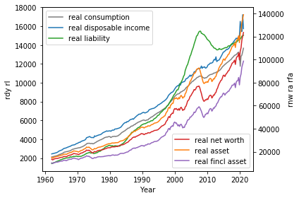
1 | data1 = df['rc']/df['rdy'] |
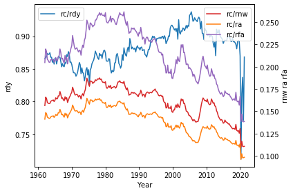
1 | data1 = np.log(df['rc']/df['rdy']) |
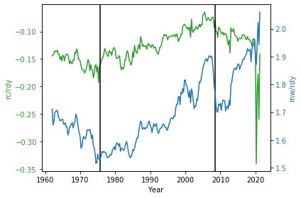
Are there any structural breaks in the relationship before 1975Q4 and after 2008Q3? If so, we have to create dummies to allow for them. Let’s run a regression to further confirm it.
1 | Y = np.log(df['rc']/df['rdy']) |
1 | ax = res.resid[:-8].plot(style='.',grid=True) |
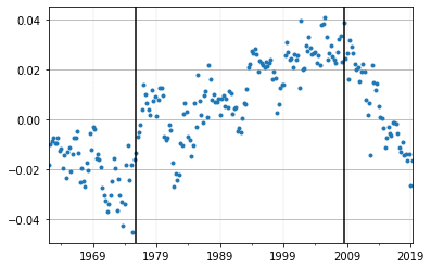
Both the time plot and the regression of log(rc/rdy) on a constant and log(rnw/rdy) suggests that there were structural breaks around 1975Q4 and 2008Q3. Notice the consistently negative residuals till 1975Q4 and the wider gap between log(rc/rdy) and log(rnw/rdy) before 1976 compared to the gap after 1976. Another one is that household net worth and assets have increased at an accelerating rate after the 2008 global financial crisis (increasing rnw/rdy ratio). While at the same time, we don’t see a rising trend of consumption compared to income even though households have accumulated higher real net wealth benefited from the booming asset prices post-crisis, which is a quite different behavior compared to pre-crisis.
These are strong suggestive evidence that structural breaks occurred around 1975Q4 and 2008Q3. But why? What are the drivers?
Inequality and the Kondratiev theory
Let’s now take a look at the inequality data, which will give us better clues to our questions.
Data is downloaded from the World Inequality Database WID. Buckets I selected are top 10%, middle 40% and the bottom 50% of the US population.
1 | income_inequality = pd.read_csv('income_inequality.csv',index_col=0) |
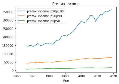
As we can tell from the following graphs, income inequality in the US has risen dramatically since the mid 1970s, see how the income of the top 10% grows whereas that of the middle and bottom classes remains nearly flat. This issue has drawn heightened attention in recent years (including me :D).
In the past decade, economic observers have also become increasingly worried about “secular stagnation” - or a chronic shortfall of aggregate demand, fearing that this shortfall will constrain American economic growth in coming years. These two phenomena—rising inequality and chronic weakness of demand - are related. Specifically, since the marginal propensity to consume (MPC) is much lower at the higher wealth quintiles (for low-wealth households, the MPC is 10 times larger than it is for wealthy households, see this paper elaborating it), rising inequality transfers income from high MPC households in the bottom and middle of the income distribution to lower MPC households at the top. All else equal, this redistribution away from low- to high-saving households reduces consumption spending, which drags on demand growth.
1 | pretax_income.iloc[:,1:].plot(title='Pre-tax Income') |
1 | net_wealth.iloc[:,1:].plot(title='Net Wealth') |
<matplotlib.axes._subplots.AxesSubplot at 0x23c76c39e48>
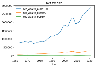
Due to the differences in income growth, we see a larger and larger wealth gap between groups.
1 | data1 = wealth_inequality['sw_p99p100'] |
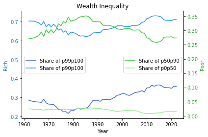
Based on the theory, we can assume that there is a negative correlation between income inequality and consumption. Here I created an inequality indicator using the difference in shares of wealth of the top 10% and the bottom 50%, so that we can further look into the change of inequality over the last half century. The long-term trend is estimated using the Hodrick–Prescott filter, which can smooth the data by getting rid of the short-term fluctuations (shorter cycles).
1 | wealth_inequality.index = pd.to_datetime(wealth_inequality.index, format='%Y') |
1 | f, (ax1, ax2) = plt.subplots(1,2,figsize=(15,4)) |
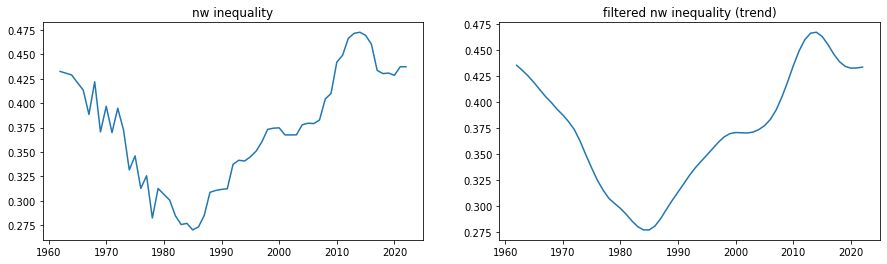
Seeing the long-term inequity trend, it’s no wonder why we have identified two structural breaks.
Actually up to now, if you are familiar with the theory of Kondratieff cycles, this probably starts to look quite interesting to you. Kondratiev waves (also called super-cycles, great surges, long waves, K-waves or the long economic cycle) are hypothesized cycle-like phenomena in the modern world economy. The phenomenon is closely connected with the technology life cycle. It is stated that the period of a wave ranges from forty to sixty years, the cycles consist of alternating intervals of high sectoral growth and intervals of relatively slow growth.
Though there is a lack of agreement about both the cause of the waves and the start and end years of particular waves, inequity appears to be the most obvious driver, and yet some researchers have presented a technological and credit cycle explanation as well. However, among several modern timing versions of the cycles based on any of the causes, the consensus is that the start of our current cycle - Wave of the Information and Telecommunications Revolution falls into the range of early 1970s to mid 1980s, which happens to be the first break point we identified.
Every wave of innovations lasts approximately until the profits from the new innovation or sector fall to the level of other, older, more traditional sectors. It is a situation when the new technology, which originally increased a capacity to utilize new sources from nature, reached its limits and it is not possible to overcome this limit without an application of another new technology. For the end of an application phase of any wave there is typically an economic crisis and economic stagnation. The financial crisis of 2007–2008 is viewed by some as a result of the coming end of the Wave of the Information and Telecommunications Revolution, our second break point.
So after all, I create two dummy variables below to represent the turning points of the cycle.
1 | df['sb_1975_4'] = np.where(df.index < '1976-10-1',0,1) |
Long-run Model Specification
Now let’s put aside the fun ideas and start model development with specifying the long-run predictive equation for real consumption.
Consider the following long-run model for U.S. real consumption:
\begin{align}
\log rc_t &= \beta_0 + \beta_1 \log rdy_t + \beta_1 \log rnw_t + \epsilon_t
\end{align}
It’s helpful to express our model in logarithmic form, so that the parameter estimates are elasticities.
1 | df['ln_rc'] = np.log(df['rc']) |
Sample and Forecast Period
The sample period for model specification i.e., specifying the preferred model for forecasting purposes can be 1962:1 to 2016:4 (and no later than 2007:4). Remember we have to stick with the train data from now on for the model development. The test set will be preserved for testing the predictive power of the model.
1 | cut = 220 |
((220, 39), (18, 39))
1 | train.tail() |
| saving_rate | ns | nnw | nl | na | nfa | interest_payments | cpi | c_deflator | dff | ... | rnw | rl | ra | rfa | sb_1975_4 | sb_2008_3 | ln_rc | ln_rdy | ln_rnw | const | |
|---|---|---|---|---|---|---|---|---|---|---|---|---|---|---|---|---|---|---|---|---|---|
| 2015-10-01 | 7.4 | 1026.972 | 89638.832 | 14191.141 | 104202.900 | 72619.083 | 271.856 | 237.837 | 1.03286 | 0.16 | ... | 86787.010824 | 13739.655907 | 100887.729218 | 70308.737873 | 1 | 1 | 9.392924 | 9.505978 | 11.371212 | 1 |
| 2016-01-01 | 7.5 | 1046.172 | 90792.562 | 14181.444 | 105350.157 | 73464.821 | 266.871 | 237.689 | 1.03340 | 0.36 | ... | 87858.101413 | 13723.092704 | 101945.187730 | 71090.401587 | 1 | 1 | 9.400231 | 9.513525 | 11.383478 | 1 |
| 2016-04-01 | 6.9 | 969.635 | 92170.184 | 14313.771 | 106862.978 | 74353.858 | 271.273 | 239.590 | 1.03989 | 0.37 | ... | 88634.551731 | 13764.697228 | 102763.732702 | 71501.656906 | 1 | 1 | 9.405301 | 9.511885 | 11.392277 | 1 |
| 2016-07-01 | 6.8 | 961.218 | 93991.425 | 14497.803 | 108869.331 | 75700.352 | 274.959 | 240.607 | 1.04379 | 0.39 | ... | 90048.213721 | 13889.578363 | 104301.948668 | 72524.503971 | 1 | 1 | 9.411142 | 9.516705 | 11.408101 | 1 |
| 2016-10-01 | 6.8 | 974.320 | 94743.726 | 14601.767 | 109726.272 | 76056.719 | 277.958 | 242.135 | 1.04872 | 0.45 | ... | 90342.251507 | 13923.418072 | 104628.758868 | 72523.379930 | 1 | 1 | 9.415978 | 9.522002 | 11.411361 | 1 |
5 rows × 39 columns
Check for Stationary
I’m going to pre-test the data to determine whether if it has a unit root, that is, whether it’s stationary or non-stationary.
1. What is stationarity?
A stationary process is a stochastic process whose probability distribution does not change over time. For our work in time series analysis, we mostly care about stationarity in its weak form - covariance stationary.
Covariance stationary:
- Constant mean:
\begin{align}
&E(y_t) = E(y_{t+1}) = \mu
\end{align} - Constant variance:
\begin{align}
&Var(y_t) = Var(y_{t+1}) = \sigma^2
\end{align} - Covariance depends on time that has elapsed between observations, not on reference period:
\begin{align}
&Cov(y_t,y_{t+j}) = Cov(y_s,y_{s+j}) = \gamma_j
\end{align}
To get an intuition of stationarity, one can imagine a frictionless pendulum. It swings back and forth in an oscillatory motion, yet the amplitude and frequency remain constant. Although the pendulum is moving, the process is stationary as its “statistics” are constant (frequency and amplitude). However, if a force were to be applied to the pendulum, either the frequency or amplitude would change, thus making the process non-stationary.
2. Why is stationarity important?
Stationarity is one important assumption underlying in time series analysis as if the series is non-stationary, the shocks do not die out, the impact of disturbances become more influential over time and so gives a poor forecast accuracy.
Consequences of non-stationarity
- The effect of a shock will diminish as time elapses
- Statistical consequences
- Non-normal distribution of test statistics
- Bias in autoregressive coefficients; we might mistakenly estimate an AR(1), deficient forecast
- Usual confidence intervals for coefficients not valid, poor forecast ability
3. How do we determine whether a time series is nonstationary?
As always, visual inspection is one of the most useful ways to identify non stationary series. It looks that all of the curves obviously have a trend, which is definitely against the definition of stationarity.
1 | train[['ln_rc','ln_rdy','ln_rnw']].plot() |
<matplotlib.axes._subplots.AxesSubplot at 0x23c0007c248>
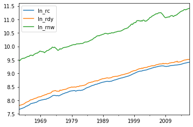
Then we can turn to statistical tests. The first would be Augmented Dickey-Fuller (ADF) Test, which tests for non-stationarity.
Recall AR(1) model:
\begin{align}
y_t = by{t_1} + \epsilon_t
\end{align}
A special case is the random walk when $b = 1$. However, for stationarity, it requires $b<1$.
If generalizing to AR(p), it means that roots of the polynomial below must all be >1 in abs value,
\begin{align}
1 - b_1z -b_2z^2-b_3z^3-…-b_pz^p
\end{align}
If one of the roots = 1, then it is said to have a unit root i.e., non-stationary.
The ADF Test can test for the coefficient on $y_{t-1}$. Basically, it regresses y on its lag testing for significance of coefficient. I won’t go into great mathematical details, if anyone’s interested, check out this wiki page.
However, ADF has been found to have low power in certain circumstances:
- stationary processes with near-unit roots. For example, it has difficulty distinguishing between b = 1 and b = 0.95, especially with small samples.
- Trend stationary processes.
So alternative tests have been designed, which are Phillips–Perron (PP) Test and Kwiatkowski–Phillips–Schmidt–Shin (KPSS)Test. I usually prefer to use all three of them together, but here I would focus on ADF and KPSS as they have been implemented in statsmodels.
A few notes:
- ADF and PP are called unit root tests; the null hypothesis is that $y_t$ has a unit root; is I(1) or higher.
- KPSS, on the other hand, is a stationarity test; the null hypothesis is that $y_t$ is I(0).
- Correct specification is key. Intercept and trend should be included when appropriate as critical values for the t-statistics will vary depending on whether they are included.
- Structural breaks can complicate matters further. That’s why we start this blog with detecting structural breaks.
1 | def augmented_dickey_fuller_test(time_series): |
1 | augmented_dickey_fuller_test(train['ln_rc']) |
ADF Statistic: -1.949803
ADF p-value: 0.309007
non-stationary - null hypothesis of a unit root cannot be rejected at a 5% significance level
KPSS Statistic: 2.297233
KPSS p-value: 0.010000
non-stationary - null hypothesis of stationary can be rejected at a 5% significance level
1 | augmented_dickey_fuller_test(train['ln_rdy']) |
ADF Statistic: -2.970069
ADF p-value: 0.037786
stationary - null hypothesis of a unit root can be rejected at a 5% significance level
KPSS Statistic: 2.292161
KPSS p-value: 0.010000
non-stationary - null hypothesis of stationary can be rejected at a 5% significance level
1 | augmented_dickey_fuller_test(train['ln_rnw']) |
ADF Statistic: -0.266563
ADF p-value: 0.930108
non-stationary - null hypothesis of a unit root cannot be rejected at a 5% significance level
KPSS Statistic: 2.300497
KPSS p-value: 0.010000
non-stationary - null hypothesis of stationary can be rejected at a 5% significance level
None of the variables can be considered stationary with the two tests. We can therefore ask whether the variables form a cointegrated system with a given number of “common trends”. Intuitively, I would argue that there exists one cointegration equation among the three variables as in the long run, one’s amount consumed and wealth accumulated should be equal to the income that one earns.
We will discuss how to test for cointegration relationships and how to estimate them using a vector error correction model in the next blog.