When I first look at these credit investment opportunities, the challenge was immediately clear. Our team was evaluating two legacy services chains in Florida, yet almost none of the analytical infrastructure one might expect—standardized operating metrics, historical statements, market share data—was available. Unlike more transparent service sectors, this industry provides no obvious datapoints to anchor intuition or build a conventional model.
But the nice thing about data work is: if you don’t have intuition, you can build a framework.
This post walks through a simple, self-contained demo on how I used alternative data to compare two legacy service chains for a hypothetical private credit investment. All data here are simulated and anonymized; the goal is not to value real companies, but to show how to turn a “no idea where to start” situation into a structured, defensible analysis. My hope is that it provides inspiration for approaching private-credit opportunities in niche service industries where traditional information is limited.
1 | chain_attributes.head() |
| chain | name | address | zip | usps_zip_pref_state | latitude | longitude | revenue | |
|---|---|---|---|---|---|---|---|---|
| 0 | Eternal Rest Services | Seawinds Funeral Home & Crematory - Sebastian | 735 S Fleming St, Sebastian | 32958 | FL | 27.7913 | -80.4838 | NaN |
| 1 | Eternal Rest Services | Lewis-Ray Mortuary Inc | 1595 S Hopkins Ave, Titusville | 32780 | FL | 28.5964 | -80.8076 | NaN |
| 2 | Eternal Rest Services | Beth David Memorial Gardens / Levitt Weinstein... | 3201 N 72nd Ave, Hollywood | 33024 | FL | 26.0373 | -80.2325 | NaN |
| 3 | Eternal Rest Services | Sorensen Funeral Home | 3180 30th Ave N, St. Petersburg | 33713 | FL | 27.7988 | -82.6770 | NaN |
| 4 | Eternal Rest Services | Brewer & Sons Funeral Homes - Spring Hill Chapel | 4450 Commercial Way, Spring Hill | 34606 | FL | 28.4939 | -82.5962 | NaN |
Confronting an opaque sector with minimal initial intuition
My first attempt at framing the problem was straightforward but ultimately insufficient. I began with the assumption that local population size should correlate with demand, and therefore revenue, in a necessity-based service. The logic felt self-evident.
Yet once I tested this idea against the reference dataset where one comparable chain provided actual revenue data—the relationship collapsed almost immediately. Dense ZIP codes did not necessarily produce higher revenue, and several low-population regions performed unexpectedly well. This mismatch signaled that the core driver of performance was not simply “how many people live nearby.” It forced a re-examination of what demand actually means in this context.
Refining the definition of demand
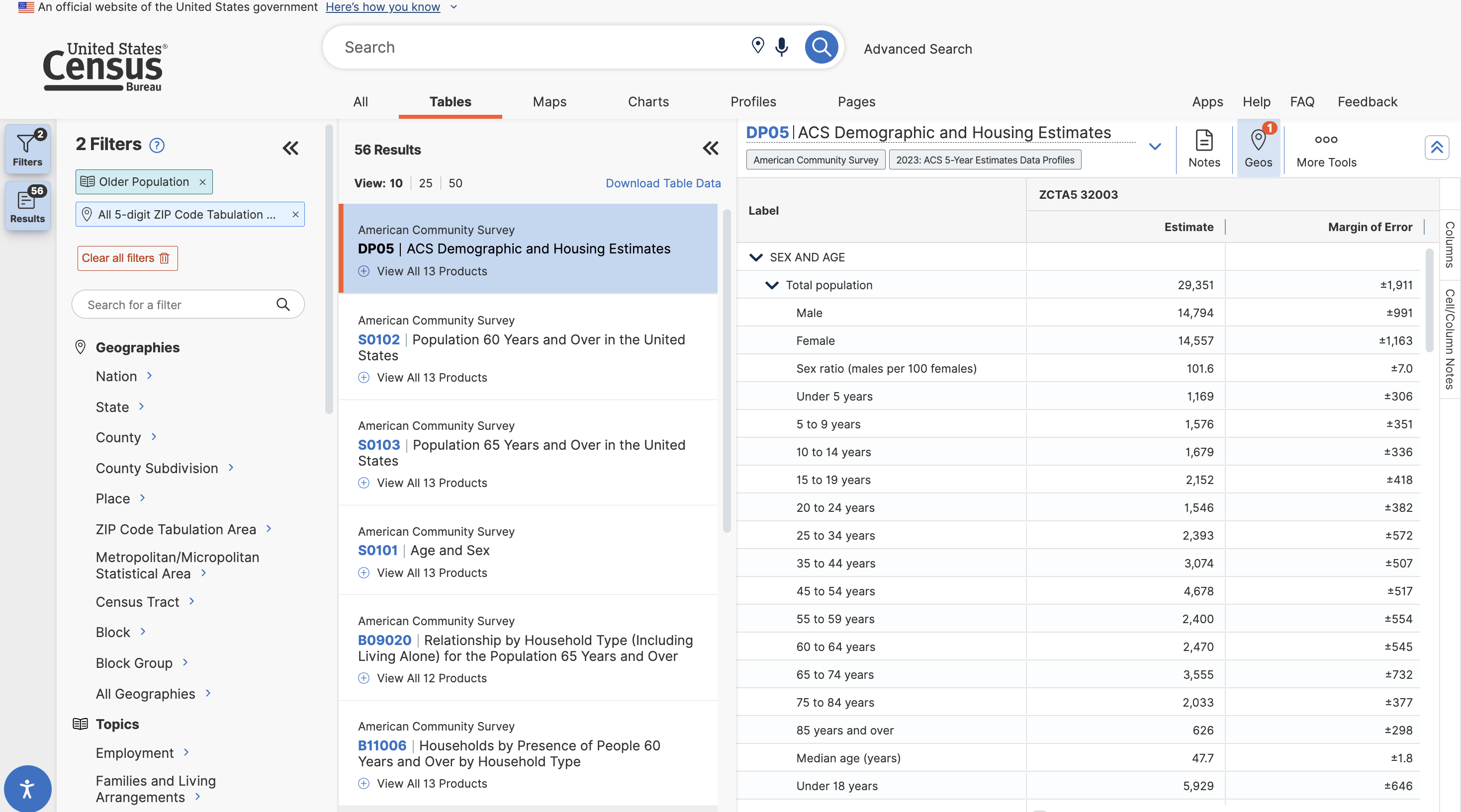
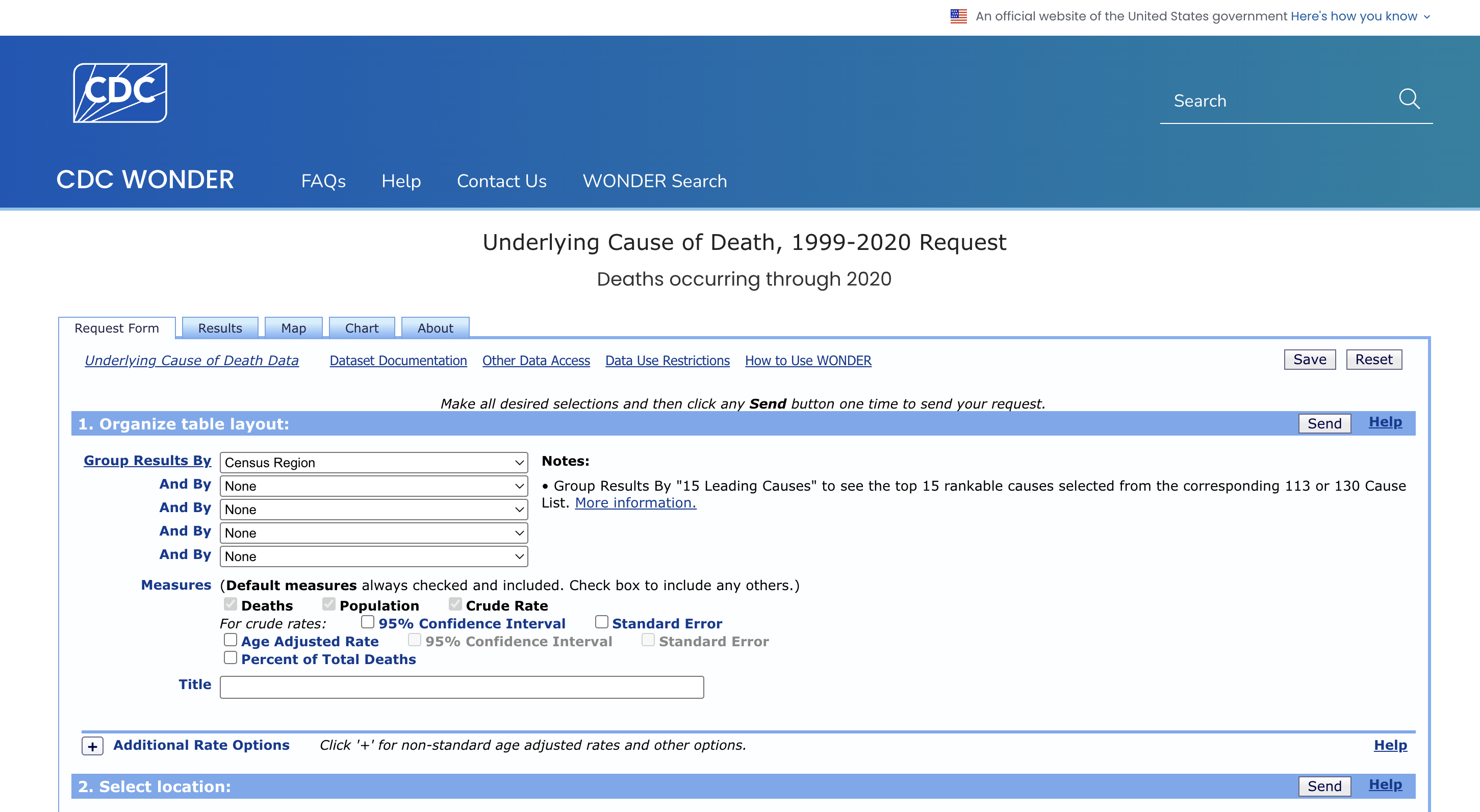
A more nuanced view is that not all population contributes equally to demand. To approximate the actual service need in each market, I began assembling a dataset that did not exist in any ready-made form. I pulled age-bucket distributions from the American Community Survey at the ZIP-code level, then matched each location to its corresponding county in order to merge in CDC crude mortality rates by age group. Only after aligning these disparate geographies—coordinates → ZIP → county—was it possible to compute a more meaningful proxy: the expected number of annual events within each location’s true catchment area.
1 | import pandas as pd |
1 | # Load the datasets |
1 | # clean up ACS data |
All rows have been successfully merged.1 | # Drop columns that will not be used |
I translated demographic structure into an estimate of actual annual events. Mortality data from the CDC are reported as crude rates per 100,000 people for each age bracket, so the calculation effectively becomes a weighted sum of age-specific risk. For each ZIP, I multiplied the population in each senior age group by the corresponding crude mortality rate, scaled the result back to actual counts, and then aggregated across age brackets. The resulting field—Estimated deaths—provides a first-order approximation of the true service demand in each catchment area.
1 | # estimated death = population * crude rate |
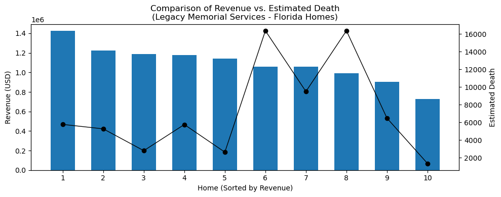
This proxy proved substantially closer to the underlying demand function than raw population counts when comparing with one chain in a different state but with actual revenue data. But while the measure improved explanatory power, it still did not explain why sites with nearly identical expected-event profiles performed so differently. Revenue dispersion within the reference chain remained wide. It became clear that another structural factor—something demographic data alone could not capture—was driving the variation.
1 | df[['zip', 'Population 65 to 74 years','Crude Rate 65-74 years', 'Population 75 to 84 years','Crude Rate 75-84 years', |
| zip | Population 65 to 74 years | Crude Rate 65-74 years | Population 75 to 84 years | Crude Rate 75-84 years | Population 85 years and over | Crude Rate 85+ years | Estimated deaths | revenue | |
|---|---|---|---|---|---|---|---|---|---|
| 50 | 28105 | 82170 | 1667.1 | 35797 | 4417.0 | 14314 | 13249.3 | 4848.0 | 1443785.90 |
| 51 | 28715 | 33804 | 1673.3 | 15735 | 4515.7 | 7033 | 14083.6 | 2267.0 | 1142504.96 |
| 52 | 28301 | 25938 | 2324.2 | 12208 | 5129.5 | 4598 | 13700.4 | 1859.0 | 933859.23 |
| 53 | 27292 | 18861 | 2247.5 | 9673 | 5438.5 | 3306 | 15263.5 | 1455.0 | 1104161.22 |
| 54 | 27604 | 89427 | 1405.2 | 39811 | 4244.9 | 14816 | 13564.1 | 4957.0 | 902405.14 |
| 55 | 30134 | 11119 | 2198.6 | 4615 | 5267.5 | 1732 | 15275.1 | 752.0 | 1046596.19 |
| 56 | 30046 | 68686 | 1472.3 | 28960 | 4319.0 | 7830 | 14309.8 | 3382.0 | 783832.30 |
| 57 | 30092 | 68686 | 1472.3 | 28960 | 4319.0 | 7830 | 14309.8 | 3382.0 | 1305180.42 |
| 58 | 31404 | 29473 | 1966.1 | 14405 | 4595.0 | 4936 | 13413.5 | 1903.0 | 1264724.73 |
| 59 | 30060 | 64020 | 1532.7 | 28231 | 4505.9 | 9642 | 14546.6 | 3656.0 | 946321.92 |
1 | ### plot comparison of revenue vs. estimated death |
Competition determines revenue more than raw demand
The turning point occurred when I spatially mapped all sites and overlaid nearby competitors. Only then did the inconsistencies resolve.
Two locations with nearly identical demographic and demand characteristics behaved very differently when their competitive environments diverged. A near-monopoly footprint materially outperformed markets with multiple service providers.
1 | ### plot locations on FL map to see the competitive dynamic |
/var/folders/8t/vzks7t793bq9w_c_km9_4f2h0000gn/T/ipykernel_63287/4228247440.py:16: SettingWithCopyWarning:
A value is trying to be set on a copy of a slice from a DataFrame.
Try using .loc[row_indexer,col_indexer] = value instead

See the caveats in the documentation: https://pandas.pydata.org/pandas-docs/stable/user_guide/indexing.html#returning-a-view-versus-a-copy
  df_fl['color'] = df_fl['chain'].map(colors)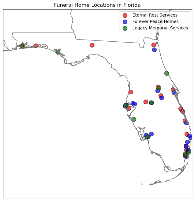
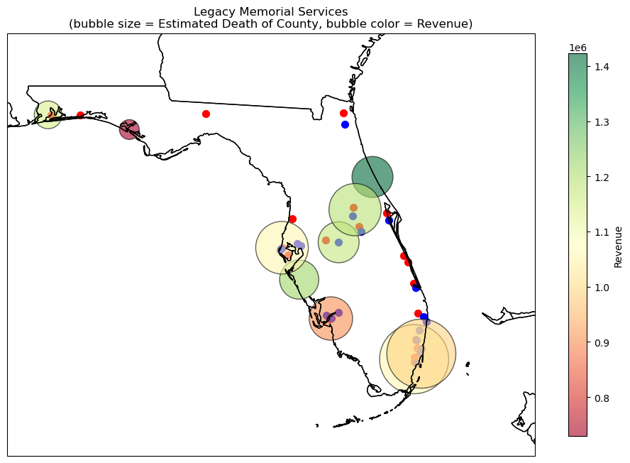
The map below visualizes the reference chain across Florida, and it quickly illustrates why demographic data alone could not explain revenue dispersion. Each bubble represents a county, with bubble size proportional to estimated annual events (derived from senior population × county-level mortality rates) and bubble color reflecting actual 2023 revenue for the nearest location.
What immediately stands out is the lack of a clean relationship between demand potential and realized performance. Several counties with sizeable senior populations and high expected-event estimates (large bubbles) exhibit only mid-range revenues. Conversely, some moderately sized markets but without any competitors nearby outperform expectations despite smaller demand pools.
1 | ### further plot estimated death and revenue for "Legacy Memorial Services" |
This led to a critical insight:
Performance is driven less by total demand and more by demand per available provider.
To quantify this, I constructed a measure that ultimately became central to the analysis:
“death share,” defined as expected annual events divided by the number of competitors within a defined radius.
While conceptually simple, it captured competitive intensity more effectively than any other variable and proved to be the strongest empirical predictor of revenue.
First, I reconstructed local market structure directly from geospatial coordinates. The first step was implementing a haversine function, a standard method for calculating great-circle distances between two points on the Earth’s surface. With this, each site could be compared to every other location in the dataset to determine whether it falls within a reasonable competitive radius.
For this analysis, I used a ten-mile radius as a practical proxy for the area in which consumers are likely to consider alternatives. By converting that radius to kilometers and iterating through all pairs of coordinates, I was able to count, for each site, how many competing providers operate within that local catchment. The resulting competitors_within_10_miles field became a foundational feature: it quantifies the local supply environment and captures the structural headwinds—or advantages—that shape a site’s revenue potential.
1 | # Define the haversine function to calculate distance between two coordinates |
1 | df[['name','competitors_within_10_miles']].head(10) |
| name | competitors_within_10_miles | |
|---|---|---|
| 0 | Seawinds Funeral Home & Crematory - Sebastian | 1 |
| 1 | Lewis-Ray Mortuary Inc | 1 |
| 2 | Beth David Memorial Gardens / Levitt Weinstein... | 3 |
| 3 | Sorensen Funeral Home | 0 |
| 4 | Brewer & Sons Funeral Homes - Spring Hill Chapel | 0 |
| 5 | Fairchild Funeral Home-Crmtry | 0 |
| 6 | Memorial Plan Flagler Memorial Park | 3 |
| 7 | All County Funeral Home & Crematory | 1 |
| 8 | Affordable Cremations by Baldwin Brothers | 3 |
| 9 | Neptune Society | 1 |
Once competition was quantified, the next logical step was to translate local demand into something economically meaningful: how much of that demand a given site could reasonably capture. Estimated annual events alone are insufficient because two locations with identical demand can perform very differently if one operates in a near-monopoly environment while the other is surrounded by multiple providers. To reflect this, I constructed a simple but powerful measure of implied market share.
For each age group—and for total expected events—I divided the estimated annual deaths by the number of competitors within a ten-mile radius (plus one, to include the site itself). This produces an approximate “demand-per-provider” metric, or what I refer to analytically as death share. While coarse by design, this adjustment captures the structural effect of market fragmentation: the more providers sharing the same catchment, the smaller the realistic opportunity set for each individual location.
1 | # estimate maket share for each location by dividing estimated death by number of competitors in 10 miles |
Learning the revenue function from a reference chain
Because neither of the two target chains disclosed revenue, the only way to infer the economic structure of the industry was to learn it from the reference operator with known revenue across its Florida locations. The goal was not to build a sophisticated forecasting model, but rather to identify a stable, interpretable mapping between local market characteristics and realized revenue.
I began by isolating the Florida subset of Legacy Memorial and merging in the features I had engineered earlier—competitive density, household income, and various age-adjusted demand metrics. To understand how much revenue each location generated relative to its local opportunity set, I calculated a simple ratio: revenue per unit of estimated demand share. Conceptually, this expresses how much value a site captures from each unit of its adjusted demand pool.
1 | # filter 'Legacy Memorial Services' homes in FL |
At this point, one location—Baldwin Fairchild Funeral Home in Seminole County—stood out as a clear outlier. Its implied revenue-per-share figure was substantially higher than that of other sites. A closer look revealed that Seminole is the smallest county in Florida, meaning that computing expected events strictly within county boundaries understates the true catchment area. In practice, residents often cross county lines for this category of services, especially when adjacent counties are significantly larger.
To correct for this geographical artifact, I expanded the demand base for Seminole locations by incorporating senior population from neighboring Orange County. This adjustment created a more realistic representation of the actual market size accessible to those sites.
1 | # add the population of the closest neighbor county Orange to locations in Seminole |
| Population 65 to 74 years | Population 75 to 84 years | Population 85 years and over | Estimated deaths 65 to 74 years | Estimated deaths 75 to 84 years | Estimated deaths 85 years and over | Estimated deaths | |
|---|---|---|---|---|---|---|---|
| 9 | 157525 | 74102 | 29533 | 2545.0 | 3104.0 | 3701.0 | 9350.0 |
| 45 | 157525 | 74102 | 29533 | 2545.0 | 3104.0 | 3701.0 | 9350.0 |
After correcting the denominator for Seminole, the revenue-per-share metric became remarkably consistent across the reference chain’s locations. This stability provided exactly what I needed: a proportionality constant linking adjusted demand to realized revenue.
In other words, the reference chain supplied a set of empirical weights that could be transplanted onto the two target portfolios. With these weights in hand, I could estimate the economic potential of each site—even in the absence of disclosed financials—and ultimately compare the attractiveness of the two acquisition candidates.
1 | # recalculate estimated deaths share based on updated data |
| chain | name | zip | county | revenue | competitors_within_10_miles | Mean household income | Estimated deaths share | rev per death | |
|---|---|---|---|---|---|---|---|---|---|
| 40 | Legacy Memorial Services | Lohman Funeral Home Ormond | 32174 | Volusia | 1423140.28 | 0 | 87233.0 | 5765.0 | 247.0 |
| 41 | Legacy Memorial Services | Russell Allen Wright, Sr. Mortuary LLC | 32405 | Bay | 729434.16 | 0 | 92641.0 | 1348.0 | 541.0 |
| 42 | Legacy Memorial Services | Gendron Funeral & Cremation Services Inc. | 33901 | Lee | 904327.89 | 3 | 102290.0 | 1618.0 | 559.0 |
| 43 | Legacy Memorial Services | Caballero Rivero Hialeah | 33010 | Miami-Dade | 1060401.51 | 3 | 102498.0 | 4090.0 | 259.0 |
| 44 | Legacy Memorial Services | Alexander Funeral Home Inc | 33881 | Polk | 1175491.50 | 1 | 84031.0 | 2875.0 | 409.0 |
| 45 | Legacy Memorial Services | Baldwin Fairchild Funeral Home | 32714 | Seminole | 1189375.91 | 2 | 111625.0 | 3117.0 | 382.0 |
| 46 | Legacy Memorial Services | Sound Choice Cremation | 34232 | Sarasota | 1221708.98 | 0 | 120022.0 | 5263.0 | 232.0 |
| 47 | Legacy Memorial Services | Christian Family Funeral | 32503 | Escambia | 1142915.31 | 1 | 88025.0 | 1314.0 | 870.0 |
| 48 | Legacy Memorial Services | Smith-Youngs Funeral Home, Inc. | 33756 | Pinellas | 1056734.64 | 3 | 101629.0 | 2372.0 | 446.0 |
| 49 | Legacy Memorial Services | Riverside Gordon Memorial Chapels | 33162 | Miami-Dade | 989213.10 | 4 | 102498.0 | 3272.0 | 302.0 |
By combining demographic variables, event-based demand estimates, income proxies, and competition measures, I allowed a simple regression model to reveal which characteristics truly mattered.
The results were:
Death share was the dominant explanatory factor.
Senior population contributed largely through its relationship to death share.
Household income, despite being intuitively appealing as a proxy for pricing power, exerted minimal influence in this dataset.
The muted role of income is less a substantive conclusion about the industry and more a feature of the simplified, simulated structure of this exercise. In this notebook, each location relies on county-level income data without adjusting for actual catchment boundaries. counties are administratively convenient but economically arbitrary; they often fail to reflect the true service footprint, especially in suburban or cross-county markets where consumers may travel several miles beyond their residential ZIP.
In real underwriting work, analysts typically aggregate population and income across multi-ZIP catchments or construct custom polygons based on drive-time radii. That process—while far more laborious—yields a materially more accurate representation of the household base each site can access. Under such a framework, income variability tends to matter more: higher-income catchments support differentiated service tiers, greater upsell elasticity, and more stable spend per event. Here, because the analysis relies on a simplified approximation, income contributes little incremental signal beyond what competition already explains.
The exercise nevertheless confirms a useful takeaway: when pricing dispersion is narrow and supply is unevenly distributed, market structure dominates household characteristics. The regression results remain directionally consistent with qualitative research showing that, in this sector, proximity and provider availability outweigh income-driven preference formation.
1 | df['income'] = df['Mean household income'] |
                            OLS Regression Results
==============================================================================
Dep. Variable:                revenue   R-squared:                       0.597
Model:                            OLS   Adj. R-squared:                  0.481
Method:                 Least Squares   F-statistic:                     5.178
Date:                Sat, 12 Apr 2025   Prob (F-statistic):             0.0417
Time:                        00:05:45   Log-Likelihood:                -130.67
No. Observations:                  10   AIC:                             267.3
Df Residuals:                       7   BIC:                             268.2
Df Model:                           2
Covariance Type:            nonrobust
===============================================================================
                  coef    std err          t      P>|t|      [0.025      0.975]
-------------------------------------------------------------------------------
Intercept    1.219e+06   4.01e+05      3.042      0.019    2.71e+05    2.17e+06
death_share    98.2885     30.567      3.215      0.015      26.009     170.568
income         -4.3804      4.182     -1.048      0.330     -14.268       5.508
==============================================================================
Omnibus:                        0.129   Durbin-Watson:                   1.711
Prob(Omnibus):                  0.938   Jarque-Bera (JB):                0.230
Skew:                          -0.196   Prob(JB):                        0.891
Kurtosis:                       2.369   Cond. No.                     9.25e+05
==============================================================================

Notes:
[1] Standard Errors assume that the covariance matrix of the errors is correctly specified.
[2] The condition number is large, 9.25e+05. This might indicate that there are
strong multicollinearity or other numerical problems.


/opt/anaconda3/lib/python3.12/site-packages/scipy/stats/_axis_nan_policy.py:531: UserWarning: kurtosistest only valid for n>=20 ... continuing anyway, n=10
  res = hypotest_fun_out(*samples, **kwds)
Applying the model to the two target chains
1 | df_other = df.loc[df['chain'] != 'Legacy Memorial Services',['chain', 'name','zip','county','Mean household income', 'Estimated deaths share', 'predicted_revenue']] |
With a stable revenue-per-share relationship established from the reference chain, I applied this calibrated mapping to the two target portfolios. For each location, I used the engineered features developed earlier (estimated senior demand, competitive density, and adjusted death share) to compute its implied revenue contribution.
This step effectively converted a qualitative location footprint into a quantifiable economic profile, allowing the two portfolios to be compared on a like-for-like basis despite the absence of financial disclosures.
1 | total_revenue_by_chain = df_other.groupby('chain')['predicted_revenue'].sum() |
chain
Eternal Rest Services    22158799.0
Forever Peace Homes      22932606.0
Name: predicted_revenue, dtype: float64
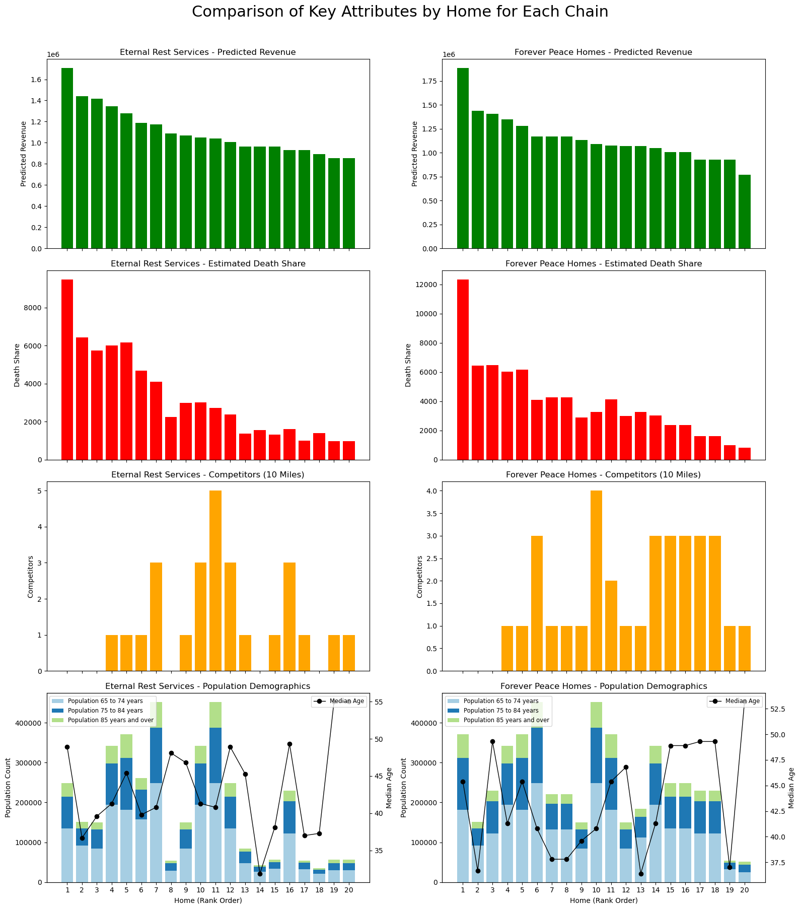
Stepping back from the individual charts, a consistent story emerges across both portfolios. The relative attractiveness of each chain is driven less by headline population numbers and far more by where each location sits within the competitive and demographic landscape. Sites with moderate density and limited competition reliably rise to the top of the revenue distribution; those with constrained catchment areas or fragmented competitive markets tend to fall behind.
Although Eternal Rest Services benefits from several monopoly-like locations, many of these assets are situated in counties with shallow senior populations, limiting their ability to translate exclusivity into sustainable economics. Conversely, Forever Peace Homes competes in denser and occasionally more contested areas, yet still delivers stronger revenue because its best locations sit at the intersection of healthy demand and manageable competition. The Miami cluster illustrates this clearly: even in a tighter competitive environment, the underlying demographics and service need create enough economic weight to outperform less populated regions further north.
1 | chains_of_interest = ["Eternal Rest Services", "Forever Peace Homes"] |
Building structure out of ambiguity
This simplified, simulated exercise obviously abstracts away many real-world complexities—pricing tiers, referral patterns, operational differences, and localized brand effects. But the analytical path is instructive: by breaking the problem into demand, competition, and share of market opportunity, a coherent investment framework emerges even in a niche sector with sparse standardized data. In practice, the analysis would be enriched by catchment-level population aggregation, drive-time modeling, and income-segmented demand estimation, all of which tend to sharpen revenue mapping further.
Yet even in this lightweight demonstration, the conclusion is clear:
the economics of legacy services are fundamentally spatial, and the winning portfolio is the one that consistently occupies strong demographic basins with structurally advantaged competitive positions.
This project began as a blank slate—no intuition, no industry metrics, no obvious path forward—but ended with a defensible, data-driven view of portfolio quality. That is ultimately the value of alternative data in private-credit underwriting: when traditional signals are absent, rigorous structure can still be built from the ground up.