In the last two blogs, we went through linear regression and generalized linear regression in search of the best solution to the covid data by relaxing the assumptions of linear regression and OLS. Based on what have done so far, our conclusion is negative binomial regression fit the data best. However, still, we have this problem that for some states with high vaccination rates, the increasing cases are over-estimated, and a few state such as FL and KY, are more like outliers to the model. Today, we are going to fixed these issues with the mixed-effects model, specifically, the generalized linear mixed-effects model(GLMM), which is very popular in biostatistics and econometrics, especially useful for economists when modeling cross-country macro data.
A mixed-effects model contains both fixed effects and random effects. They are particularly useful in settings where measurements are made on clusters of related statistical units. There are several ways people usually choose to deal with this type of inherently “lumpy” data.
1. Pooled Data Regression
One can run a regular regression on $y$ versus $x$ ignoring the group information, like what we have done in the last two blogs.
It works but:
- It throws away useful information.
- Linear Regression assumes observations are independent here they are not.
- The $\alpha$ and $\beta$ coefficients are unbiased estimates (not bad).
- The confidence intervals will be too optimistic.
2. Unpooled Data Regression
Instead one can run a regression for each of the groups.
- One needs to estimate too many coefficients (51 $\alpha$s and 51 $\beta$s in our case).
- This results in unbiased, but very noisy estimates if some groups have few observations.
3. Pooled Slope, Unpooled Intercept
We can instead fit a regression with a dummy variable for each group.
$$
y_i = \alpha + \beta x + \rho^T Z_i
$$
where $\rho$ is now a vector with as many coefficients as groups, and $Z$ is a vector of dummies, one column per group (we must leave one group out to avoid co-linearity of Z).
This method:
- Pools information for the slope $\beta$.
- Treats each group intercept independently. If some group $g$ has few examples $\rho_g$ will be noisy.
4. Penalized Linear Regression
To pool over the different groups, we can introduce a regression penalty to penalize model coefficients to reduce the model degrees of freedom.
- Theoretically, the correct penalty is proportional to the ration of variances for the observations $\sigma_Y^2$ and the random effects $\sigma_\rho^2$.
- Because there is no penalty for $\alpha$, the mean over all the population will be matched exactly.
5. Linear Mixed-effect Model
For people who are familiar with penalized regressions and regularizations like lasso and rigid, the estimation of mixed models would be very straightforward as essentially, they are the same. Same result can be obtained with less work by fitting to a Linear Mixed Effect Model with statsmodels.mixed_linear module.
6. Generalized Linear Mixed-effects Model (GLMM)
Today, as we already know that negative binomial distribution fits the covid data better, we will skip the linear mixed model and start with the non-linear GLMM. Since the model is relatively complex, we will be using a much cooler statistical inference method – Bayesian.
Preliminaries
1 | import numpy as np |
As usual, let’s prepare the data. Hospital admissions and vaccinations are from the CDC website, and the most up-to-date populations by state are from the US Census Bureau.
1 | data_dir="../data" |
1 | hospitalizations=pd.read_csv(f"{data_dir}/covid_hospitalizations.csv",parse_dates=["date"]) |
| date | state | used_beds | admissions | vaccinated | population | |
|---|---|---|---|---|---|---|
| 0 | 2021-06-10 | MT | 66.0 | 16.0 | 0.397597 | 1080577 |
| 1 | 2021-06-21 | MT | 57.0 | 13.0 | 0.411614 | 1080577 |
| 2 | 2021-08-05 | MT | 149.0 | 23.0 | 0.440153 | 1080577 |
| 3 | 2021-07-15 | MT | 62.0 | 9.0 | 0.431722 | 1080577 |
| 4 | 2021-08-21 | MT | 224.0 | 59.0 | 0.449196 | 1080577 |
Split the train and test data,
1 | # train dates |
Here we write a function to generate our desired matrix. This time, we will need an extra step to label data by state.
1 | def define_variables(data,date0): |
1 | X_train,Z_train,P_train=define_variables(train_data,date0) |
We have 51 regions in total,
1 | # number of states/regions |
511 | # all states/regions |
Index(['AK', 'AL', 'AR', 'AZ', 'CA', 'CO', 'CT', 'DC', 'DE', 'FL', 'GA', 'HI',
       'IA', 'ID', 'IL', 'IN', 'KS', 'KY', 'LA', 'MA', 'MD', 'ME', 'MI', 'MN',
       'MO', 'MS', 'MT', 'NC', 'ND', 'NE', 'NH', 'NJ', 'NM', 'NV', 'NY', 'OH',
       'OK', 'OR', 'PA', 'RI', 'SC', 'SD', 'TN', 'TX', 'UT', 'VA', 'VT', 'WA',
       'WI', 'WV', 'WY'],
      dtype='object')
Mixed Negative Binomial Regression Model
Model Definition
We have data from multiple dates, so it makes sense to incorporate Time as a extra variable.
\begin{eqnarray}
\eta_{i,j} =& \beta_0 + \beta_1 x_{i,j} + \beta_2 t_{j} + \beta_3 t_{j}^2 + \rho_i\newline
\rho_i \sim & N(0,\sigma_{\rho}^2) \newline
\lambda_{i,j} =& e^{\eta_{i,j}} \newline
y_{i,j} \sim & \text{NB}(y;\lambda_{i,j} P_i,\alpha)
\end{eqnarray}
with priors
\begin{eqnarray}
\beta_0 \sim & N( \bar{y},1) \newline
\beta_i \sim & N(0,1) \newline
\log \sigma_\rho \sim & N(0,1) \newline
\log \alpha \sim & N(0,1)\newline
\end{eqnarray}
where
- Each index $i$ represents a state in the US.
- Each index $j$ represents a particular date.
- $y_{i,j}$ is the number of hospital admissions on state $i$ at date $j$.
- the random effects (random intercept) $\rho_i$ for different states $i$ are independent and have a normal distribution. It will be fit to the data.
- $x_{i,j}$ is the percentage of the state population fully vaccinated on state $i$ at date $j$.
- $t_j$ is the number of days elapsed since the beginning of the training period.
- $P_i$ is the population of state $i$.
- $\bar{y}$ is log of the average per person incidence on the event in the US Population.
- the parameters and $\beta_1,\beta_2,\beta_3$ will be fitted to the observed data to maximize agreement with the model.
- the parameter $\sigma_\beta$ is our prior uncertainty about the value of $\beta_i$, it is set to 1.
To estimate the model coefficients, we will go for full Bayesian.
Bayesian Approach
Unlike the classical frequentist methods, in Bayesian analysis, a parameter is summarized by an entire distribution of values instead of one fixed value, and it provides a natural and principled way of combining prior information or expert knowledge with the data observed.
Both Bayesian methods and classical methods have advantages and disadvantages, and there are some similarities. When the sample size is large, Bayesian inference often provides results for parametric models that are very similar to the results produced by frequentist methods. Some advantages to using Bayesian analysis include the following:
It provides a natural and principled way of combining prior information with data, within a solid decision theoretical framework. You can incorporate past information about a parameter and form a prior distribution for future analysis.
It provides interpretable answers based on parameter distributions, such as “the true parameter has a probability of 0.95 of falling in a 95% credible interval.”
It provides a convenient setting for a wide range of complex models, such as the GLMM model we are trying to build but not easy to get an analytical solution. MCMC, along with other numerical methods, makes computations tractable for virtually all parametric models.
The disadvantages of Bayesian are quite obvious as well:
It does not tell you how to select a prior. There is no correct way to choose a prior. Bayesian inferences require skills to translate subjective prior beliefs into a mathematically formulated prior.
It often comes with a high computational cost, especially in models with a large number of parameters.
To solve our model with Bayesian approach, we have to specify the distributions of the parameters/variables. The good thing is that there are convenient functions provided by pymc3.
1 | Y_bar=np.log(Y_train.sum()/P_train.sum()) |
I choose $N(0,1)$ for $\beta$s , and $lognormal(0,1)$ for $\sigma_\rho$s just to speed up the convergence.
1 | with pm.Model() as mod: |
Then we can start the Monte Carlo sampling process. 4 chains, of which 1000 samples are generated. That means there will be 4000 samples for each of the parameters. Be patient, the computation can take a while. (Honestly, sometimes HOURS if using personal laptops)
Monte Carlo Sampling
1 | with mod: |
Auto-assigning NUTS sampler...
Initializing NUTS using jitter+adapt_diag...
Multiprocess sampling (4 chains in 4 jobs)
NUTS: [alpha, rho, lsigma_group, beta]
Sampling 4 chains, 0 divergences: 100%|█████████████████████████████████████████| 6000/6000 [04:36<00:00, 21.72draws/s]
The acceptance probability does not match the target. It is 0.8915155058428972, but should be close to 0.8. Try to increase the number of tuning steps.
The rhat statistic is larger than 1.05 for some parameters. This indicates slight problems during sampling.
The estimated number of effective samples is smaller than 200 for some parameters.
Regression Coefficients
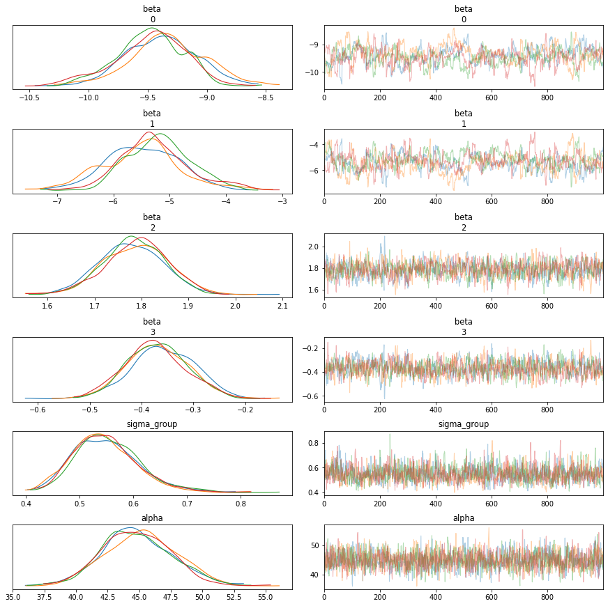
One of the advantages of Bayesian is that a parameter is summarized by a distribution of values instead of a fixed value, which definately helps us get a better understanding of the things going on, like how high the uncertainty is, how much confidence the model has in the estimations.
1 | with mod: |
| mean | sd | hdi_3% | hdi_97% | mcse_mean | mcse_sd | ess_mean | ess_sd | ess_bulk | ess_tail | r_hat | |
|---|---|---|---|---|---|---|---|---|---|---|---|
| intercept | -9.42 | 0.31 | -10.06 | -8.84 | 0.02 | 0.02 | 160.54 | 160.54 | 142.03 | 351.53 | 1.04 |
| vaccinated | -5.36 | 0.66 | -6.57 | -4.02 | 0.05 | 0.04 | 149.80 | 119.62 | 150.75 | 192.52 | 1.04 |
| T | 1.79 | 0.07 | 1.66 | 1.91 | 0.00 | 0.00 | 749.07 | 749.07 | 751.34 | 1212.85 | 1.01 |
| T2 | -0.37 | 0.06 | -0.47 | -0.25 | 0.00 | 0.00 | 916.41 | 916.41 | 917.97 | 1287.44 | 1.01 |
| sigma_group | 0.55 | 0.06 | 0.43 | 0.66 | 0.00 | 0.00 | 1010.83 | 1010.83 | 1001.36 | 1747.82 | 1.00 |
We can see the distribution of parameters very clearly,
1 | with mod: |
Random Effects
We also get a distribution for the random, state specific, effects.
1 | with mod: |
1 | random_effects.head(9) |
| mean | sd | hdi_3% | hdi_97% | mcse_mean | mcse_sd | ess_mean | ess_sd | ess_bulk | ess_tail | r_hat | |
|---|---|---|---|---|---|---|---|---|---|---|---|
| AK | 0.03 | 0.09 | -0.15 | 0.20 | 0.01 | 0.01 | 63.60 | 63.60 | 65.35 | 339.69 | 1.05 |
| AL | 0.55 | 0.12 | 0.33 | 0.77 | 0.01 | 0.01 | 88.48 | 88.48 | 86.71 | 428.54 | 1.04 |
| AR | 0.71 | 0.11 | 0.51 | 0.92 | 0.01 | 0.01 | 74.26 | 74.26 | 74.61 | 435.70 | 1.05 |
| AZ | 0.12 | 0.08 | -0.04 | 0.27 | 0.01 | 0.01 | 49.42 | 49.42 | 51.50 | 317.49 | 1.06 |
| CA | 0.34 | 0.09 | 0.19 | 0.51 | 0.01 | 0.01 | 47.83 | 43.42 | 46.91 | 344.41 | 1.07 |
| CO | 0.16 | 0.09 | -0.01 | 0.34 | 0.01 | 0.01 | 45.42 | 42.62 | 44.54 | 297.58 | 1.07 |
| CT | 0.10 | 0.13 | -0.18 | 0.33 | 0.02 | 0.01 | 76.68 | 76.68 | 72.85 | 279.41 | 1.05 |
| DC | -0.31 | 0.12 | -0.52 | -0.09 | 0.01 | 0.01 | 75.16 | 75.16 | 74.36 | 724.17 | 1.04 |
| DE | -0.48 | 0.10 | -0.67 | -0.28 | 0.01 | 0.01 | 74.12 | 74.12 | 72.69 | 614.42 | 1.05 |
Comparing to the other states, states such as FL, KY which are seen as outliers in our previous models have much larger random effects.
1 | random_effects.loc[['FL','KY']] |
| mean | sd | hdi_3% | hdi_97% | mcse_mean | mcse_sd | ess_mean | ess_sd | ess_bulk | ess_tail | r_hat | |
|---|---|---|---|---|---|---|---|---|---|---|---|
| FL | 1.64 | 0.08 | 1.48 | 1.78 | 0.01 | 0.01 | 44.39 | 43.59 | 45.16 | 292.35 | 1.07 |
| KY | 0.99 | 0.08 | 0.85 | 1.16 | 0.01 | 0.01 | 45.57 | 44.32 | 47.46 | 324.94 | 1.06 |
In Sample Predictions
Now, let’s make some predictions and see how the mixed model works.
1 | def select_data(data,periods): |
1 | def plot_result(data,norm,ax): |
1 | with pm.Model() as mod: |
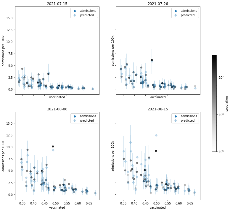
100%|█████████████████████████████████████████████████████████████████████████████| 4000/4000 [00:05<00:00, 798.51it/s]Remember, there are 4000 sample predictions for each of the records, I won’t plot out all of them, but will do their means with one standard deviation of uncertainty. The error bars would make prefect graphical representations.
1 | predicted=posterior_predictive["y_pred"] |
((4000, 1632), (1632, 6))1 | y_pred_mean=predicted.mean(axis=0) |
Looks like the predictions are closer to the actuals since we incorporate the random effects. Hooray!
1 | plot_time_facets(data,event) |
Differences comparing to linear regression
Random Intercepts
Let’s take a further look by state to better understand what I meant by random effects/intercepts.
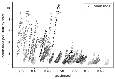
Below is all the observed data points marked by state. We can see that roughly the slopes of different groups are close, while the intercepts can vary.
In case you wonder why the slopes are upward, that’s due to the passage of time, remember time is our explanatory variable as well, but we can only plot two dimensions.
1 | fig, ax = plt.subplots() |
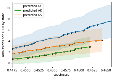
Let’s select three states in the middle to plot their predictions against actuals.
1 | def plot_states(data, states, var): |
This shows clearly how the mixed model leverages all the data points to estimate the correlation (slope) between admissions and vaccinations, but at the same time allows states to have different starts (intercept) due to fundamental differences which we consider are random.
1 | plot_states(data,['KY','AK','KS'],"vaccinated") |
Variance
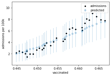
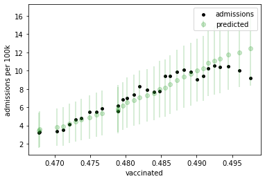
The Bayesian approach gives the distributions of the predictions, so we don’t need to rack our brains for the analytical solution of the prediction band, instead, we can simply plot it out with the samples generated by pymc3. Here I used one unit of the sample standard deviation.
As we can see, the variance of prediction is larger with greater admissions, meaning they are positively correlated, which is not what we’ve seen with the linear regression that the variance of dependent variable is always constant. So using GLMM based on a negative binomial distribution allows the magnitude of the variance to change as a function of the predicted value.
1 | def plot_state(data, state, color): |
1 | plot_state(data,'KY','tab:blue') |
1 | plot_state(data,'FL','tab:green') |
Predicted Dependence on vaccination Rate
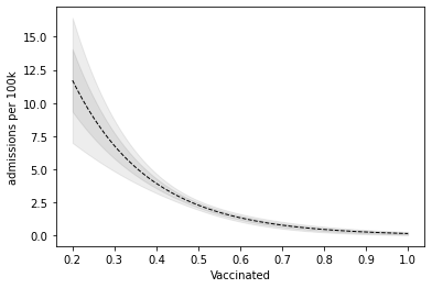
One of the things that we are interested is that how does the vaccination rate impact the admissions?
To see this better, I fixed the time at Aug.15, and let the vaccination rate to vary from 20% to 100%.
1 | # given current time point, generate test set for vaccination rate from 20% to 100% |
1 | with pm.Model() as mod: |
100%|████████████████████████████████████████████████████████████████████████████| 4000/4000 [00:01<00:00, 3891.10it/s]1 | # generate predicted mean and standard deviation |
We can see that vaccinations and admissions are negatively correlated. And when vaccination rate is low, the prediction can be quite uncertain.
1 | plt.plot(V,y_pred_mean,"k--",linewidth=1) |
Predicted Time Evolution
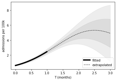
The other thing that we are most interested in is that how the third wave of covid19 is going to evolve. How many admissions are there going to be given the current vaccination rate? So I use the GLMM model to project the next two months from Aug.15th on.
1 | # given the average vaccination rates |
0.488521809877163651 | # generate test set for the past month and the next 2 months |
1 | with pm.Model() as mod: |
100%|████████████████████████████████████████████████████████████████████████████| 4000/4000 [00:01<00:00, 3831.47it/s]1 | # generate predicted mean and standard deviation |
The prediction tells us that the admission will peak in one and half month from Aug.15th, which is by the end of September. However, I would be careful as the model have low confidence when projecting beyond one month. Look at that wide confidential interval band after T=2. Basically, the reality can fall any where between the curve flattening out as early as the start of September to that we won’t be able to see a peak until mid October. But overall I am very optimistic as there’s at least 80% of chance that we’ll see it peaking before mid October. Eventually, we will get there. So hang in there, everyone!!
1 | T0=T[T<1] |
Officially we are done, cheers! I hope you find this project inspiring. And if you read it all the way through - congrats, you are an incredibly patient person, have a cookie!